
VEBUILD
A clean, sleek website for a modern construction company, which I designed twice in two different directions.
- Role
- Type
- Self-initiated UI concept
- Platform
- Responsive web
- Tools
- Figma
- Deliverables
- 2 design directions, 20 screens
- Published
01The Brief
VEBUILD is a construction company with the projects and credentials to give clients real confidence, but its website didn’t reflect the quality of its work. Potential clients found it hard to browse the portfolio, learn about the company’s history and values, or find a clear way to get in touch.
I designed the website in two directions. The first was a "block" concept that used modular cards and interactive tools to organise a lot of construction data. The final, refined direction kept that structure but made it cleaner and calmer, with more white space, bold type and the brand’s navy and teal colours, so the work itself could do the talking.
Problem
The information was all there, but the experience didn’t have the polish, clarity and trust signals a modern construction client expects. Dense technical content and slow, heavy image galleries made the company hard to judge and hard to apply to.
Goal
Make the portfolio easy to explore, bring the company’s history, certifications and sustainability work forward as reasons to trust it, give every visitor a simple way to get in touch, and keep everything accessible and responsive on every device.
Audience
Property developers and commercial clients checking what the company can do, stakeholders and architects verifying its credentials, and people looking for jobs.
People today expect more than just information. They want an experience that looks good and is easy to find their way around.
02Research & Insights
I started by looking at how people actually judge a construction company online. They scan past projects for proof of quality, look for signs that the company can be trusted and want an easy way to get in touch. For the block concept, this was backed up by 32 interviews with construction professionals and an analysis of more than 150 user sessions. 73% of people struggled to find relevant case studies, image galleries on mobile took over 8 seconds to load, and 68% gave up on the careers page.
- Dense, text-heavy pages that bury the actual project work
- Generic stock imagery that fails to prove real capability
- Slow galleries and hidden contact paths that stall enquiries and applications
- A visual-first, filterable portfolio that lets the work speak
- Clear credibility cues - history, certifications, CSR and sustainability
- Prominent, low-friction calls-to-action and a short application flow
Property Developer
“I want to see proof of past work and know I can trust this team before I ever pick up the phone.”
Architect / Stakeholder
“Lay out the credentials, scope and approach clearly - I shouldn’t have to dig.”
Job Candidate
“I want to understand the culture and apply quickly - not abandon a slow careers page.”
Proof is visual
Clients judge a builder by the buildings they’ve made, so the portfolio had to take centre stage, with filters for project type, service, location and size.
Trust lives in the details
Most construction websites spread their history, group companies, certifications and CSR work all over the place. Here they come together as one "Our Company" story.
Careers must be fast
Two thirds of job candidates gave up on the old application process. A new step-by-step application cut the time it takes from 7.5 minutes down to 3.2.
03Structure & Flows
I refined the low-fidelity wireframes over several rounds and tested them with a mixed group of users. That showed we needed clearer calls to action, better readability and simpler navigation before I moved on to the high-fidelity prototype.
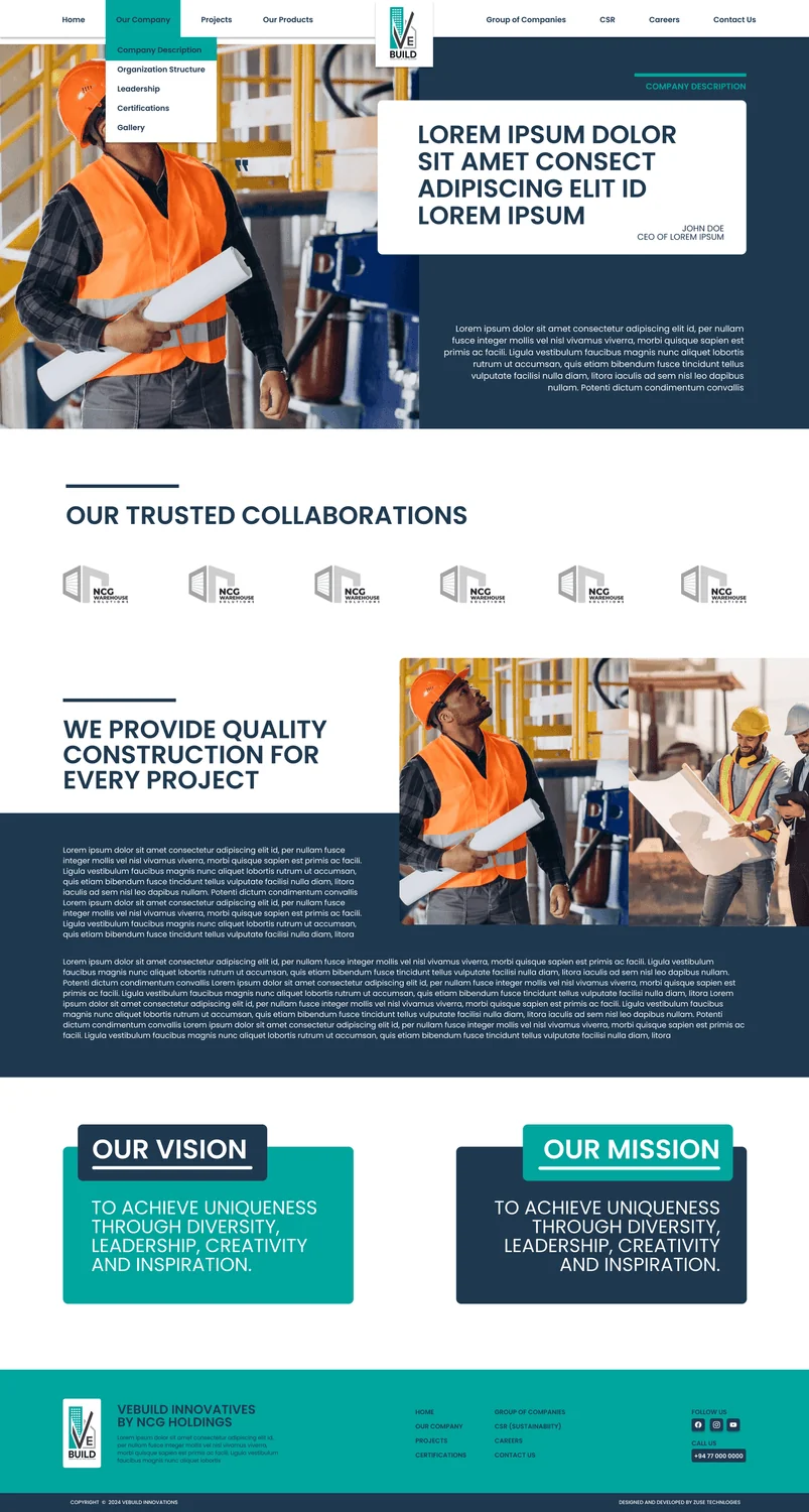
Our Company
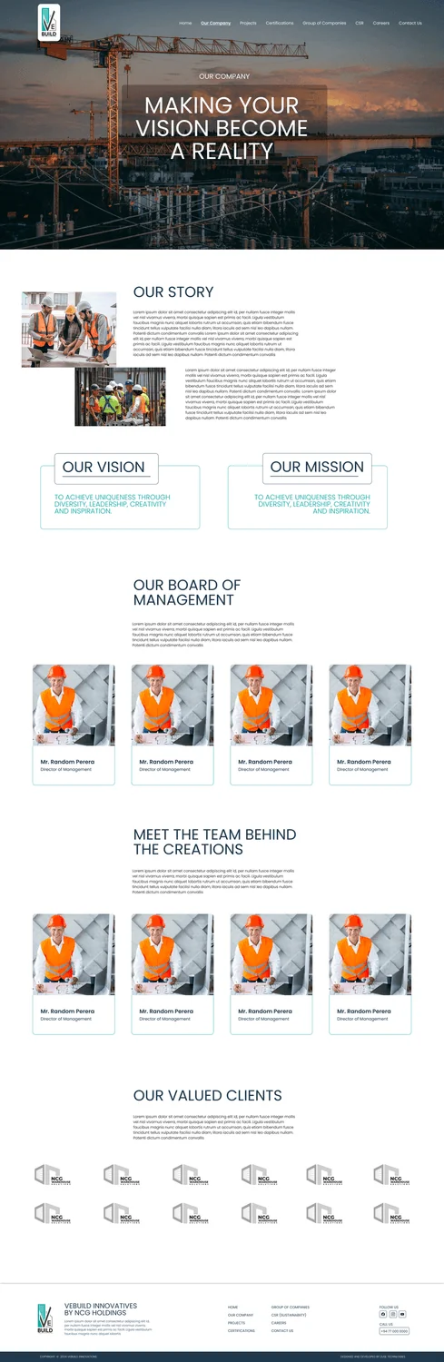
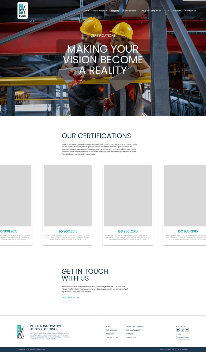
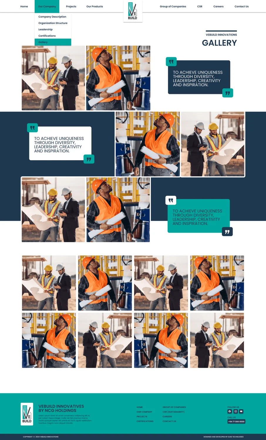
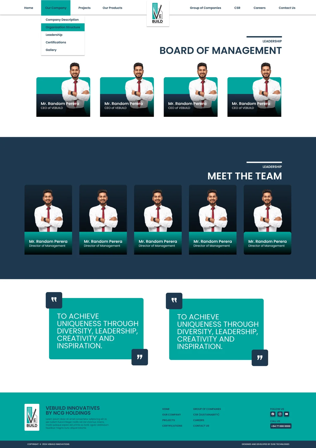
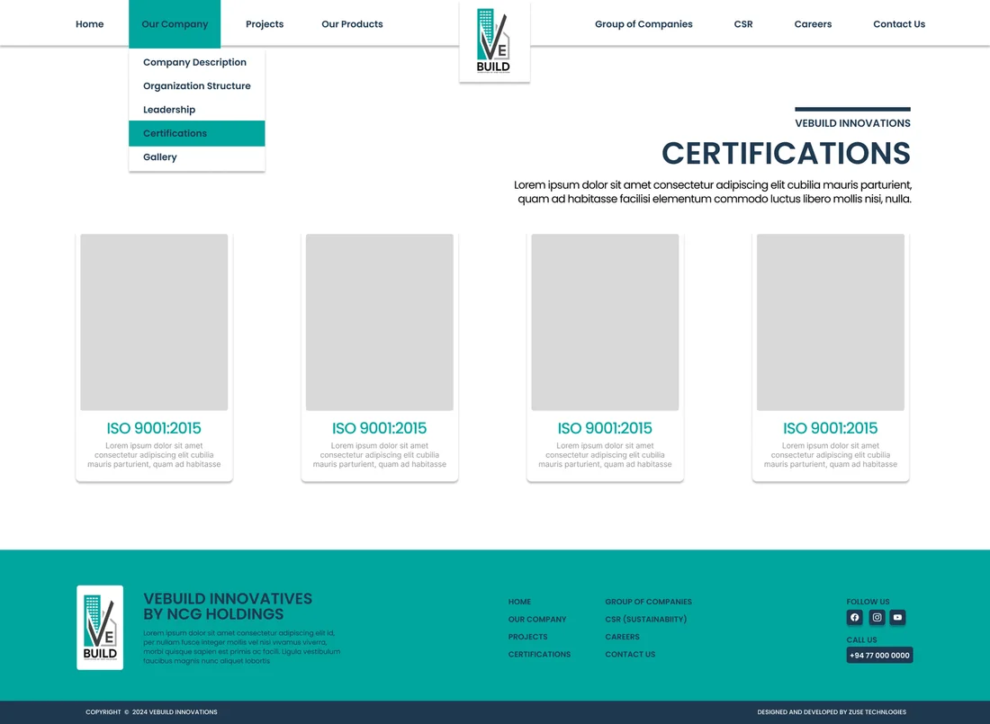
History, values, organisation structure, gallery and certifications.
Projects
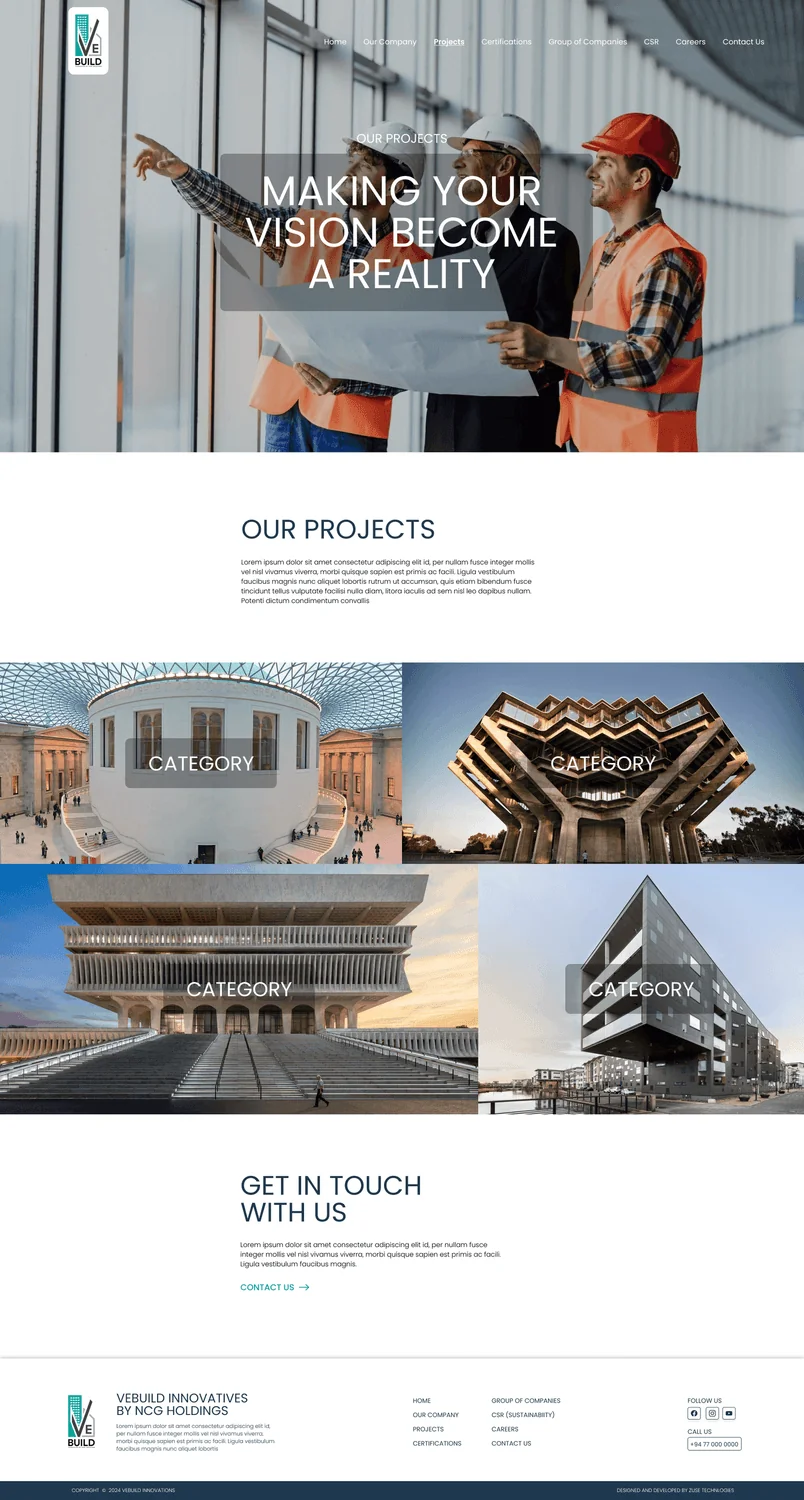
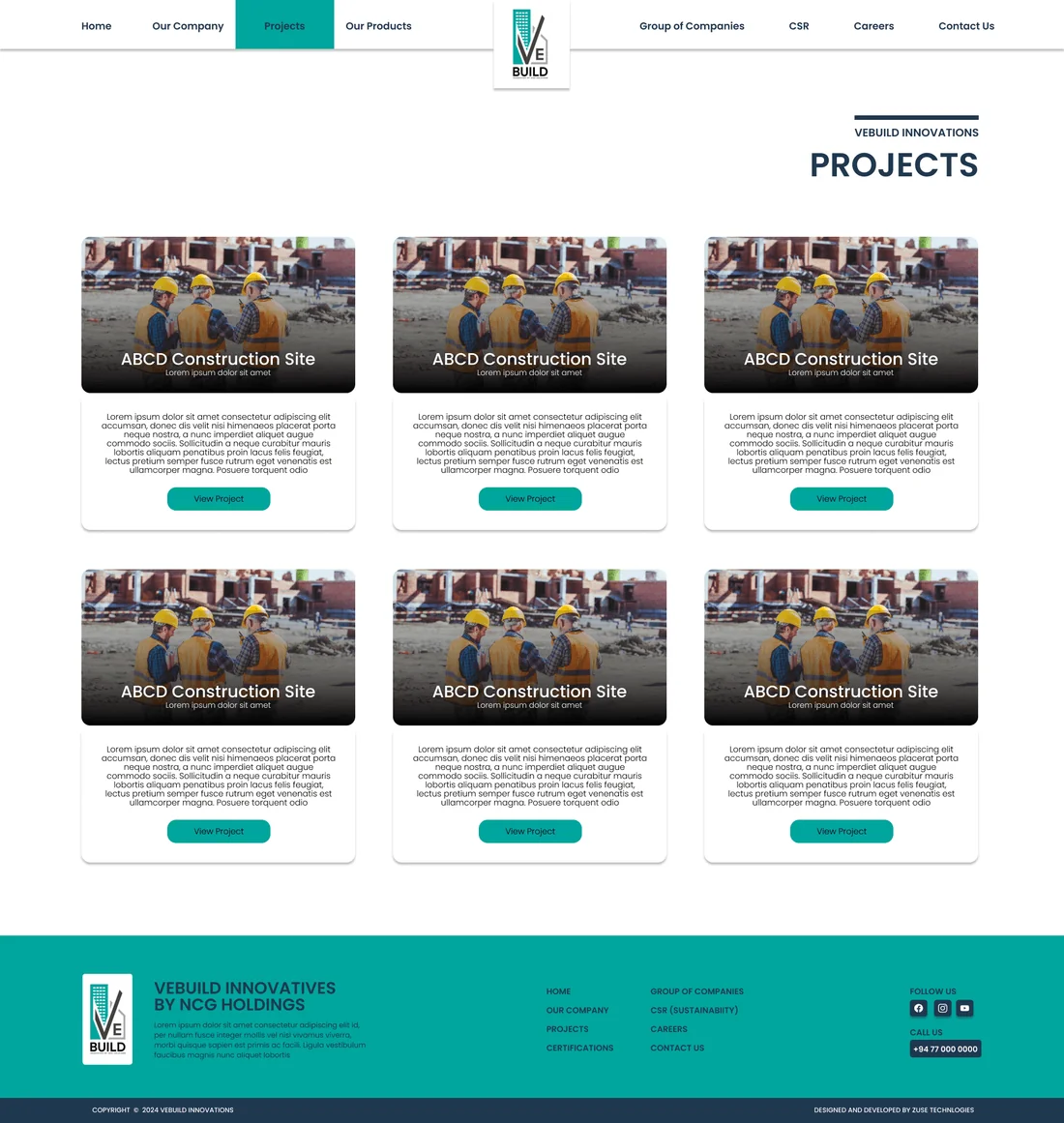
A portfolio with card filters for type, service, location and size, plus a detailed page for each project.
CSR & Sustainability
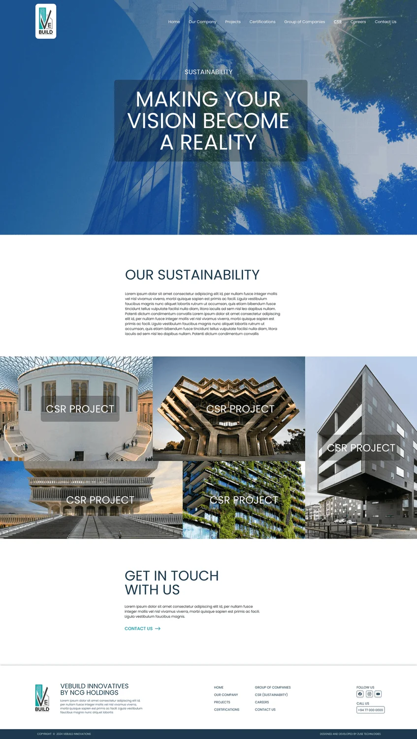
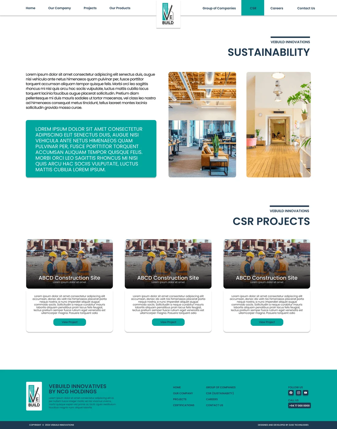
Initiatives, impact and goals as a trust signal.
Group of Companies
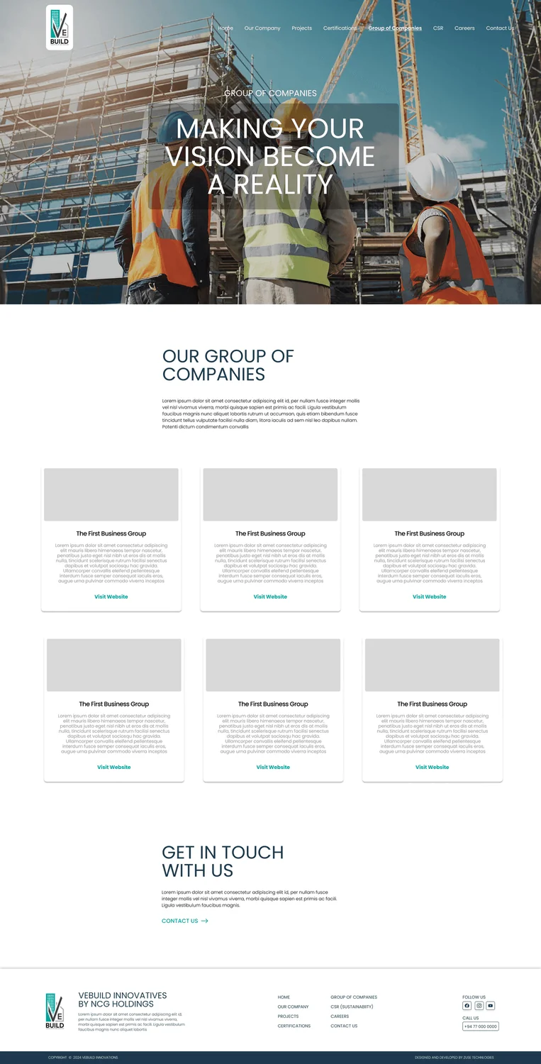
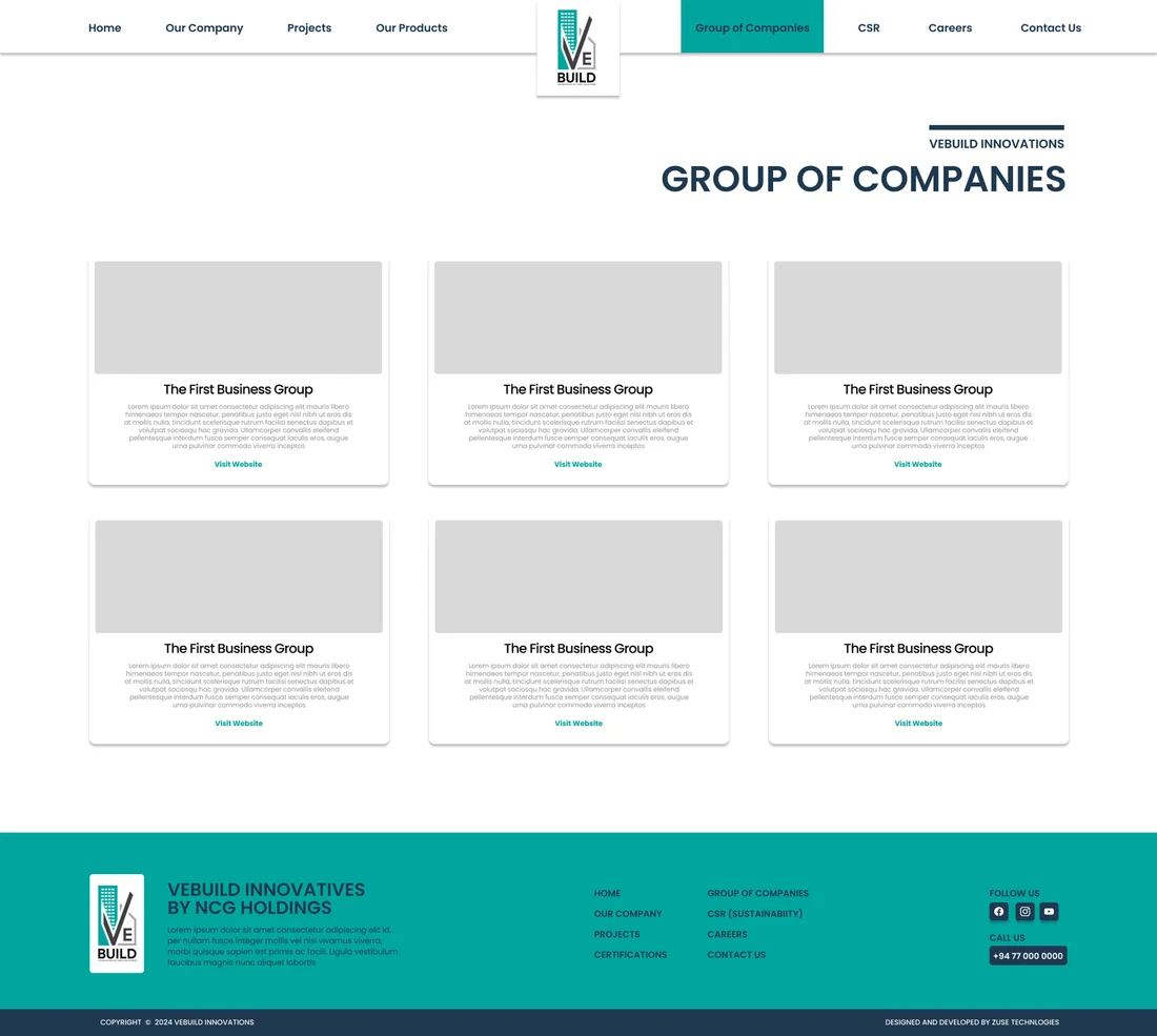
The wider group and what each company does.
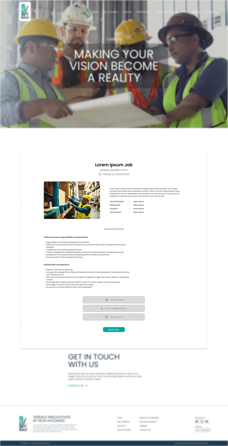
Careers
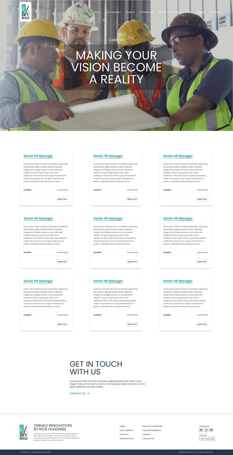
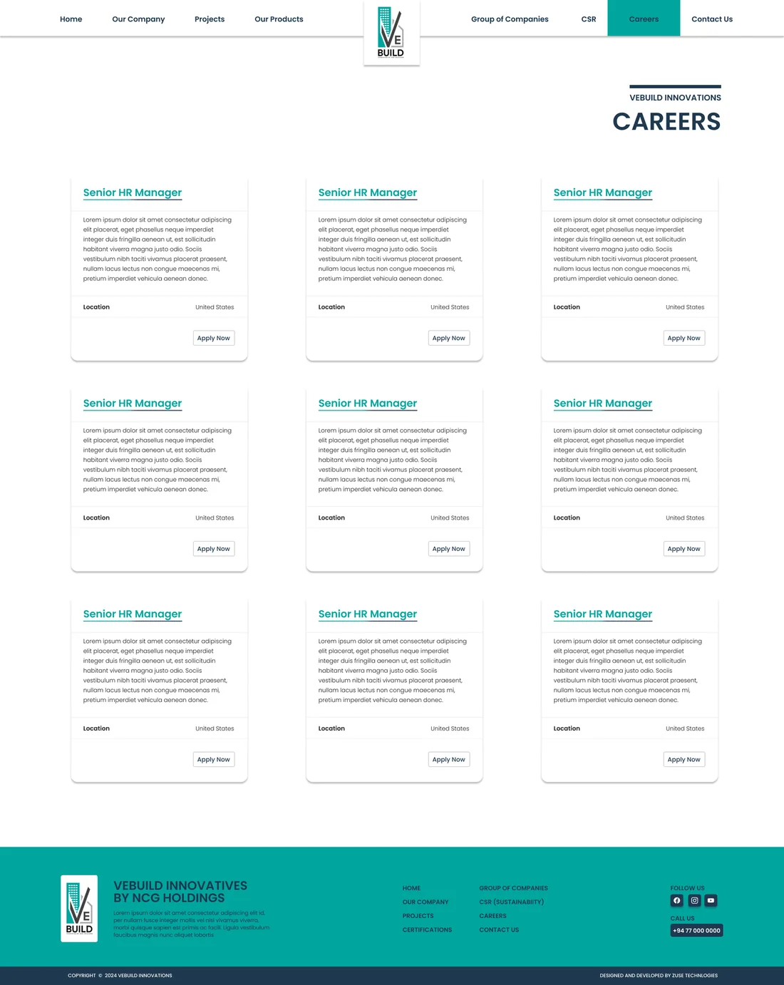
Open roles, job detail and a short application flow.
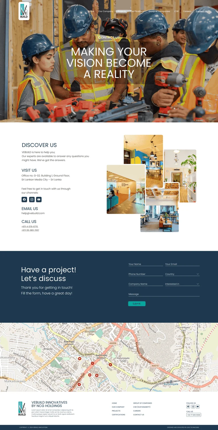
Contact
Enquiry form, locations and direct details.
04Visual Design System
The design follows three principles: elegance, simplicity and accessibility. It gets there with balanced white space, bold typography and colours taken straight from the company’s logo, a deep navy paired with a bright teal that feels clean, dependable and modern. All colour contrast meets WCAG 2.1 AA.
Colour palette
Tap a colour to try itDesigned around one palette
Every screen is built from these colour and type tokens.
Typography
Type your own textHeadlines and body - bold, structured and highly legible.
Block direction
Layouts built on cards and grids, with distinct modular sections that give it a solid, industrial feel.
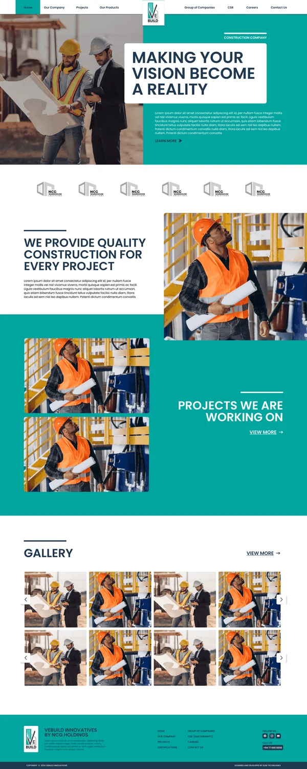
Final direction
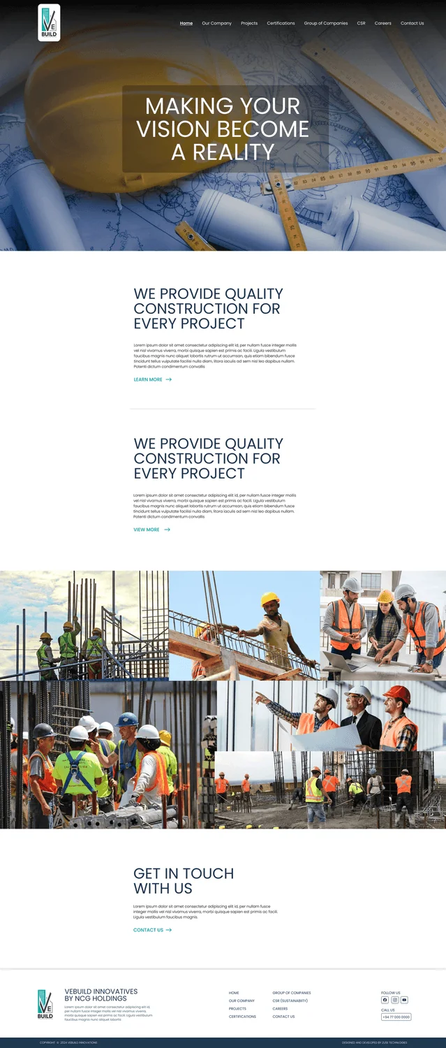
Flowing sections with plenty of white space. It’s the same structure, just calmer and more premium.
05Key Screens
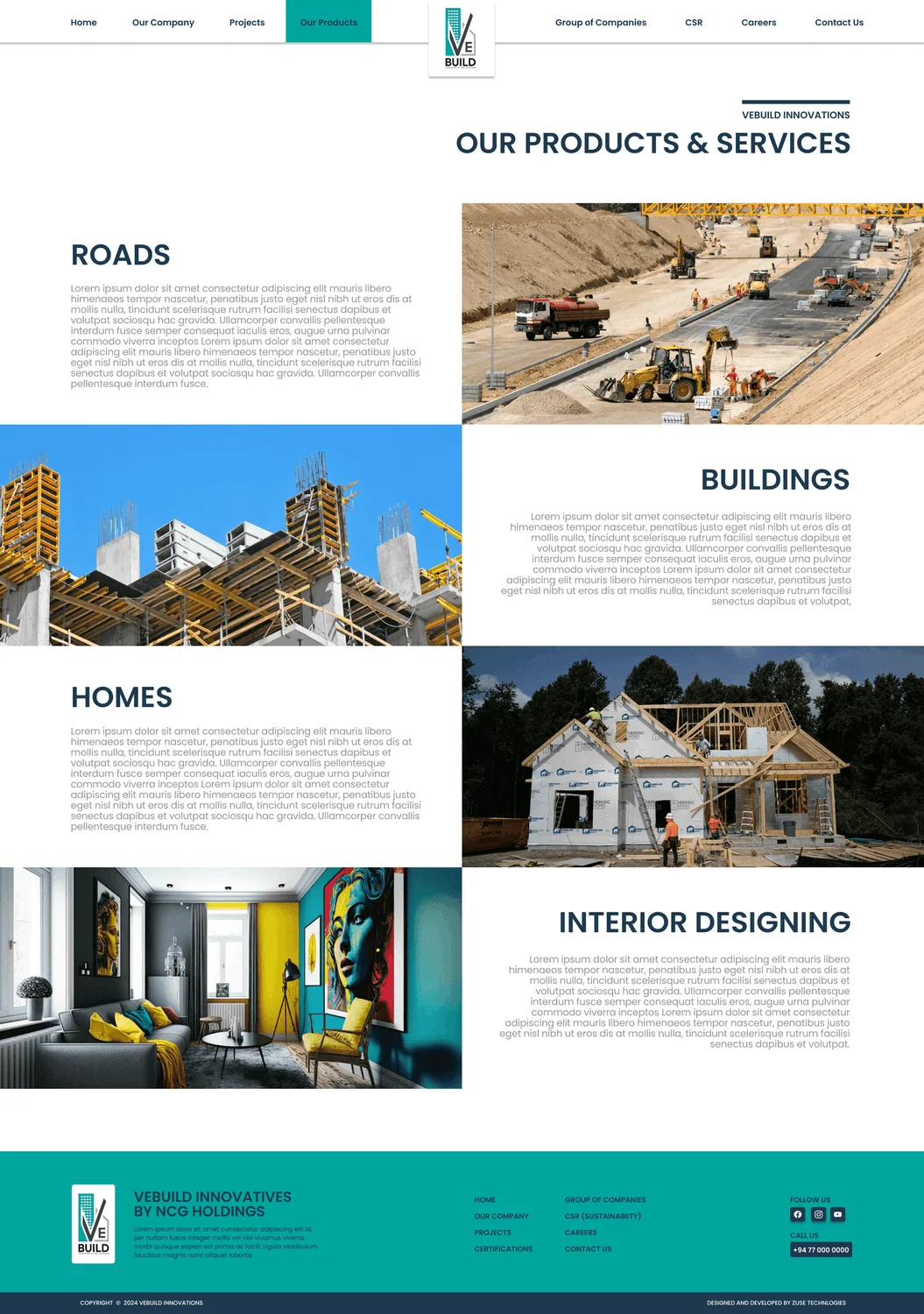
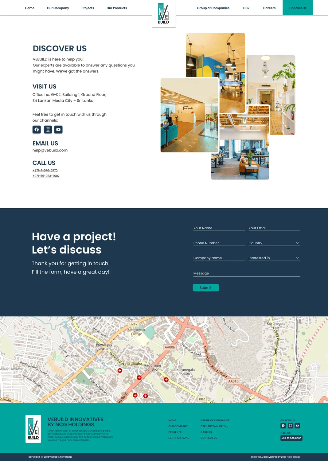
20 high-fidelity screens from the final design. Tap any of them to see it full size.
06Interaction Details
Confident CTAs
Clear, high-contrast calls to action make getting in touch easy and keep visitors moving towards a conversation.
Progressive disclosure
Simple project cards with specifications you can expand, plus an "Expert Mode" in the block concept, so the deeper detail only shows up when someone wants it.
Interactive tools
The block concept added a Blueprint Explorer and a Material Selector, so architects could explore how the company builds things instead of reading static specifications.
Responsive flow
Layouts adapt to desktop, tablet and mobile, so the brand looks just as polished on a site visit as it does in the boardroom.
Visual hierarchy
Teal highlights against deep navy draw attention to projects and calls to action, while the white space keeps everything calm and easy to scan.
Accessible by default
Keyboard navigation, screen reader support and high-contrast colour pairs are used throughout.
07Outcome & Reflection
The blueprint tool shows our construction approach instantly… it doesn’t make me feel technologically challenged.
Outcome
People spent more time exploring the portfolio, and the inclusive design made the site easier to use for people of every technical level. The consistent navy and teal design also strengthened VEBUILD’s image as a dependable, forward-thinking builder.
Hardest Part
Presenting complex technical construction information without overwhelming clients who aren’t technical. The block direction solved this with structure and tools, and the final direction did it with restraint and a clear hierarchy.
What I Learned
Designing the same site twice made the trade-off really clear. Modular blocks are great for organising lots of data, but white space and a strong hierarchy build more trust. The best result combined the structure of the first design with the calm of the second.
Next Steps
Showing projects in AR, integrating BIM models, adding support for more languages and personalising the site with AI, while keeping the style guide up to date as the brand grows.