
TECHNOSPHERE
The website for a university tech convention, bringing schedules, speakers, registration and a CTF portal together in one energetic interface.
- Role
- Client
- FOSS Community, NSBM Green University
- Timeline
- Tools
- Platform
- Responsive web, live site
- Deliverables
- Landing, CTF, registration, profiles, Q&A
01The Brief
TECHNOSPHERE is a technical convention run by the FOSS Community of NSBM Green University. The 2022 event included talks, guest speakers, a webinar track and a capture-the-flag (CTF) competition, and it needed a website with just as much energy.
I rebuilt the event’s online presence around one question. How do you make a fast-paced convention easy to follow for a competitor racing the clock, a speaker checking their time slot and a first-year student who just wants to know what’s going on right now?
Problem
Attendees needed to get to schedules, speaker details and competition rules quickly, but most event websites bury them under clutter that falls apart on a phone in the middle of the event.
Goal
Build an eye-catching, responsive site that grabs visitors as soon as they land, gets them registered either in person or online, and keeps the schedule, speakers and CTF just one tap away.
Audience
Tech lovers, university students, lecturers and tech enthusiasts joining the sessions in person, through the webinar or in the CTF.
The UI design played a big part in improving the whole experience, and it caught visitors’ attention from the moment they landed on the homepage.
02Research & Insights
I looked at existing tech convention websites and the interaction patterns that keep people engaged during a fast-moving event. Then I looked at the three kinds of attendee who would be using the site on the day.
- Cluttered landing pages that hide the Register button
- Schedules that are unreadable on mobile during the event
- Static, dull layouts that don’t reflect a tech event
- An immersive, high-impact hero that hooks users instantly
- Quick access to Schedule, Speakers and the CTF competition
- A responsive design built for on-the-go use at the venue
Tech Enthusiast
“I need the CTF rules and leaderboard updates immediately. Every second counts.”
Speaker / Faculty
“I want the full list of speakers and the session flow to make sure everything is on track.”
General Attendee
“I’m here to learn and network. Show me what’s happening now and where I should go.”
The CTF can’t be buried
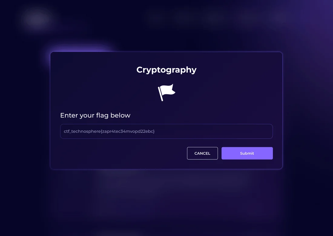
Competitors waste time looking for the rules, so the CTF portal has its own link in the sticky navigation.
One source of truth for time
Speakers noticed that schedules didn’t match between screens and signs, so there’s now one schedule with clear time slots.
Cards over walls of text
Newcomers skim through pages, so sessions are shown as cards with a clear "happening now" label.
03Structure & Flows
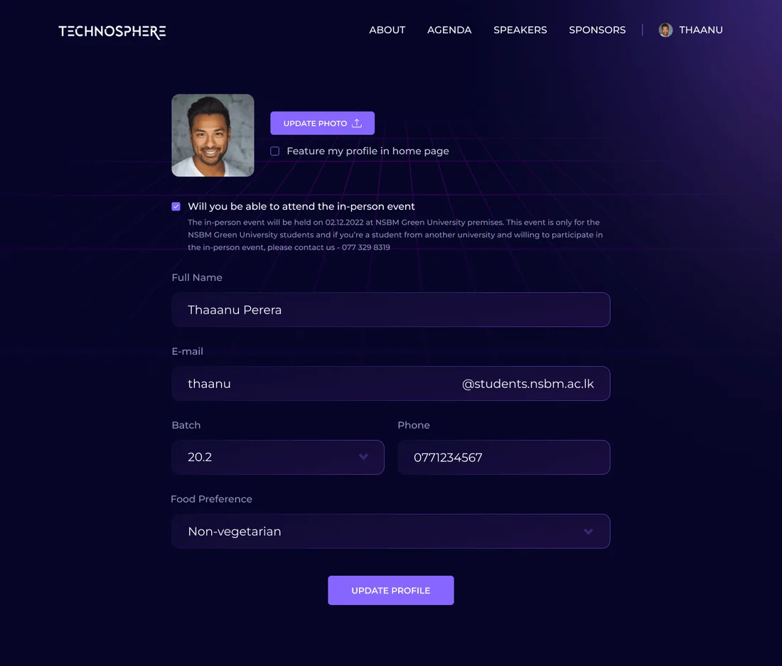
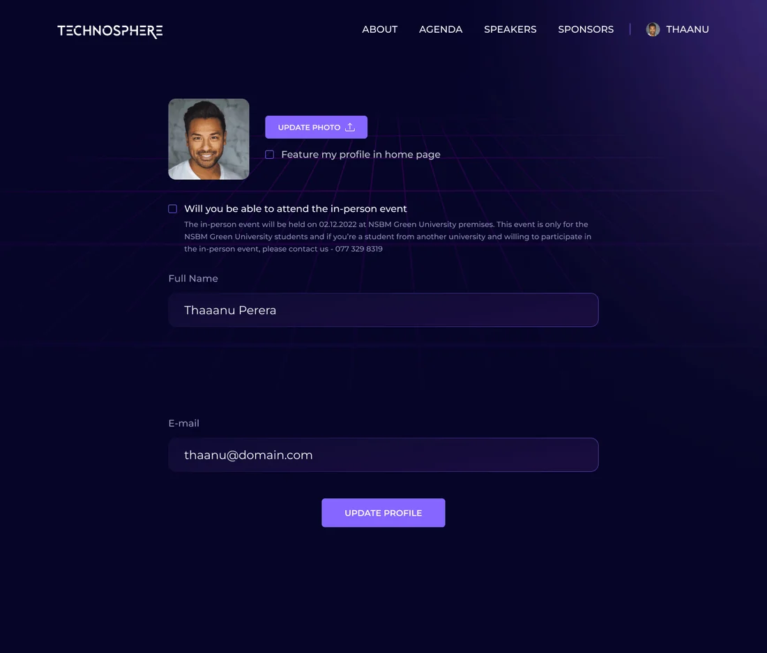
I turned low-fidelity wireframes into a high-fidelity prototype based on feedback. There are two registration paths, one for people attending in person and one for webinar attendees, and each leads to its own profile view.
Event schedule
Session timings, tracks and breakout rooms.
Speakers
Profiles, topics and Q&A links.
CTF competition
Rules, challenges and the leaderboard.
Registration
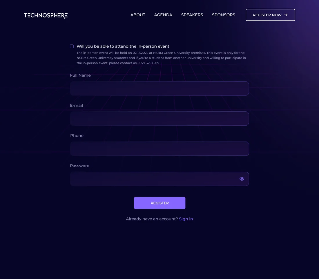
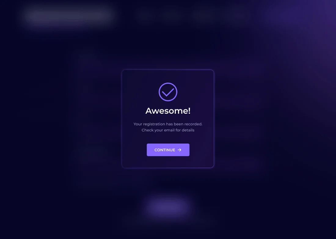
Separate registration flows for in-person and webinar attendees, each ending with a confirmation screen.
Webinar & Q&A
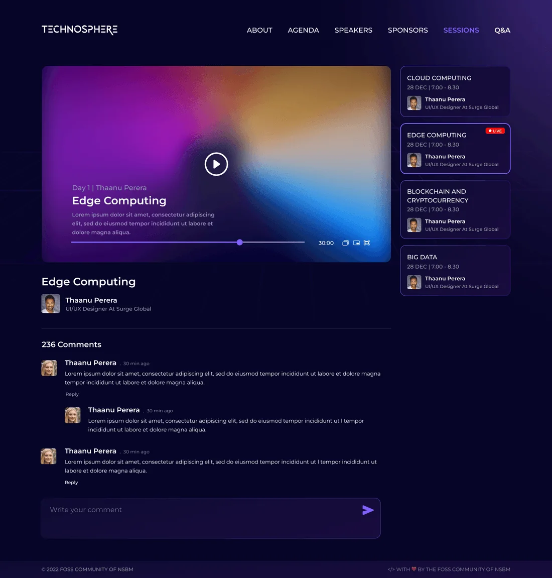
A video player with a question thread right next to the stream.
Venue info
Maps, directions and support.
04Visual Design System
The design focuses on simplicity, accessibility and good looks, with balanced white space, bold Poppins type, and a black background lit up by purple and cyan gradients that reflect innovation and the FOSS spirit.
Colour palette
Tap a colour to try itDesigned around one palette
Every screen is built from these colour and type tokens.
Typography
Type your own textHeadlines and body - bold weights for the event voice, regular for schedules and details.
05Key Screens
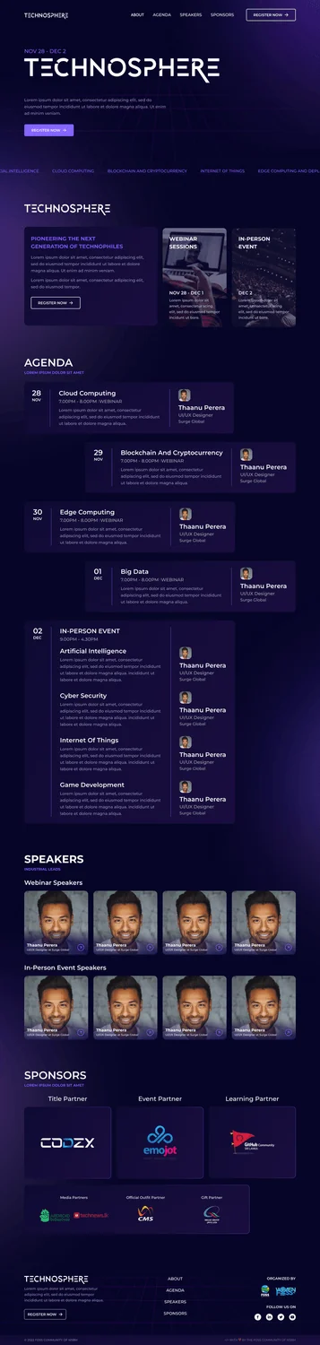
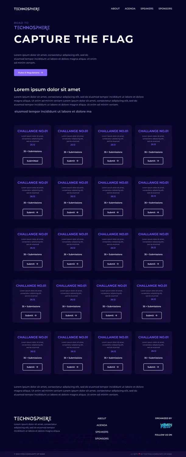
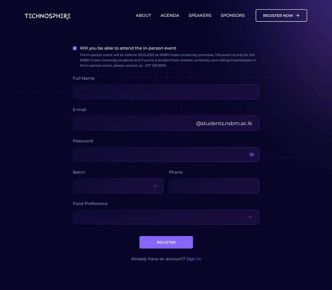
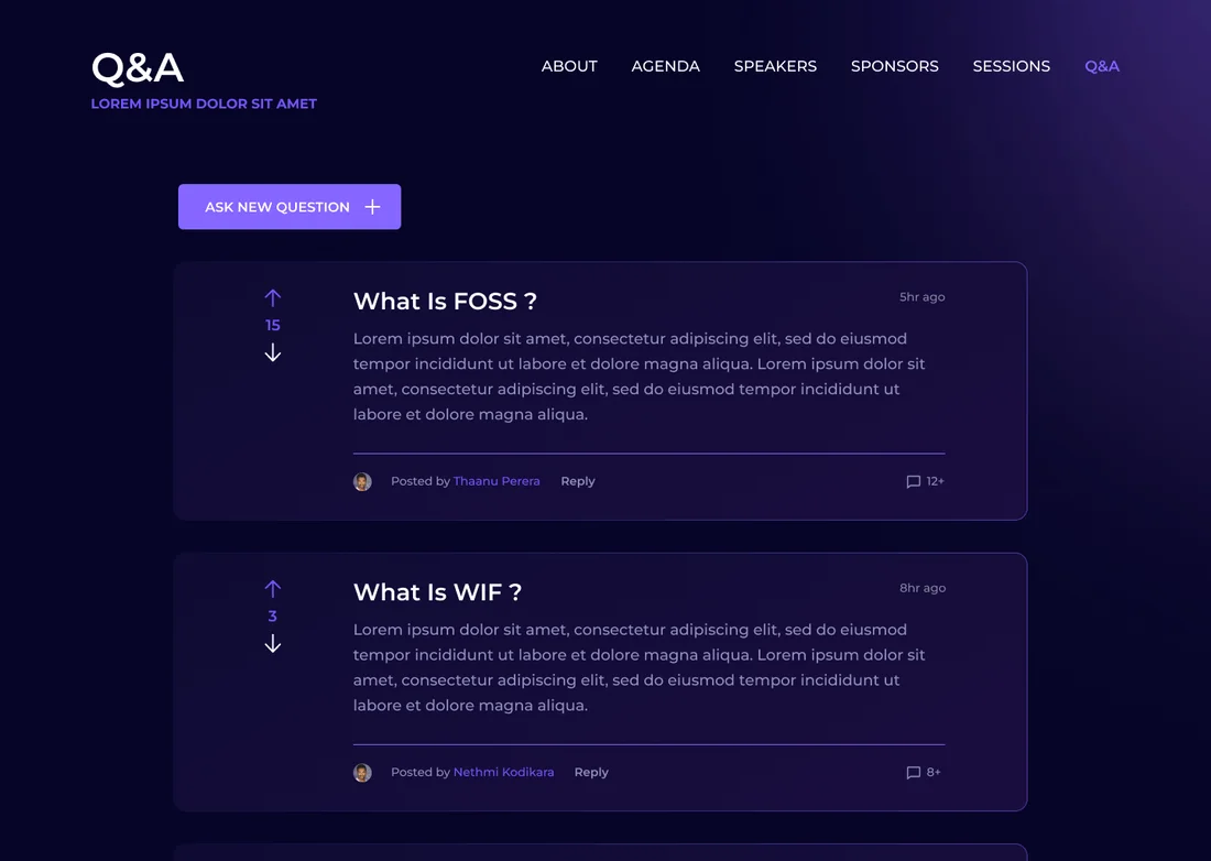
10 high-fidelity screens from the final design. Tap any of them to see it full size.
06Interaction Details
Action and clarity
High-contrast buttons with strong hover effects keep sessions, registration and the CTF easy to get to.
Tech everywhere
The layout adjusts for desktop, tablet and phone, so the schedule is just as easy to use at the venue as it is at a desk.
Gradient hierarchy
Violet to cyan gradients and bold type draw your eye to the highlights and to what’s coming up next.
Live Q&A
Webinar attendees can ask and answer questions right next to the stream instead of switching to a separate tool.
07Outcome & Reflection
Outcome
Attendees spent more time looking through event details and joining sessions and the CTF, and people of every technical level found the site easier to get around. The consistent design also helped establish TECHNOSPHERE as a leading student tech event.
Hardest Part
Fitting a lot of schedule information and a competition portal into an interface that still feels exciting, all within a four-week deadline before the event.
What I Learned
People use event websites in short bursts, on their phones and under time pressure. Designing around "what’s happening right now" mattered more than any fancy animation on the homepage.
Next Steps
Continuing to gather feedback from attendees after every event, looking into personalised schedules, and updating the style guide as the event grows.