
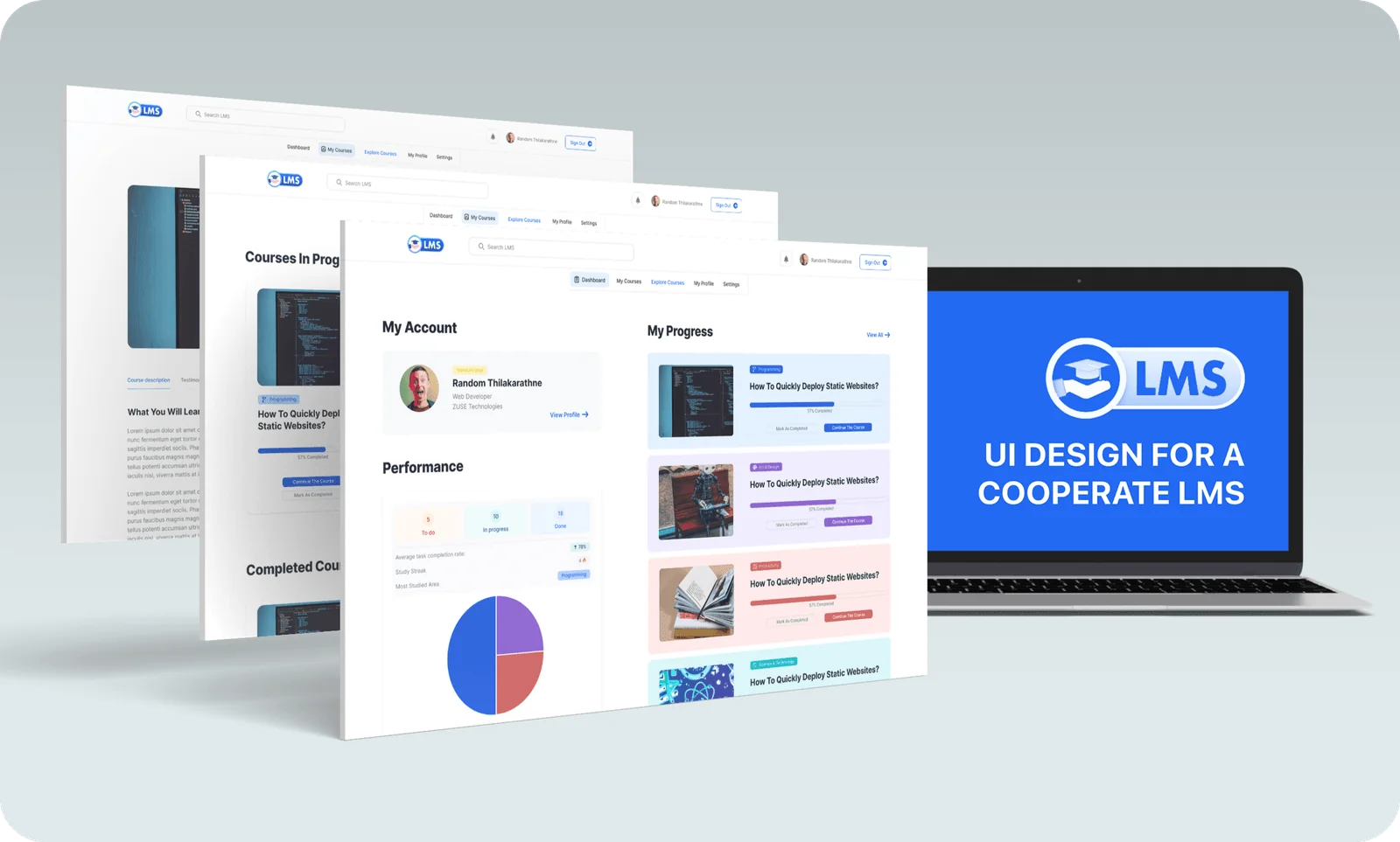
ZUSE Corporate LMS
Corporate training redesigned as a premium learning experience built around cards.
- Role
- Timeline
- Type
- Tools
- Research
- Platform
- Responsive web
01The Brief
Older LMS platforms are where professional growth tends to stall. Cluttered dashboards, confusing navigation and the same learning path for everyone end up frustrating the very people they’re supposed to help.
ZUSE swaps all that bureaucracy for a smooth, card-based interface that treats corporate training like a premium digital product.
Problem
Outdated page structures and cluttered dashboards were pushing busy professionals and senior staff to give up on training they were required to complete.
Goal
Increase course engagement by 50% by showing information gradually and building an intuitive, card-based dashboard.
Audience
Busy professionals (25-55), company administrators, and HR managers who need a simple way to track compliance.
Employees were spending 6 to 9 minutes just finding basic course information, and many gave up before they’d even started learning.
02Research & Insights
Comparing five corporate training platforms showed that they kept adding features at the cost of being efficient. When I watched people use them, they got lost in menus trying to do the simplest thing, which was to carry on with a course.
- Dense, table-heavy layouts with no visual relief
- Sidebars with 15+ top-level links
- Poor mobile support and broken session persistence
- Progressive disclosure of course material
- Personal metrics surfacing "Next up" immediately
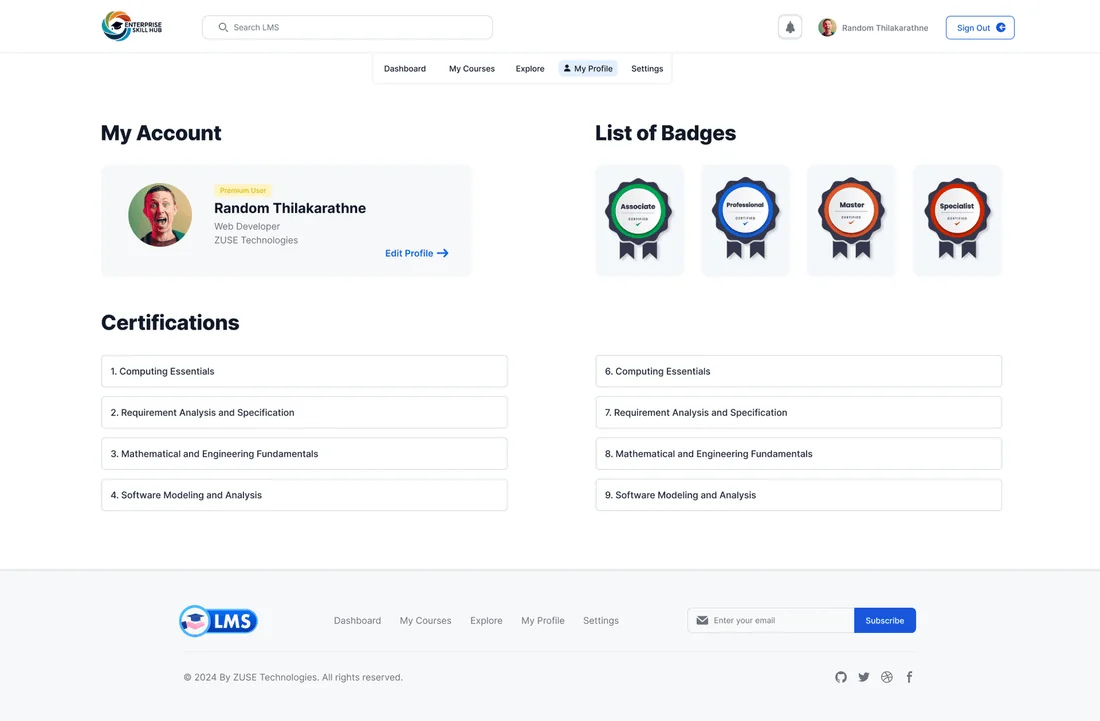
- Quick access to certificates and achievements
Kusum Perera, 28
“I need to finish a module on my commute and know exactly where I left off.”
Damith Wickramasinghe, 45
“I need to track certifications for my whole team without digging through nested reports.”
Dilshan Ratnayake, 34
“I spend half my day helping people find hidden course library links.”
"Resume now" first
Learners needed five or more clicks to continue a course, so a big "Resume" button at the top of the page fixes that.
Visual compliance
Managers get progress bars and red-flag alerts instead of dense reports.
One action bar
Admins get one combined action bar for making bulk changes, and it works the same way across every view.
03Structure & Flows
I condensed 12 old menu items into 5 dashboard categories, which cuts navigation by about 40%. The main idea behind the design was remembering where each learner was across sessions.
Dashboard
Overview · progress · recent · achievements
Library
Courses · catalogue · categories · recommendations
Analytics
Reports · stats · benchmarks · team tracking
Account
Profile · settings · notifications · help
04Visual Design System
A high-contrast palette of deep blue with turquoise highlights that feels professional but lively, with soft tinted backgrounds that give heavy course content some breathing room.
Colour palette
Tap a colour to try itDesigned around one palette
Every screen is built from these colour and type tokens.
Typography
Type your own textCrisp, familiar system type that keeps a content-heavy product calm and legible
Licensed face - previewed here in Inter, its closest web match.05Key Screens
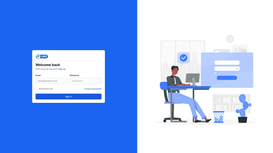
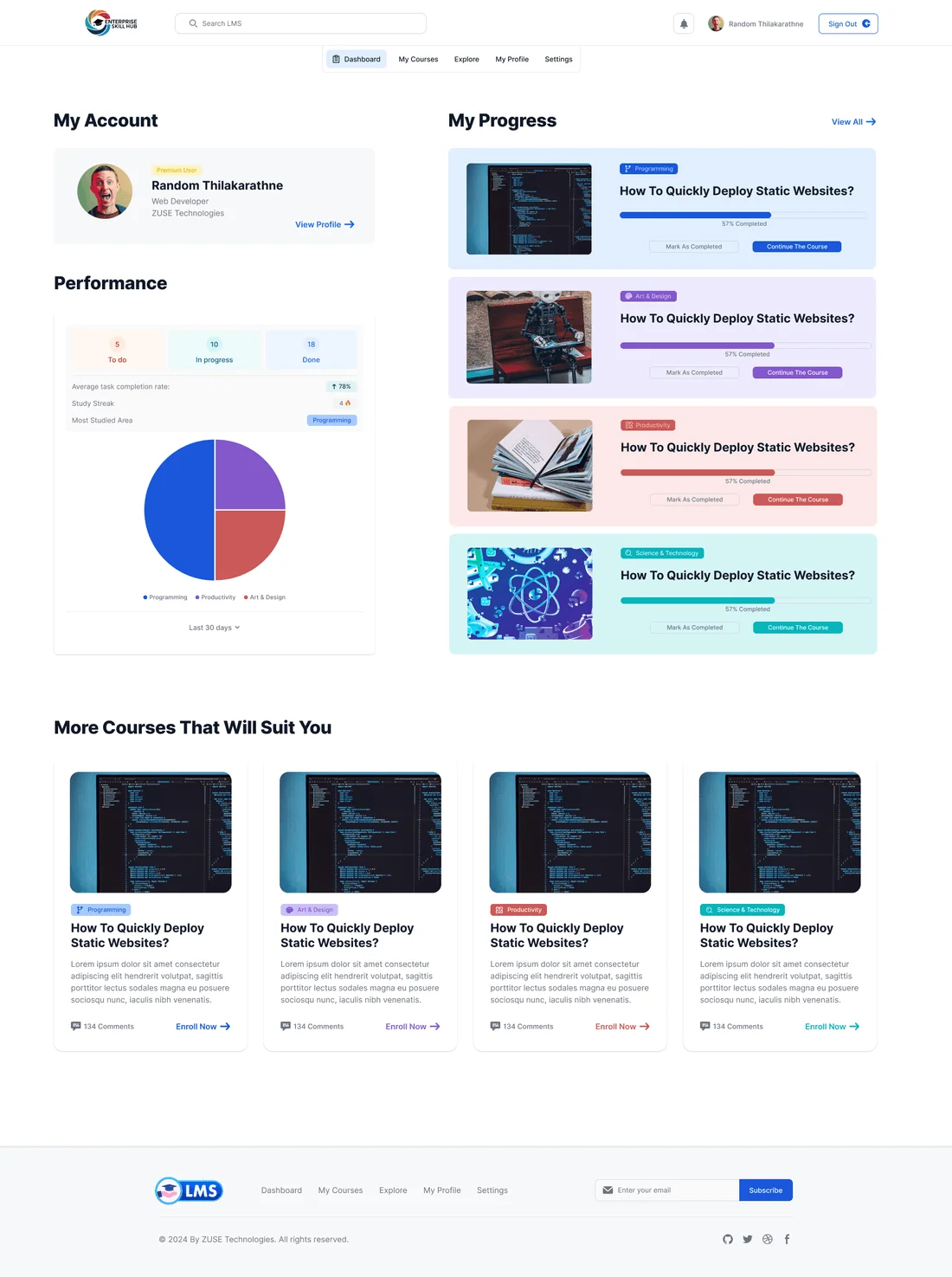
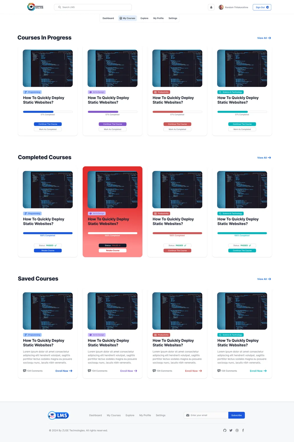
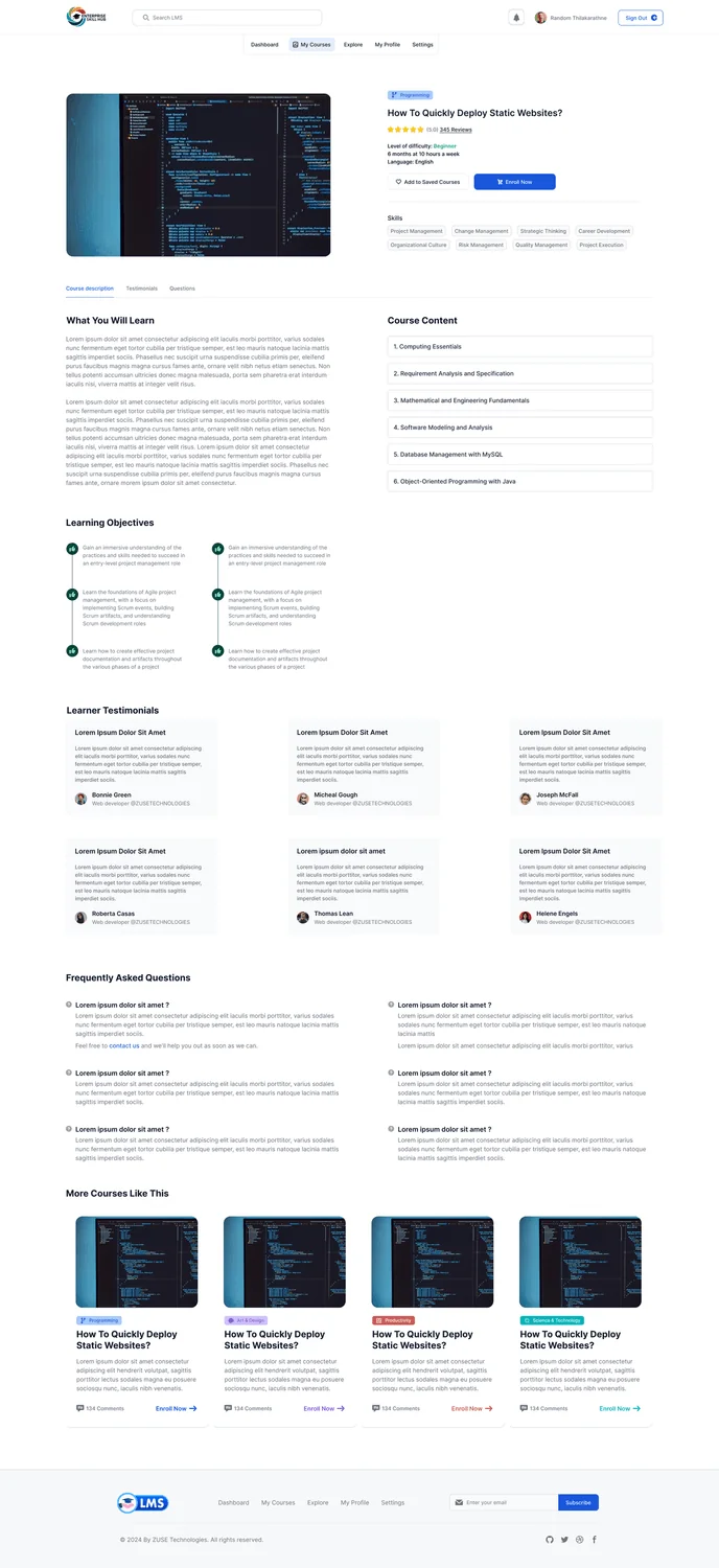
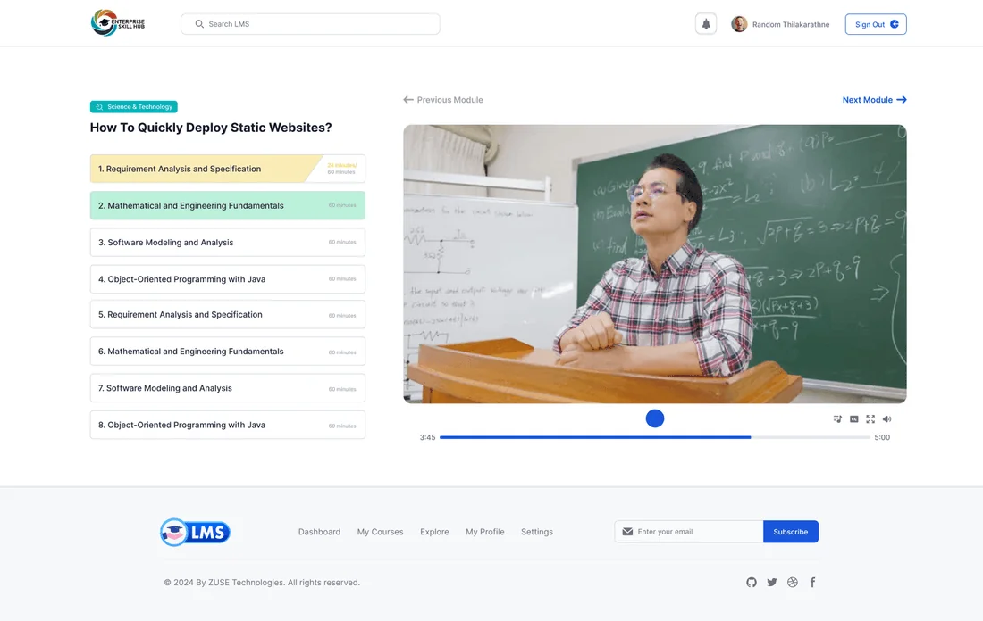
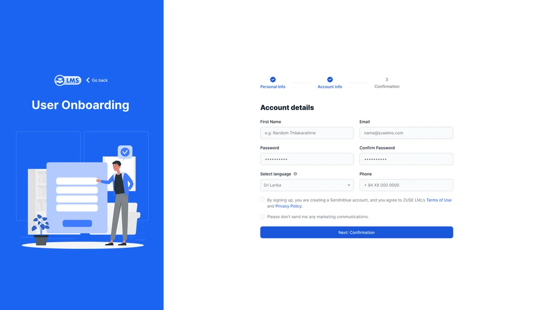
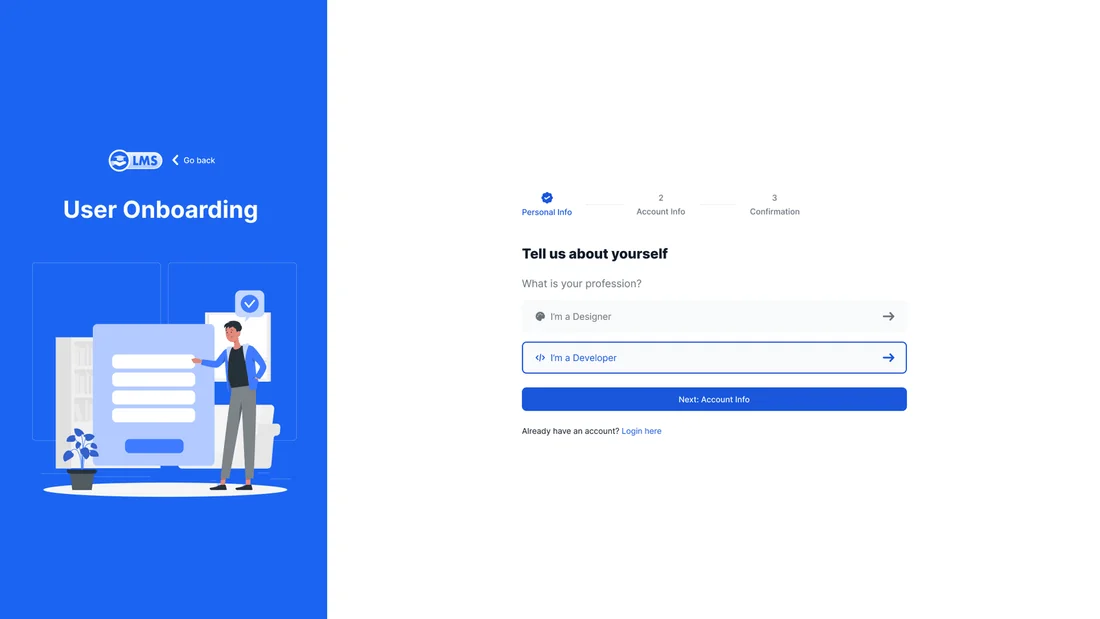
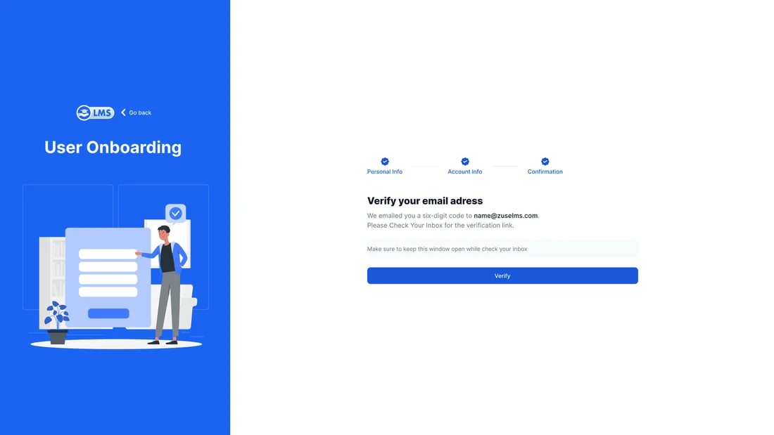
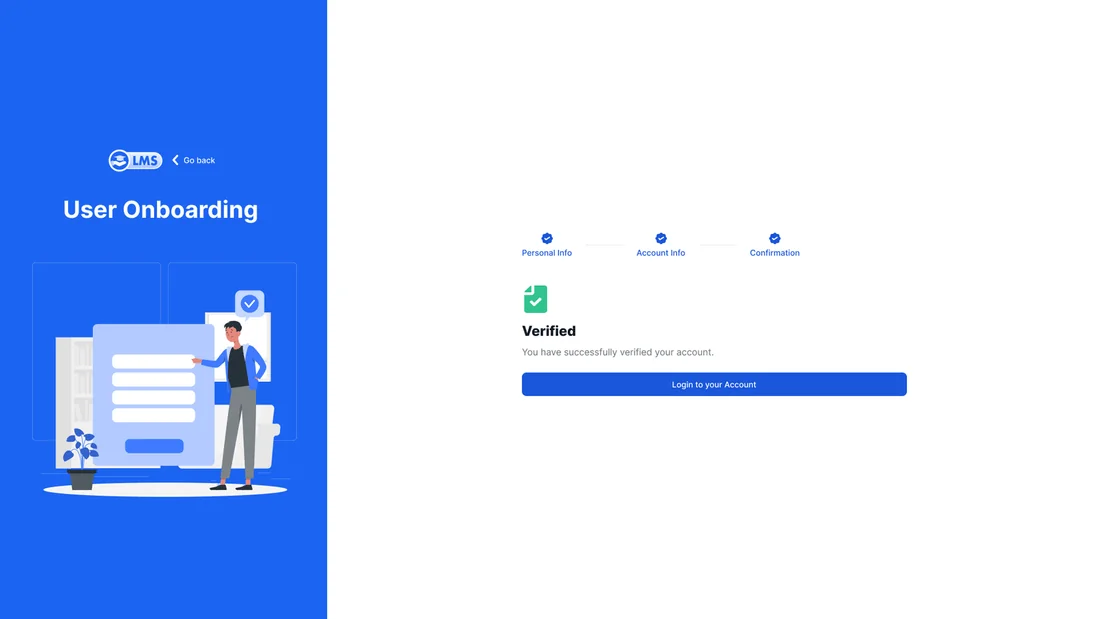
10 high-fidelity screens from the final design. Tap any of them to see it full size.
06Interaction Details
Resume where you left off
The dashboard opens with the course you’re in the middle of, so you can start a session on your commute with one tap.
Card-based library
Courses are shown as cards with your progress built in, and the full syllabus details sit one level down, only appearing when you want them.
Four-step onboarding
Account, personal details, verification and confirmation, each on its own simple, easy-to-follow screen.
07Outcome & Reflection
Professional doesn’t have to mean boring. Treating learners like premium customers boosted engagement across every age group.
Outcome
A complete LMS redesign covering login, the dashboard, the course catalogue, course overviews, the learning player, profiles and a four-step onboarding.
Hardest Part
Cutting down an old navigation with 15 links without hiding anything that managers and admins rely on.
What I Learned
Onboarding is the most important moment. Breaking it into four easy steps took away the anxiety people felt with older corporate systems.
Next Steps
Starting with a design system from day one next time. The card components already made it easy to grow the library in an organised way.