

DTM Hall Management System
Turning paper-based venue booking into a clean, visual experience that only takes a few taps.
- Role
- Team
- DreamTeam
- Type
- Tools
- Research
- Admin & booker studies
- Platform
- Responsive web
01The Brief
Booking a school hall shouldn’t involve phone calls, paper forms and dates that end up double-booked. DreamTeam noticed that schools and institutions in Sri Lanka’s education sector were still managing hall bookings by hand.
DTM HMS replaces all of that with one platform for Lyceum’s premises, where availability, pricing and layouts are clear, visual and can be booked in just a few taps.
Problem
Because the process was on paper and spread across different places, it was hard to see what was free, compare venues or trust the price.
Goal
Make booking simpler, build trust in the institution, work for very different kinds of users and set up a visual design system that can grow.
Audience
Administrative staff who need to see availability in real time and make bulk bookings, and occasional users who just want to reserve a hall.
91% of users preferred a visual calendar to lists of text, and 62% had given up on a booking because the pricing wasn’t clear.
02Research & Insights
The research split neatly into two groups: the administrators who handle bookings every day and the people who book a hall now and then. Both groups kept running into the same problems.
- 78% struggled to compare venue features
- 62% abandoned bookings over unclear pricing
- 91% preferred visual calendars over text lists
- Side-by-side venue comparison
- Transparent, upfront pricing
- A colour-coded calendar as the centrepiece
The Administrator
“I need to see what’s free at a glance and never double-book a hall.”
The Occasional Booker
“I book a hall once in a while - it has to be obvious, with no surprise costs.”
The Event Coordinator
“The calendar view saves me hours each week.”
03Structure & Flows
There are four flows: Discovery, Venue Exploration, Booking Management and Support. Complex options are only shown when they’re needed.
Discovery
Home · about · orientation
Venue Exploration
Halls · layouts · comparison
Booking Management
Calendar · availability · confirm
Support
Contact · help · enquiries
04Visual Design System
A mostly white background with one bold green accent, calm enough for an institution but sharp enough to feel modern. It uses card layouts and type that adapts to everything from 320px phones to admin screens wider than 1440px.
Colour palette
Tap a colour to try itDesigned around one palette
Every screen is built from these colour and type tokens.
Typography
Type your own textCrisp and modern, with subtle early-screen character - adaptive from phone to admin dashboard
05Key Screens
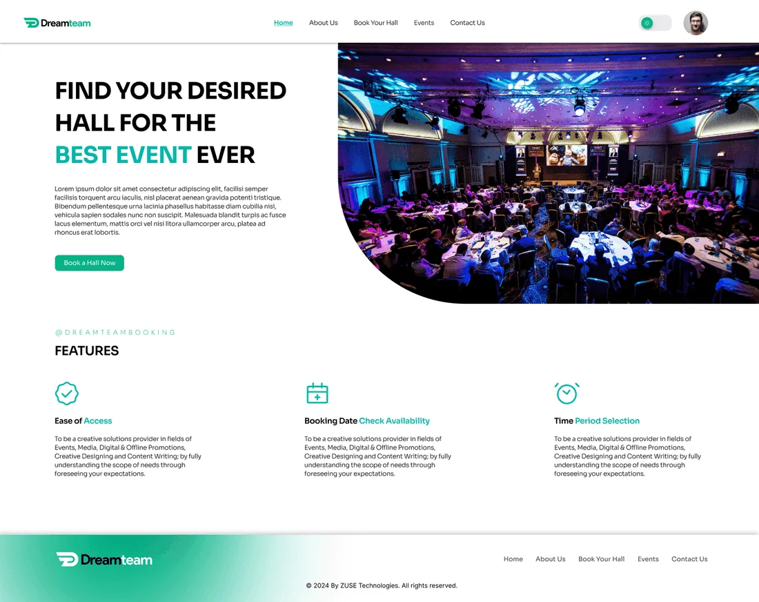
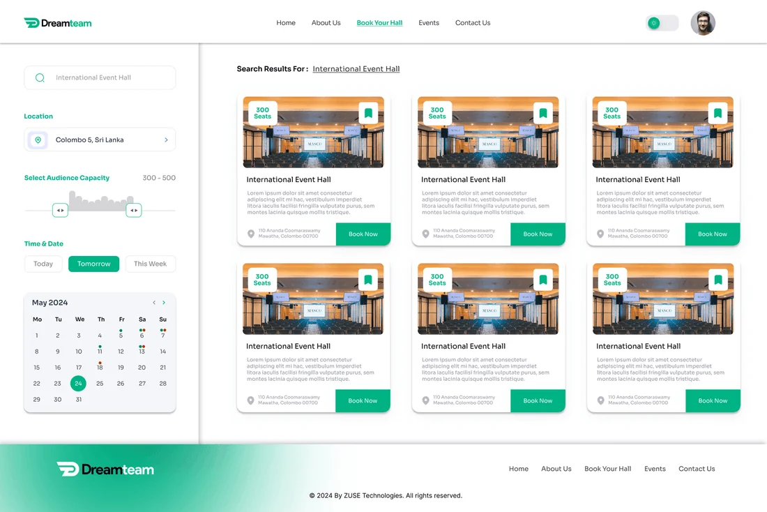
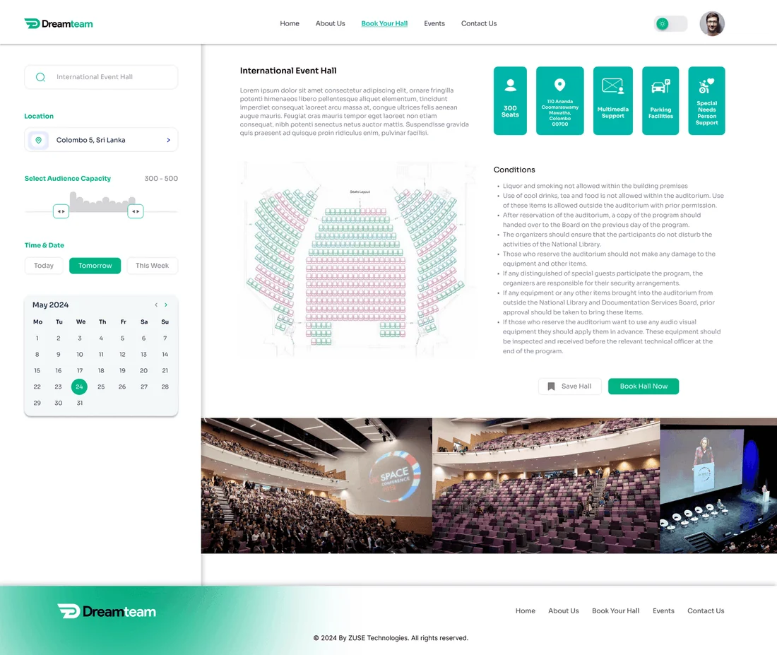
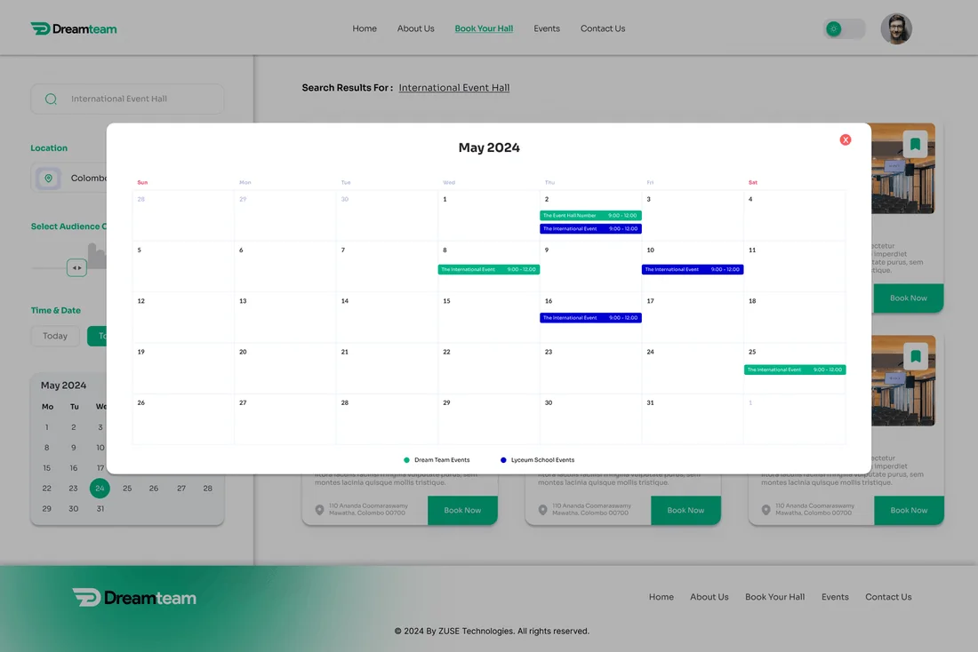
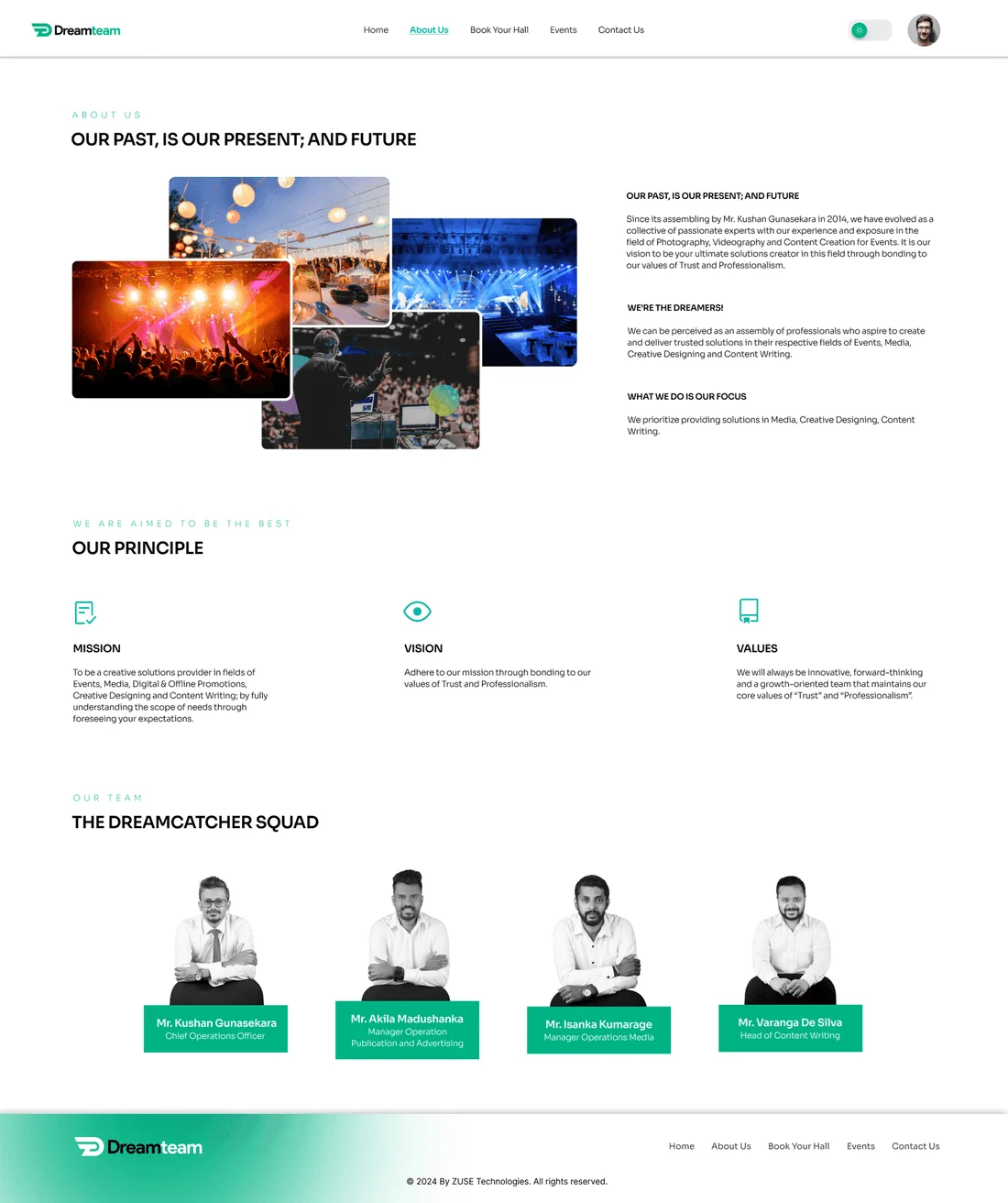
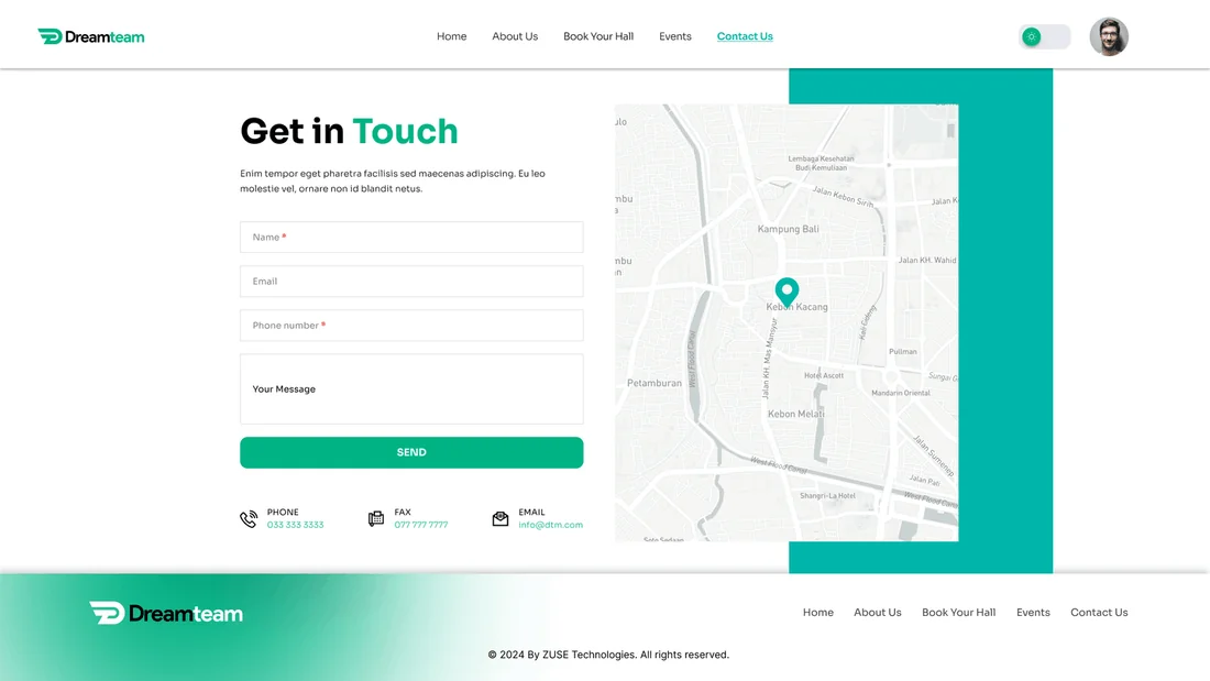
6 high-fidelity screens from the final design. Tap any of them to see it full size.
06Interaction Details
Dynamic calendar
Colour-coded availability shows which dates are free or booked at a glance, and it’s the heart of the whole product.
Comparative view
Comparing venues and their features side by side replaces scrolling through lists of text.
Progressive disclosure
More complex options stay out of the way until they’re needed, which keeps the interface calm while still supporting experienced users.
07Outcome & Reflection
"Finally feels like we’ve entered the digital age." - School administrator
Outcome
Booking errors dropped by 63%, 88% of people completed the most important tasks successfully on their first try, and the average session grew to 4.2 minutes.
Hardest Part
Fitting lots of detail into a clean interface. I solved it by putting the most important content first, showing secondary details only when asked, and using icons for amenities instead of text.
What I Learned
Good UX can completely change how an institution works. The calendar on its own took away most of the admin workload.
Next Steps
Connecting to the ERP system, suggesting available slots with AI and adding support for more languages so more institutions can use it.