

Messaging Platform
A dashboard that takes a complicated multi-channel messaging system and turns it into one calm, easy-to-use control centre.
- Role
- Type
- Tools
- Figma
- Screens
- 40+ high-fidelity
- Security
- Platform
- Responsive web
01The Brief
Sending a message is easy, but running the system behind it isn’t. Services, channels, message parameters, API keys, delivery logs and billing all need a home somewhere.
This platform brings all of that together in one dashboard, where developers and teams can set things up, send messages and keep an eye on everything with confidence.
Problem
Setting up services, building parameters, managing keys and reading logs were spread all over the place and felt intimidating, so routine setup turned into a constant stream of support requests.
Goal
Build one clear dashboard with guided service setup, an easy-to-understand parameter builder, secure tokens, and logs and billing that are easy to read.
Audience
Developers connecting through the API, team admins managing services and access, and business owners keeping track of usage and spending.
The hardest part of a messaging platform isn’t sending the message. It’s making the system behind it feel simple.
02Research & Insights
Three very different kinds of user share the product. Developers live in tokens and logs, admins look after services and access, and owners keep an eye on spending. The design separates the powerful features from the simple ones without splitting the product in two.
- Dense, developer-only UIs that intimidate teams
- Multi-step setup with no guidance or feedback
- Security and billing treated as afterthoughts
- Guided onboarding and service-creation wizards
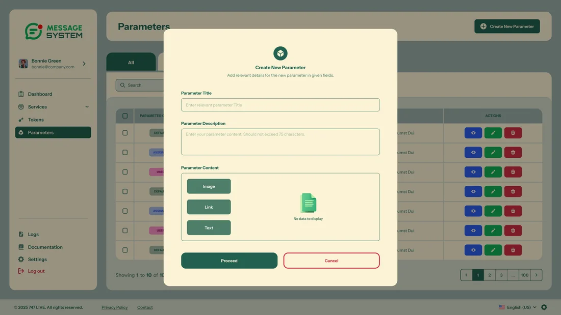
- A visual parameter builder for text, image and link
- First-class 2FA and transparent billing
The Developer
“Give me clean tokens, clear docs and readable logs - I’ll handle the rest.”
The Team Admin
“I set up services and channels, and access and security have to be airtight.”
The Business Owner
“I just want to see what we’re sending and what it’s costing - clearly.”
One developer hub
Tokens, logs and documentation are all in one place, instead of being spread across different tools.
Wizards for setup
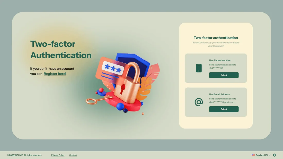
Services are created step by step with two-factor authentication, which helps admins who previously had no guidance at all.
Billing at a glance
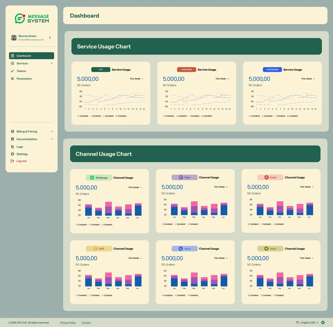
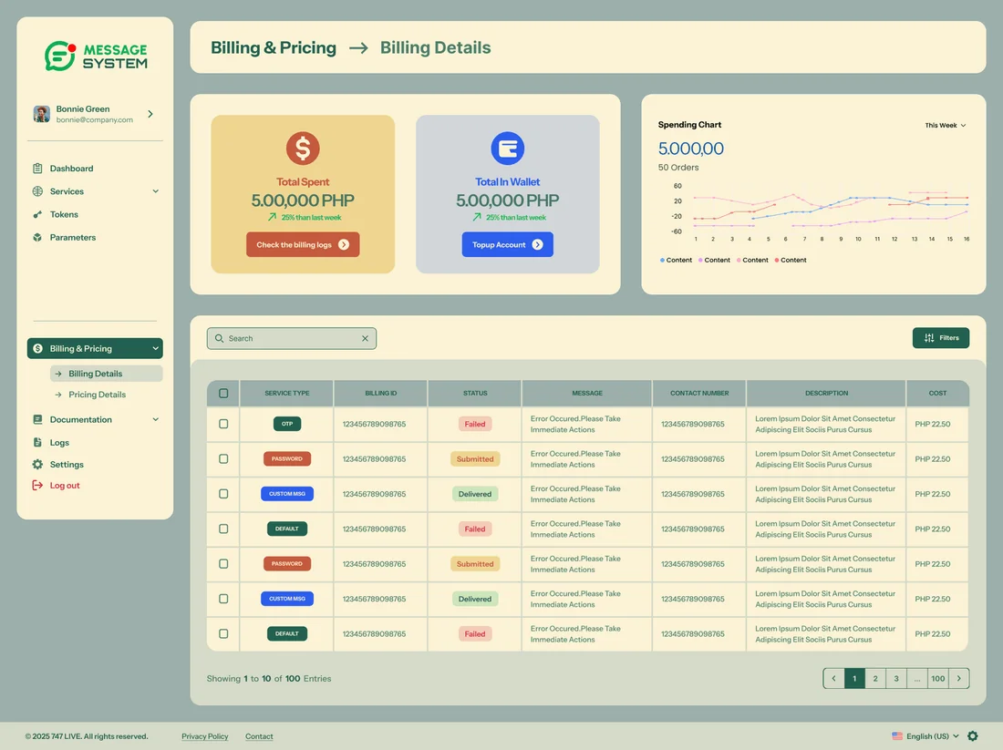
Billing and pricing are clear, and usage is easy to see instead of being tucked away.
03Structure & Flows
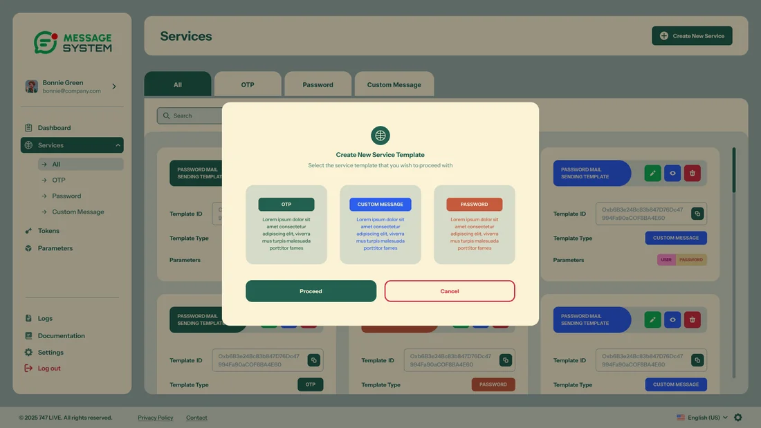
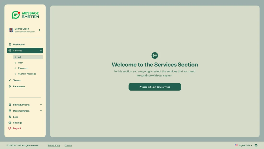
Setting up a service and building parameters are both guided wizards that finish with a clear success screen. Complicated setup feels like working through a checklist rather than finding your way through a maze.
Services
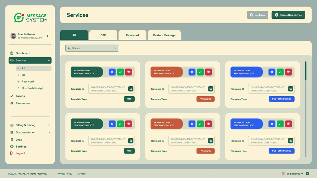
All · new · channels · OTP
Parameters
Text · image · link
Tokens & Logs
API keys · delivery logs
Billing & Docs
Pricing · billing · documentation
04Visual Design System
Instrument Sans paired with a wide but carefully controlled palette. Calm sage neutrals and deep green give the structure, while warm, bold accent colours are kept for labelling channels, statuses and states.
Colour palette
Tap a colour to try itDesigned around one palette
Every screen is built from these colour and type tokens.
Typography
Type your own textA contemporary grotesque with an even rhythm - keeps dense, data-heavy tables readable
05Key Screens
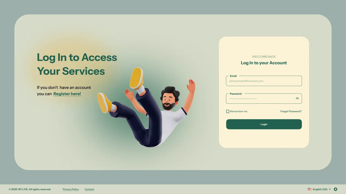
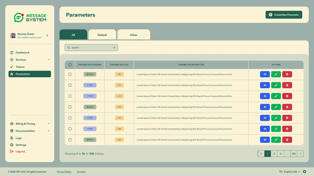
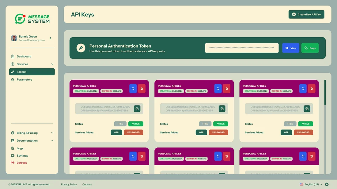
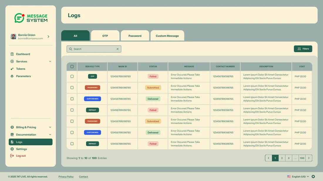
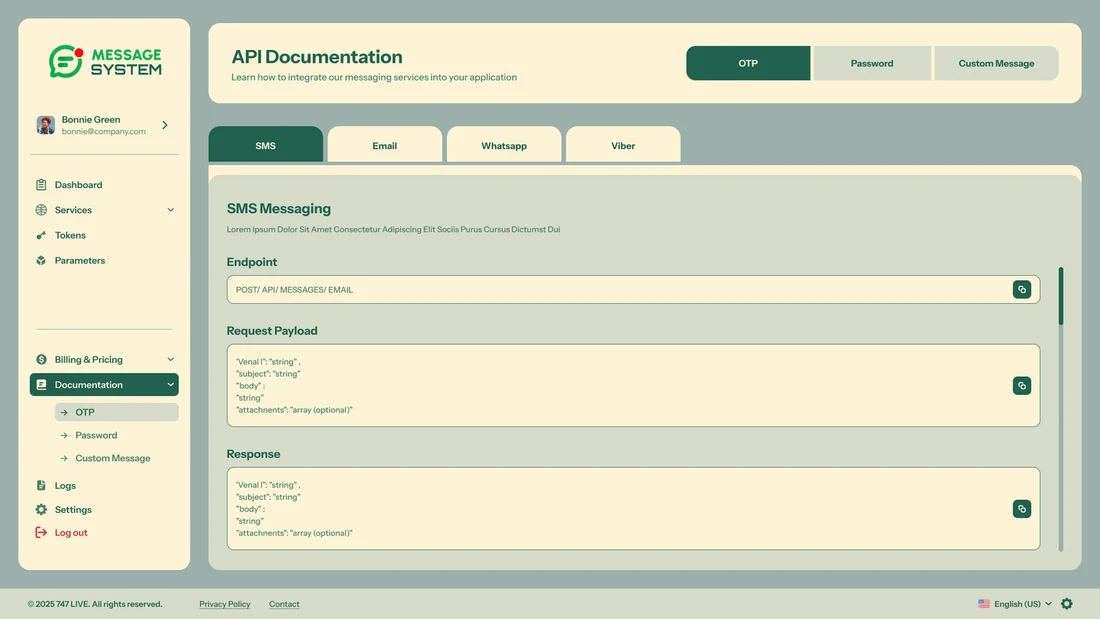
12 high-fidelity screens from the final design. Tap any of them to see it full size.
06Interaction Details
Guided wizards
Setting up a service and creating parameters are broken into steps, and each one finishes with a clear success screen.
Visual parameter builder
You add text, image and link parameters and preview them visually, which turns a fiddly setup task into something you can actually see.
Security by default
Two-factor authentication, tokens with limited access and clear confirmation steps before disabling anything make sensitive actions feel deliberate and safe.
07Outcome & Reflection
Outcome
A consistent SaaS design system covering login, services, parameters, tokens, logs, documentation, billing and settings.
Hardest Part
Meeting the needs of developers, admins and owners in one product without overwhelming any of them, across dozens of multi-step flows.
What I Learned
In complicated tools, the biggest wins come from the wizards and from the empty, success and error states. A wide colour palette only works if it follows strict rules.
Next Steps
Handing over to engineering, adding more detailed analytics to the dashboard, and building team roles and permissions on top of the two-factor authentication.