
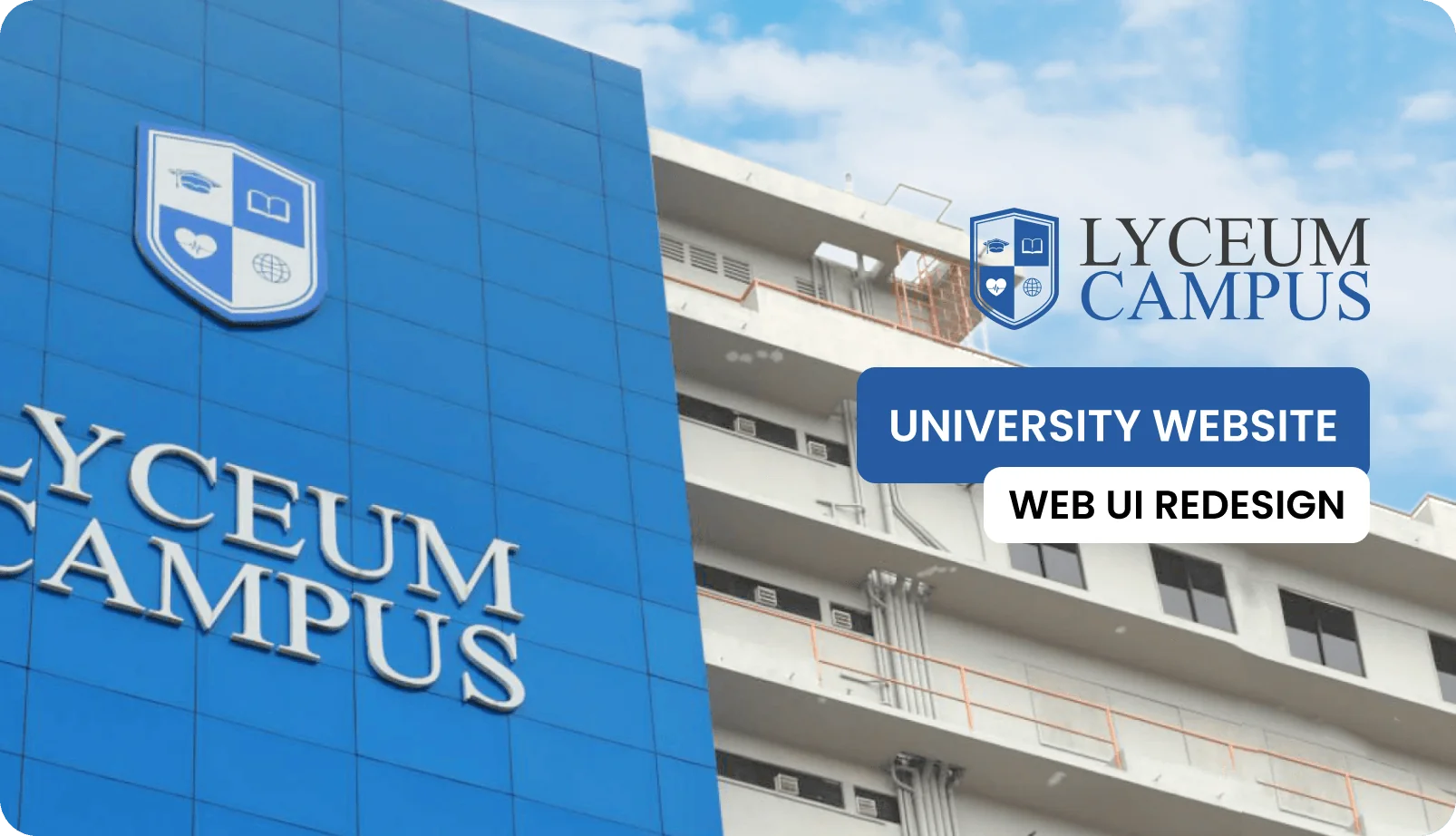
Lyceum Campus
A redesign of a university’s website, which is its digital front door. Getting to what you need used to take seven clicks, and now it takes three.
- Role
- Timeline
- Type
- University website redesign
- Tools
- Research
- Platform
- Responsive web
01The Brief
A university’s website is often the first impression a future student gets. Lyceum Campus’s site wasn’t making a good one. Course information was buried under layers of menus, the layout broke on phones, and the whole look was years out of date.
For the redesign, I stripped everything back to one question: what does a student actually need to find, and how quickly can they find it?
Problem
Messy navigation, cluttered layouts and an unclear page structure meant students, parents and staff couldn’t find important academic information.
Goal
Make the site much easier to get around, make it accessible for people of all ages and strengthen the brand, with the aim of cutting the time it takes to find information by 60%.
Audience
Current students (18-26), future applicants and their parents (16-50), and teaching and admin staff, all of whom have very different levels of comfort with technology.
Students were spending 4 to 7 minutes finding basic course information, which should take less than 30 seconds.
02Research & Insights
Before designing anything, I compared the site against five local and international university websites, chatted informally with current students and watched people use the site. That brought up patterns I never would have found by guessing.
- Dense, table-heavy layouts that overwhelm first visits
- No hierarchy between primary and secondary content
- Mobile pages that are desktop pages shrunk to fit
- Card layouts with a clear CTA hierarchy
- Progressive disclosure - essentials first, detail on demand
- "Quick access" zones for the most-searched content
Kavya Perera, 18
“I just want to know what courses you have, how much they cost, and when intake starts.”
Mr. Silva, 48
“Is this a recognised degree? I need the full curriculum and the faculty credentials.”
Dr. Fernando, 55
“I use the site purely to jump into the LMS or find calendar updates.”
Thumb-friendly search
Students needed five or more taps just to find the fees. A quick search bar and large buttons fix that.
Readable trust
Parents found the text too small and couldn’t see the things that build trust, so I used a clear type structure, high contrast and full syllabus tables.
Staff quick links
Links for staff were hidden in the footer, so now a sticky bar at the top takes them straight to the LMS and webmail.
03Structure & Flows
On the old site, it took 5 to 7 clicks to reach the admissions contact. The new flow takes 3, and an "Apply Now" button is always visible at every step.
About
History · mission · leadership · campus
Academics
Programmes · courses · faculties · calendar
Admissions
Apply · fees · requirements · deadlines
Campus Life
Events · clubs · facilities · gallery
04Visual Design System
I built a new identity from scratch that balances academic tradition with modern accessibility. It uses an institutional blue on light, airy pale-blue backgrounds, with black text for the strongest possible contrast.
Colour palette
Tap a colour to try itDesigned around one palette
Every screen is built from these colour and type tokens.
Typography
Type your own textOne family for headings and body - clear hierarchy, readable for every age group
05Key Screens
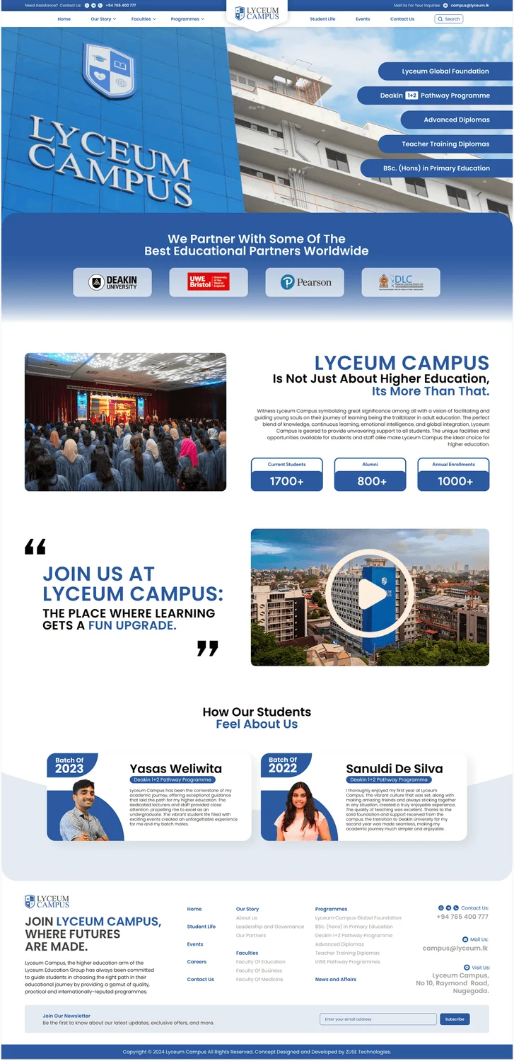
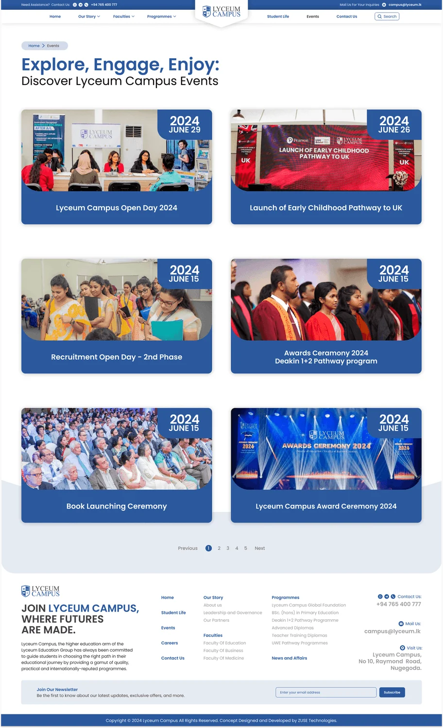
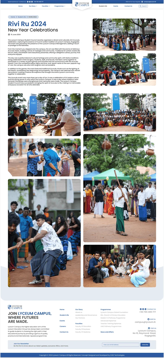
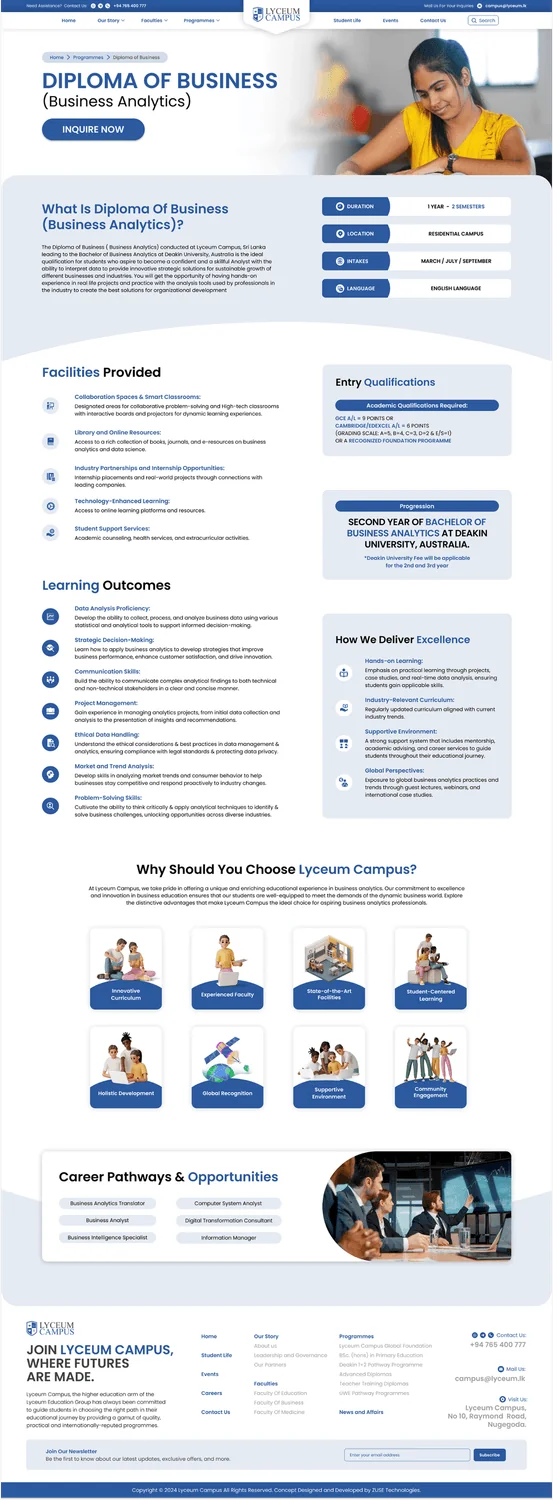
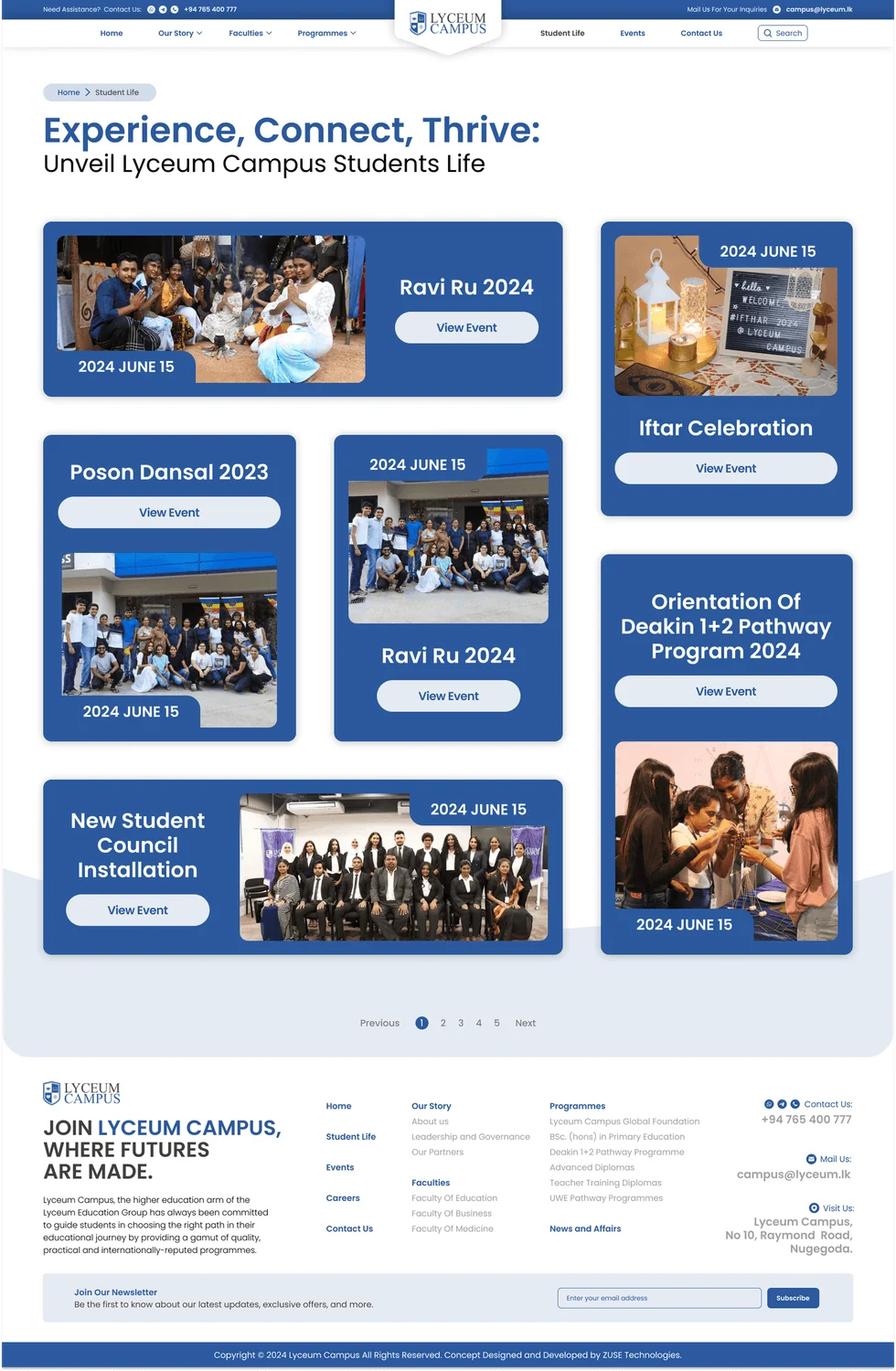
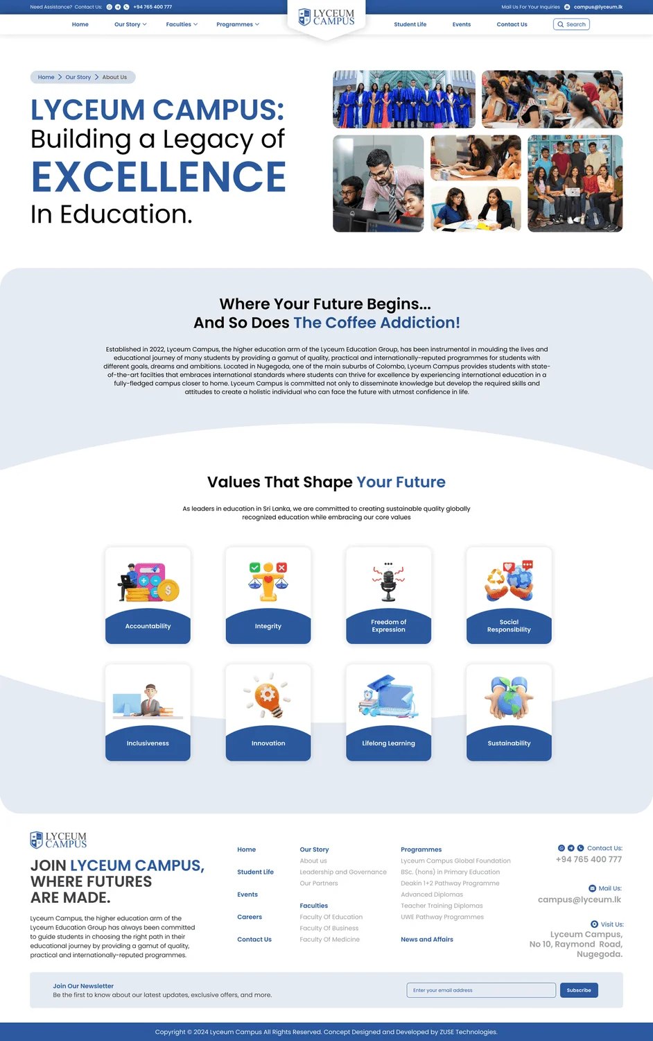
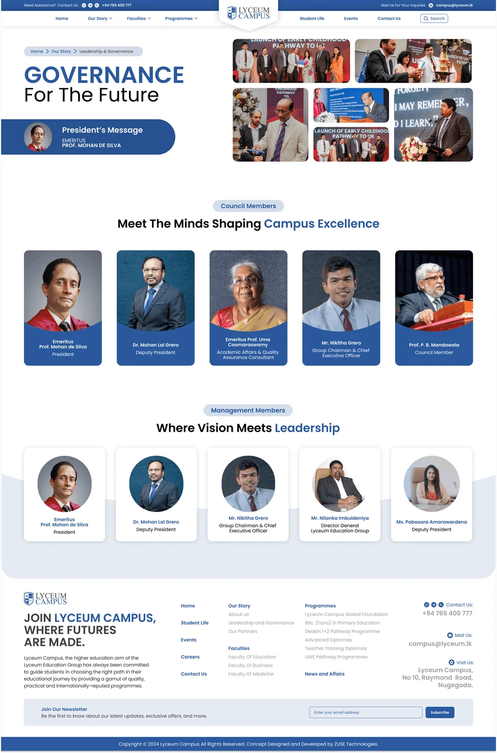
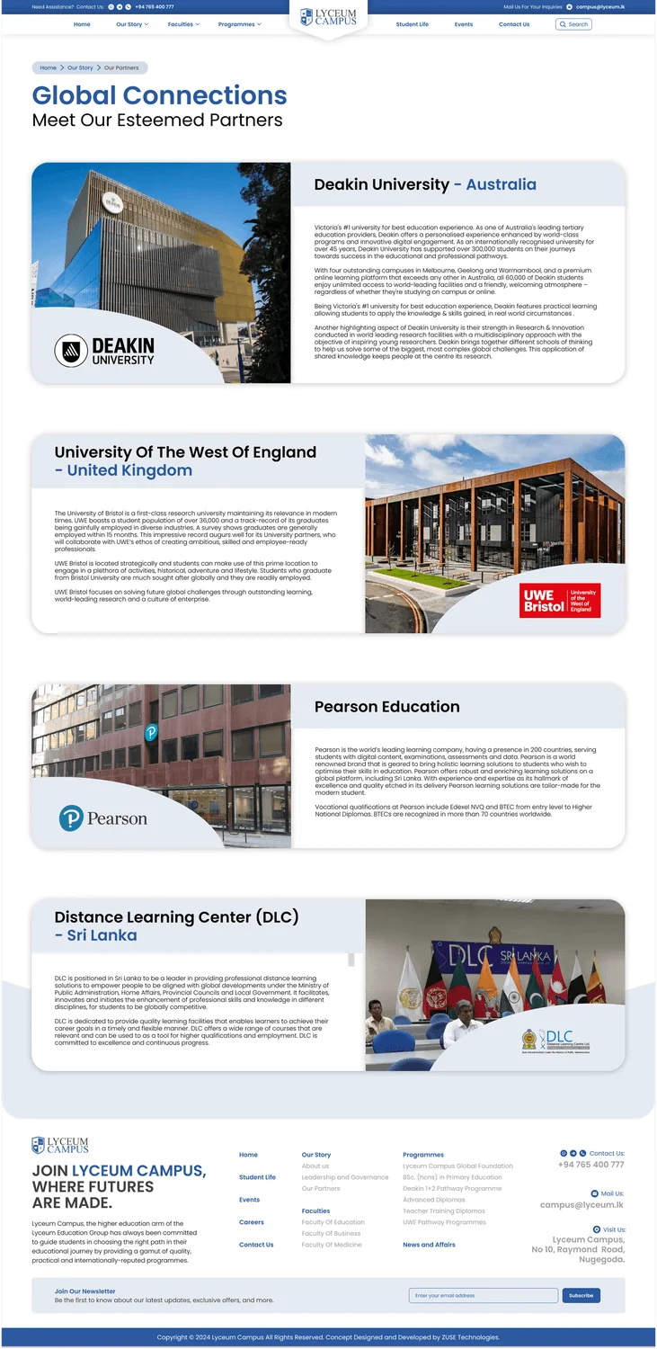
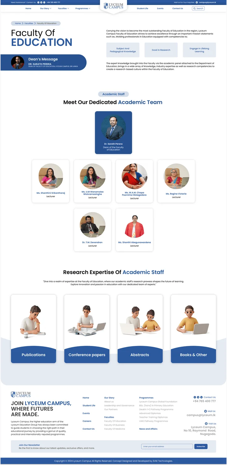
9 high-fidelity screens from the final design. Tap any of them to see it full size.
06Interaction Details
Button feel
The main buttons have a springy bounce when you hover over them. It’s a subtle press effect that shows they’re clickable without being distracting.
Page transitions
Content fades up into place one piece after another, a bit like a building revealing itself as you walk through it.
Colour psychology
Navy and blue suggest trust and authority, and cyan highlights add some energy. Together they avoid the sterile white and grey you see on most institutional websites.
07Outcome & Reflection
People in the testing sessions described it as "clean", "professional" and "easy to use", and several of them said they wished their own university’s website worked this well.
Outcome
A complete responsive redesign covering the home page, programmes, faculties, events, campus life and the "Our Story" pages, all checked through usability testing.
Hardest Part
Serving three groups of people with very different levels of tech confidence through one navigation, without hiding anything any of them need.
What I Learned
Test with real users, not just other designers. Even the difference between "Programmes" and "Courses" confused people, and changing one word made things noticeably easier to find.
Next Steps
Running A/B tests on card and list layouts for courses, using design tokens right from the start, and looking into personalised programme suggestions.