
Lottogram
A betting and lottery platform where I took a lot of dense data and made it bold, clear and trustworthy on every screen.
- Role
- Type
- Tools
- Screens
- 30+ high-fidelity
- Type scale
- Lexend, 12-36pt
- Views
- Desktop & mobile
01The Brief
A betting and lottery platform is one of the most crowded products you can design. Odds, bet slips, wallets, live events, loyalty schemes and promotions are all fighting for attention.
Lottogram brings all of that under control and turns it into a bold, confident experience that feels consistent and trustworthy, whether a player is at home on a desktop or placing a bet on their phone.
Problem
Odds, bet history, wallets and live events are hard to make easy to scan and trustworthy, and even harder to keep consistent between desktop and mobile.
Goal
Build a bold, consistent platform on a single design system that works on a wide desktop layout and scales down to a focused mobile one.
Audience
Casual players looking for promotions, and serious bettors who keep a close eye on odds, their history and their wallet, on whatever device they happen to be using.
In betting, the interface is where trust comes from. It has to feel just as confident on a phone in your hand as it does on a desktop at home.
02Research & Insights
Betting users are impatient but also want lots of detail, and they expect desktop and mobile to work in exactly the same way. That’s why I designed the two layouts side by side rather than one after the other.
- Cluttered screens that bury odds and the bet slip
- Desktop and mobile that feel like different products
- Wallets and history that are hard to trust at a glance
- A red-and-gold system that guides the eye to what matters
- One design language scaled across desktop and mobile
- Clear wallet, bet history and loyalty built for confidence
The Casual Player
“Show me what’s hot, let me grab a bonus, and make placing a bet feel effortless.”
The Serious Bettor
“I live in my bet history and wallet - I need detail, accuracy and fast switching.”
The Live Bettor
“When an event is live, every second counts - the odds and slip have to keep up.”
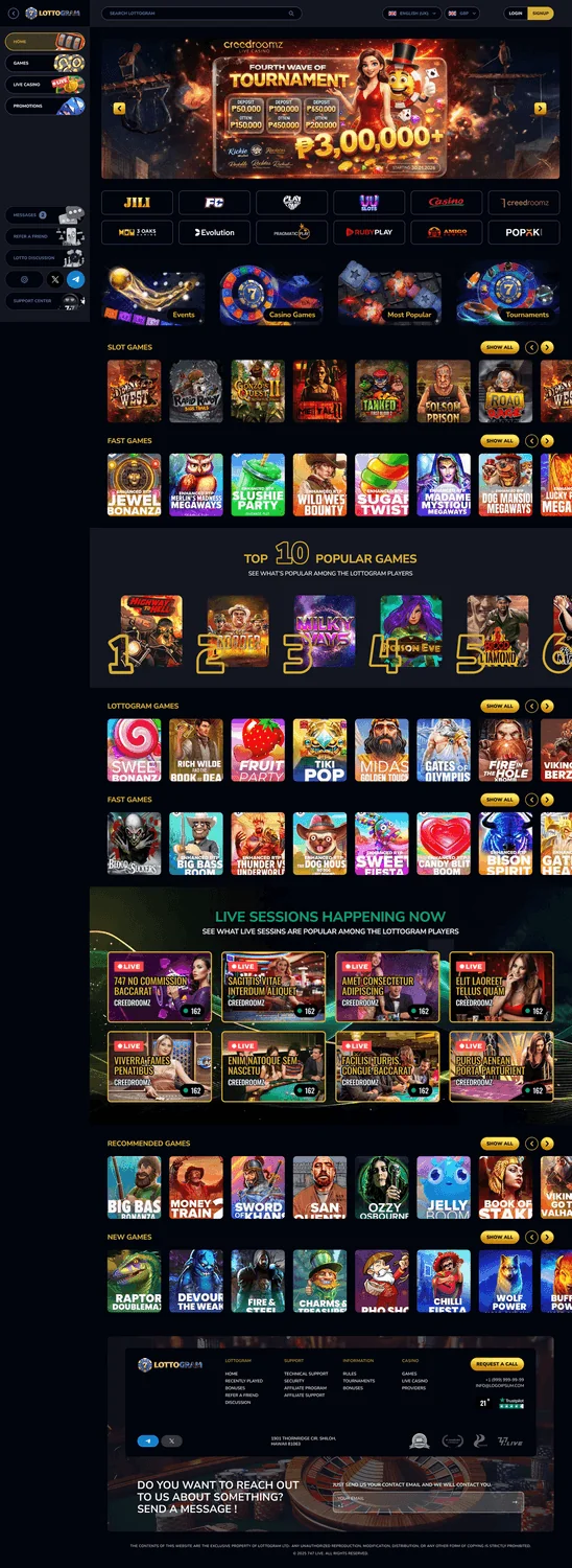
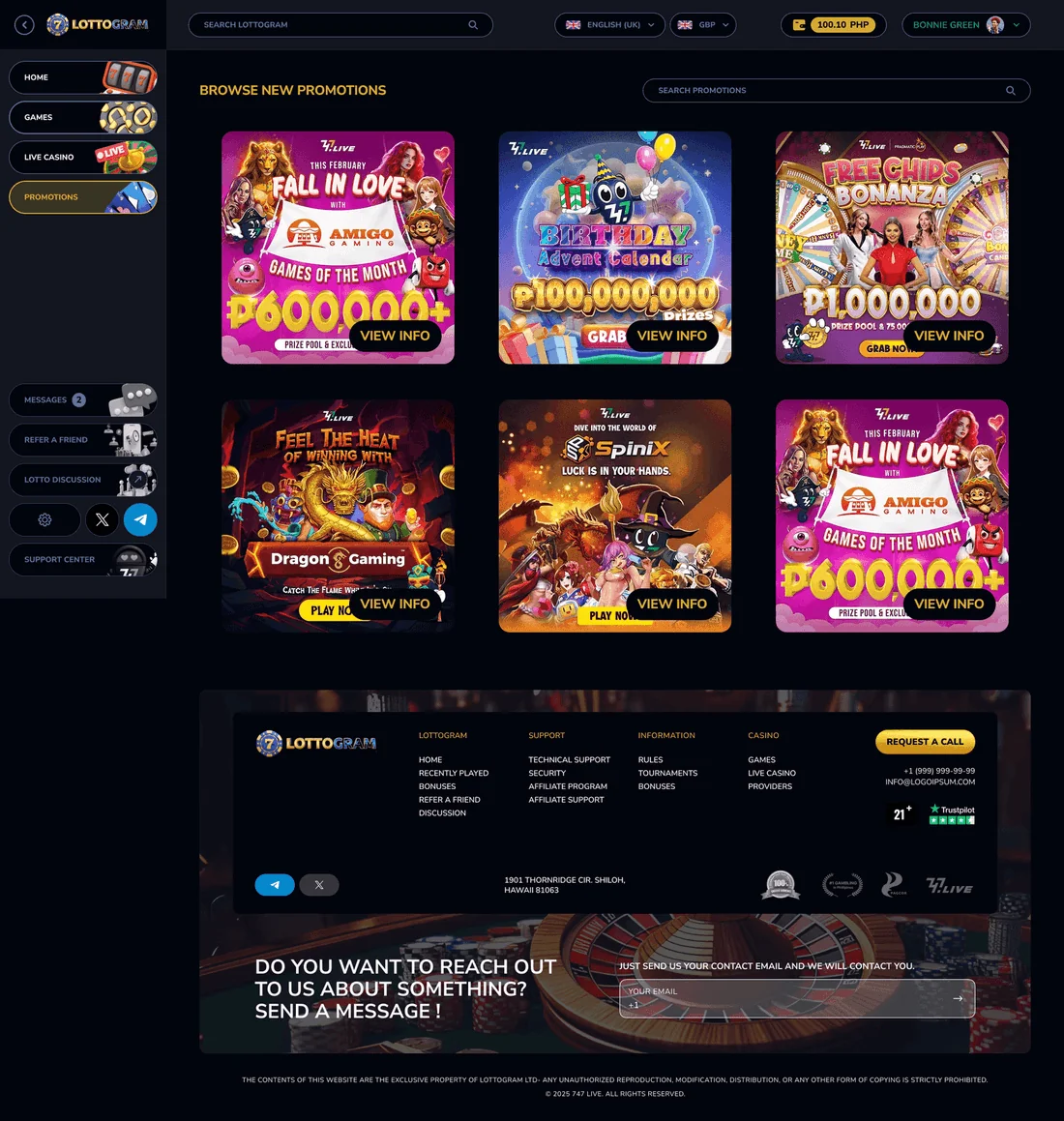
Promos front and centre
Casual players miss offers when there’s too much going on, so bold promotions and games come first.
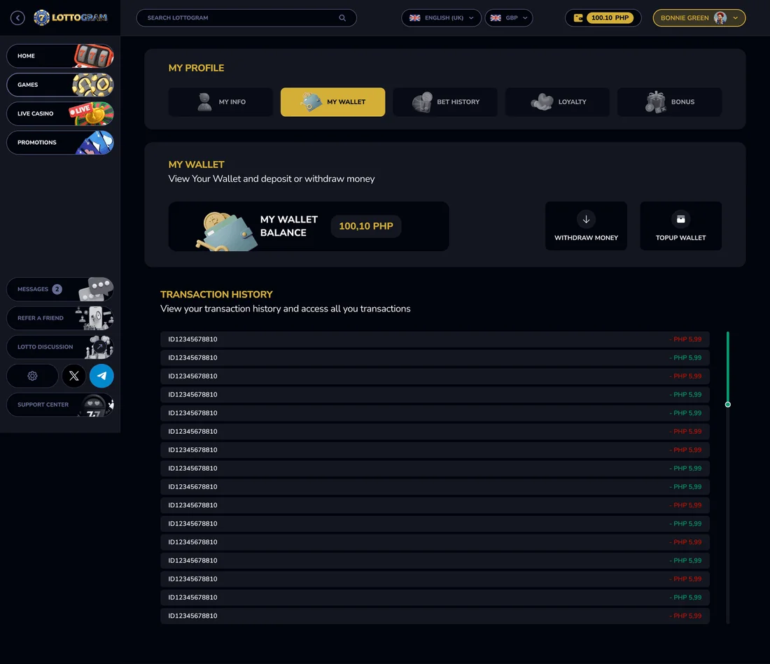
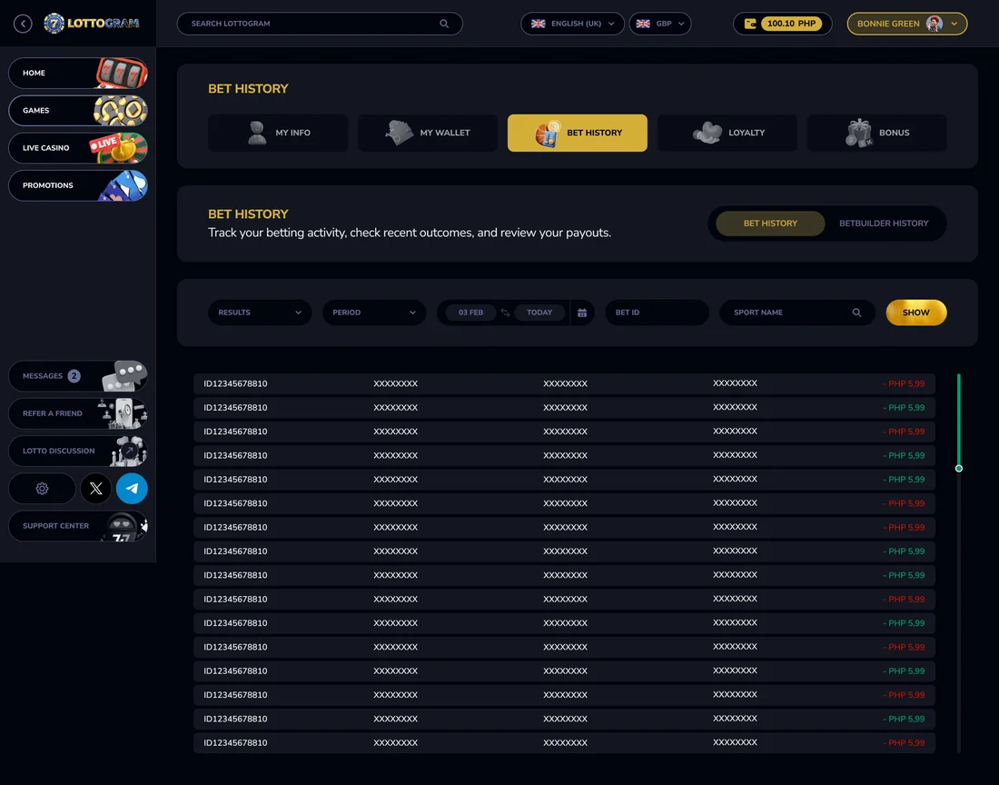
Structured money
A wallet where your bet and BetBuilder history are laid out so you can scan them quickly, instead of having to hunt for things.
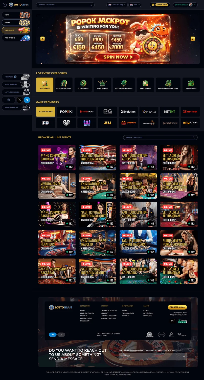
Live, on both devices
A live events layout that’s tuned separately for a wide desktop screen and for a phone.
03Structure & Flows
I designed the same structure twice, side by side: a wide desktop layout with a sidebar that folds away, and a focused mobile layout. Both are built from one shared set of components.
Play
Home · games · live events
Engage
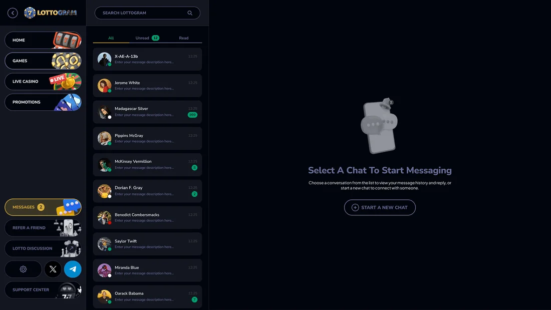
Promotions · affiliate · messages
My Wallet
Balance · loyalty · bonuses
History
Bet · BetBuilder · my info
04Visual Design System
A bold red base, lit up with gold for winnings and value, and grounded with deep navy and clean neutrals. Spacing follows a strict scale, with gaps from 4 to 80 and padding from 20 to 80, so even busy screens stay tidy on both devices.
Colour palette
Tap a colour to try itDesigned around one palette
Every screen is built from these colour and type tokens.
Typography
Type your own textBuilt for reading proficiency - keeps a data-heavy interface legible at 12-36pt
05Key Screens
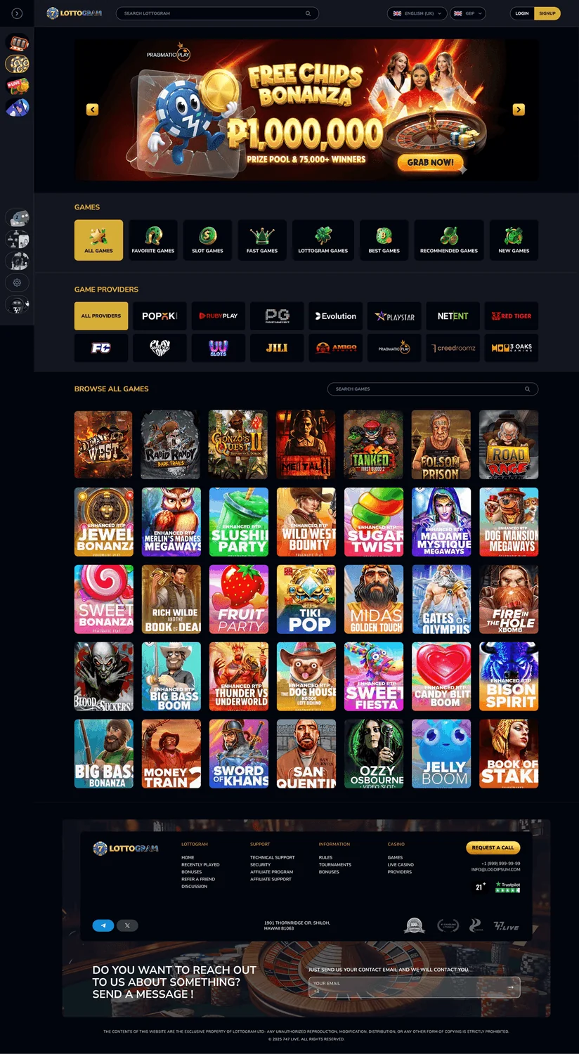
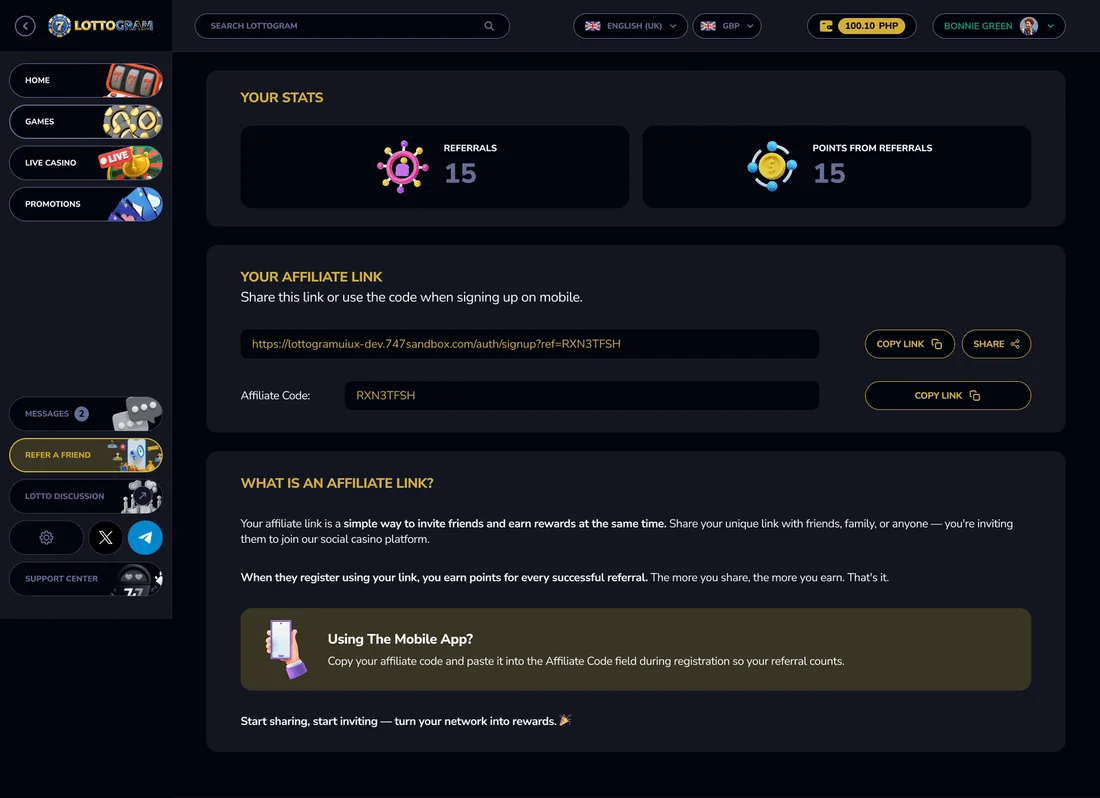
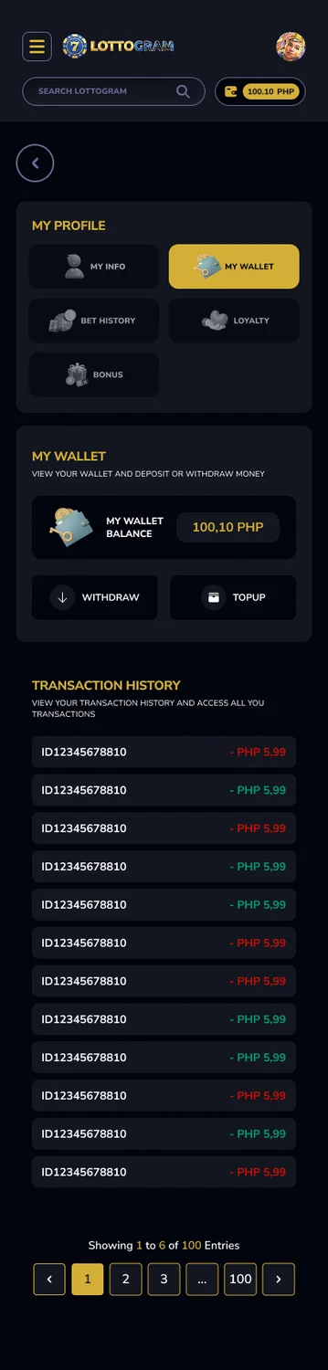
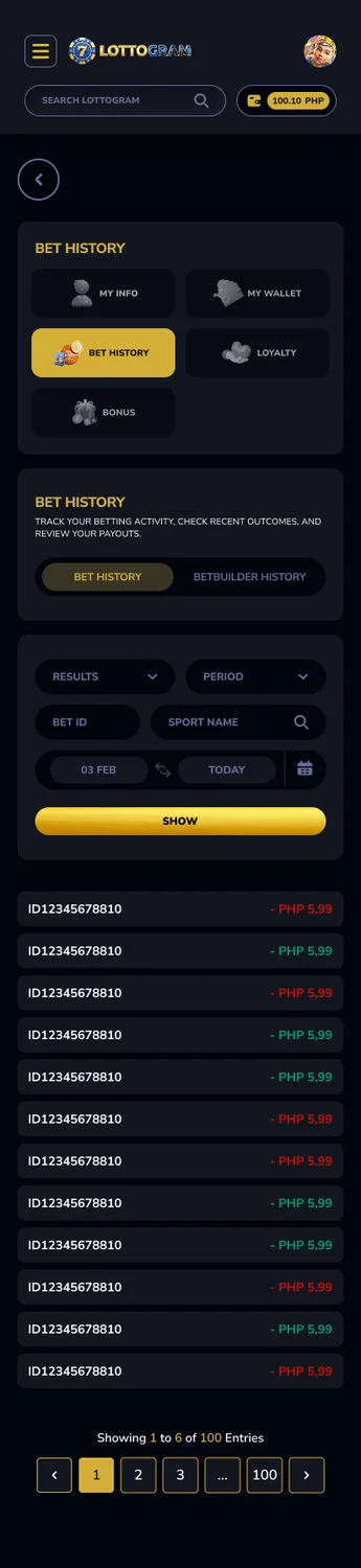
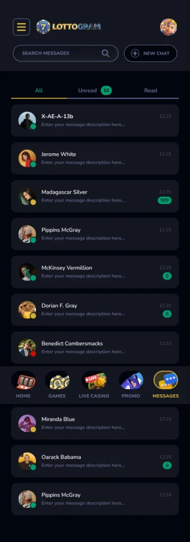
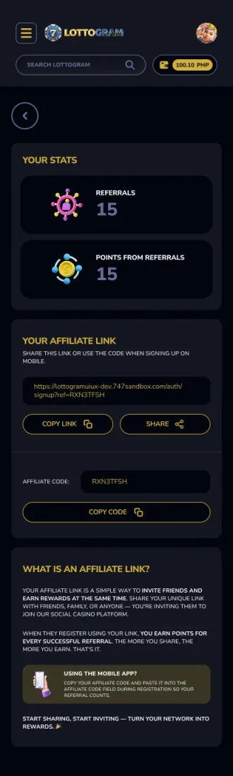
16 high-fidelity screens from the final design. Tap any of them to see it full size.




06Interaction Details
Foldable desktop sidebar
Experienced users can fold the navigation away to make more room for odds and history, or open it up when they’re browsing.
Wallet & loyalty
Your balance, bonuses, loyalty points and bet and BetBuilder history all live together in one wallet that’s built to feel trustworthy, and it works the same way on both devices.
Desktop ↔ mobile parity
Because both layouts share the same components, a bet you start on your desktop and finish on your phone never feels unfamiliar.
07Outcome & Reflection
Outcome
A complete iGaming design covering Home, Games, Live Events, Promotions, Wallet, Bet and BetBuilder history, Loyalty, Messages and Affiliate, for both desktop and mobile.
Hardest Part
Keeping a product packed with data bold but still trustworthy, and making sure two very different layouts stayed in step using one set of components.
What I Learned
Designing desktop and mobile at the same time keeps the design system honest, and a strict spacing and type scale is what holds the two together.
Next Steps
Handing over to engineering, prototyping the live in-play interactions, and adding a tablet layout and more types of games.