

KYC Verification
Identity verification redesigned as a calm, guided journey, in both light and dark themes.
- Role
- Type
- Tools
- Figma
- Flow
- Themes
- Light & dark
- Platform
- Responsive web
01The Brief
KYC is where good onboarding usually falls apart. There are long forms, blurry document uploads, nerve-racking face scans and no real idea whether any of it actually worked.
This flow turns verification into a guided journey that tells you exactly what to do and what’s happening at every step.
Problem
Verification matters a lot and asks a lot of people. Unclear steps, document and face capture that fail easily, and no feedback about what’s happening all make people anxious and cause them to give up.
Goal
Create a guided, transparent flow with preparation at the start, capture steps that forgive small mistakes, clear in-progress, success and error states, and full light and dark themes.
Audience
People going through verification for the first time, often on their phones, and the compliance teams who rely on clean, reliable captures.
Verification only works when people trust it. Every step has to tell them what to do, and be honest about whether it worked.
02Research & Insights
KYC sits between someone who just wants it over with and a compliance process that needs everything to be accurate. The design lowers people’s anxiety without lowering the quality of what gets captured.
- Every requirement dumped at once
- Silent capture - no progress, success or error feedback
- One rigid theme that fights the host app
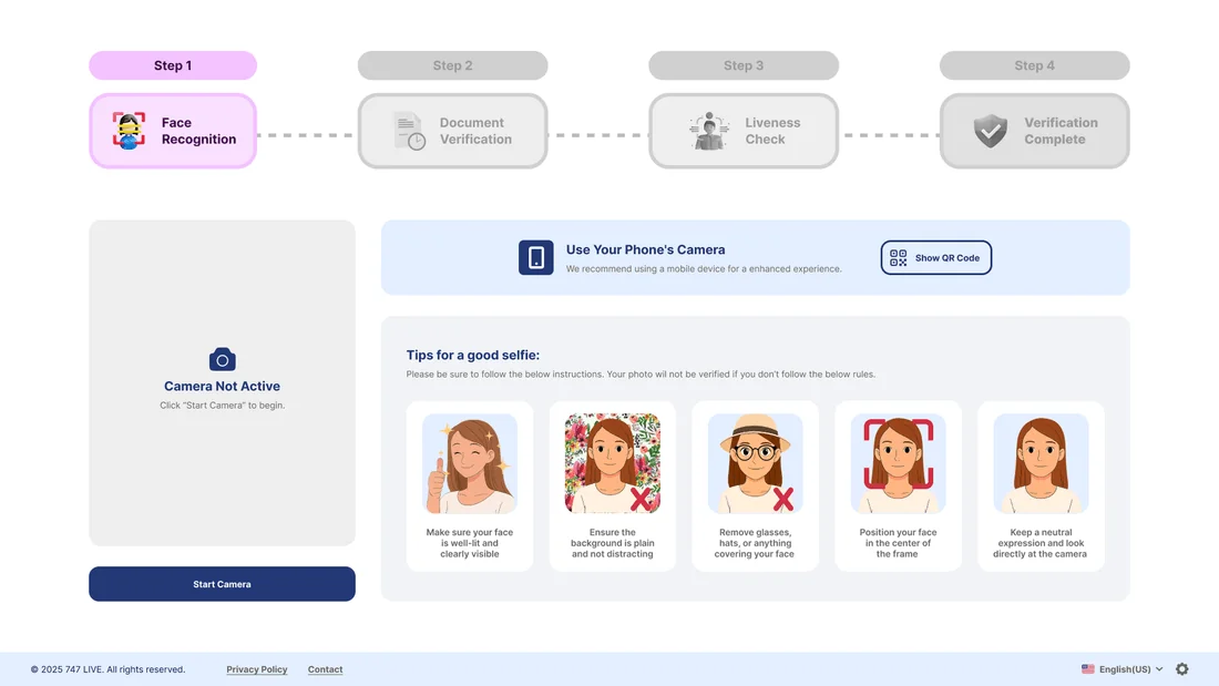
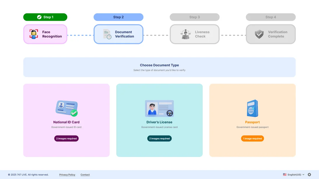
- A preparation screen before each step
- Live status for every upload and scan
- First-class light and dark themes
The New Applicant
“Just tell me what to do at each step - and whether it actually worked.”
The Mobile User
“I’m doing this on my phone - the uploads and face scan have to just work.”
The Compliance Lead
“We need clean captures and a clear pass / fail so verification holds up.”
03Structure & Flows
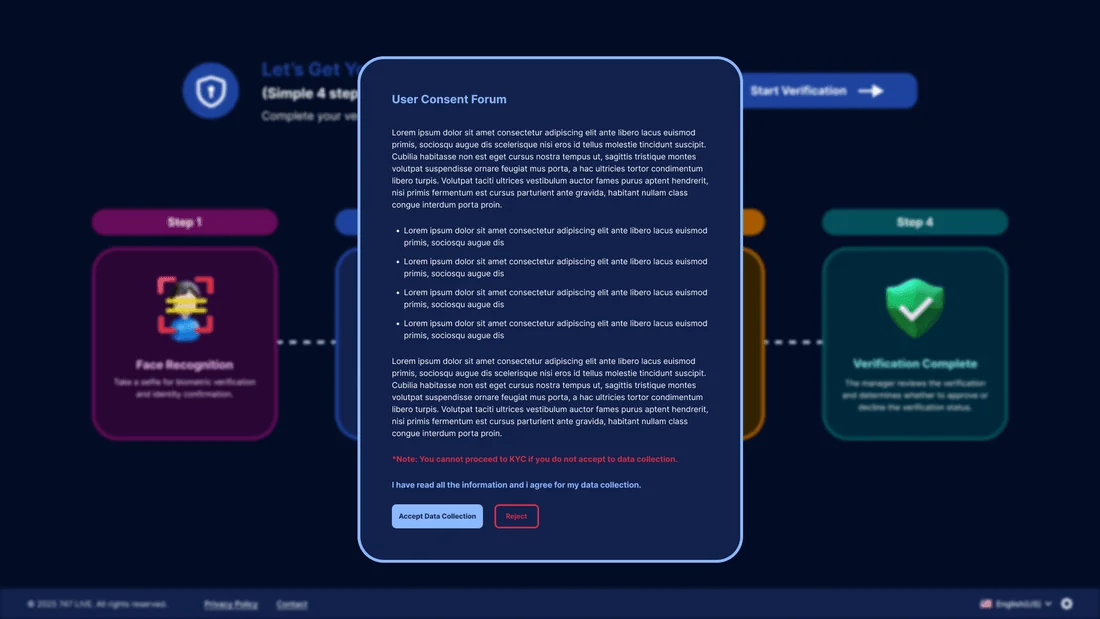
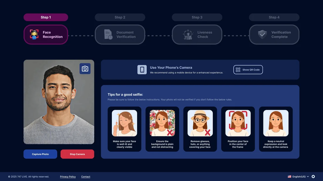
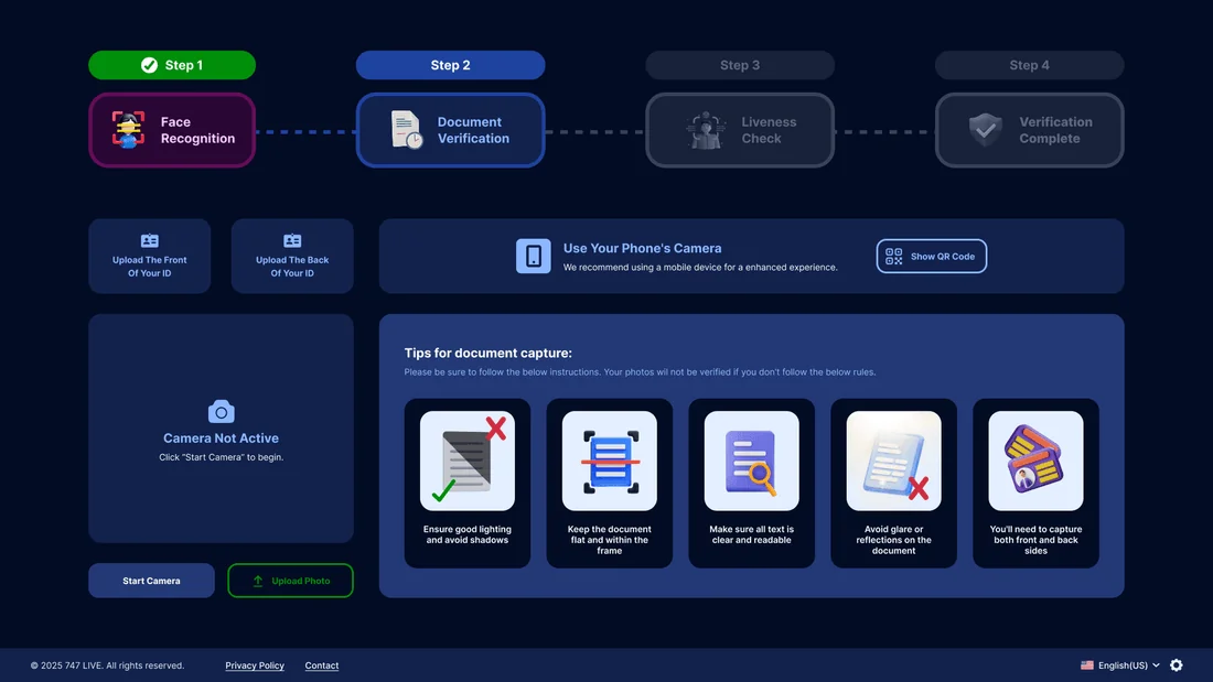
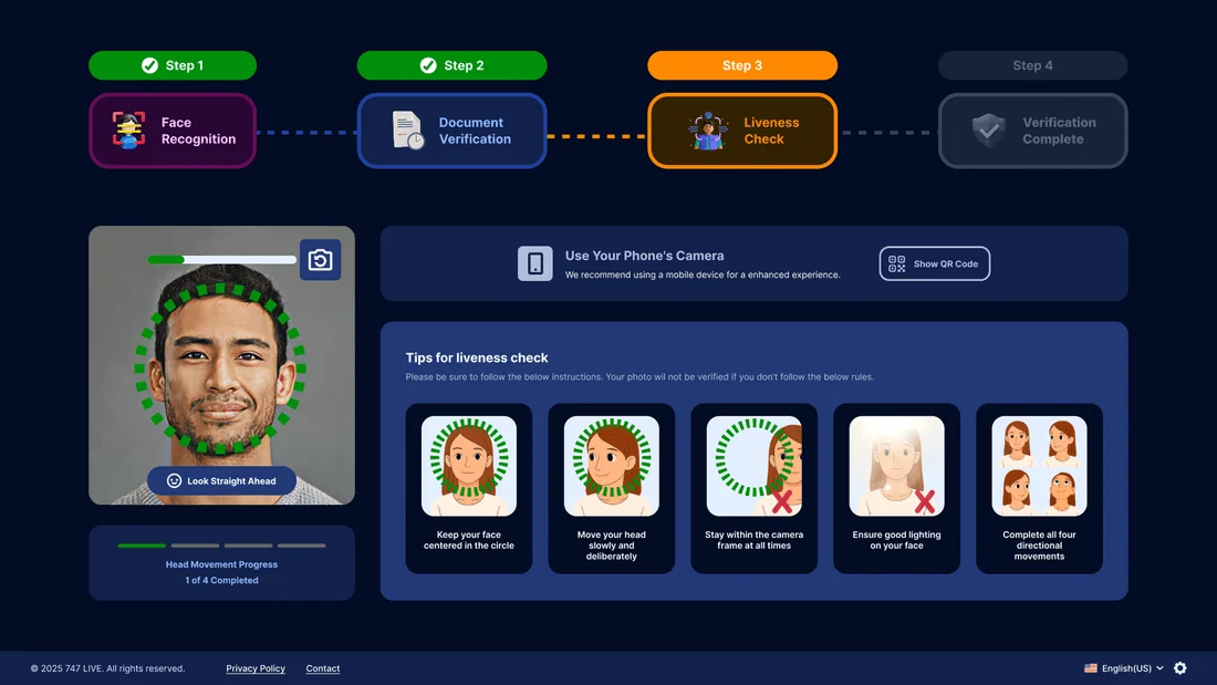
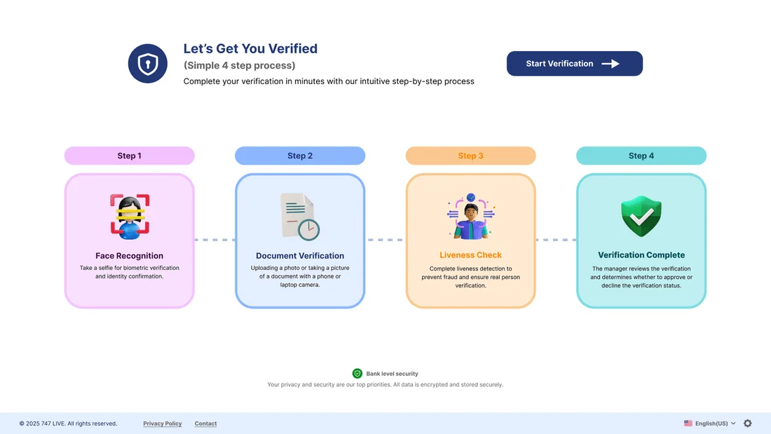
Every stage starts with a preparation screen that tells people what to expect, and ends with a clear result.
Step 1 · Consent
User consent · preparation · warnings
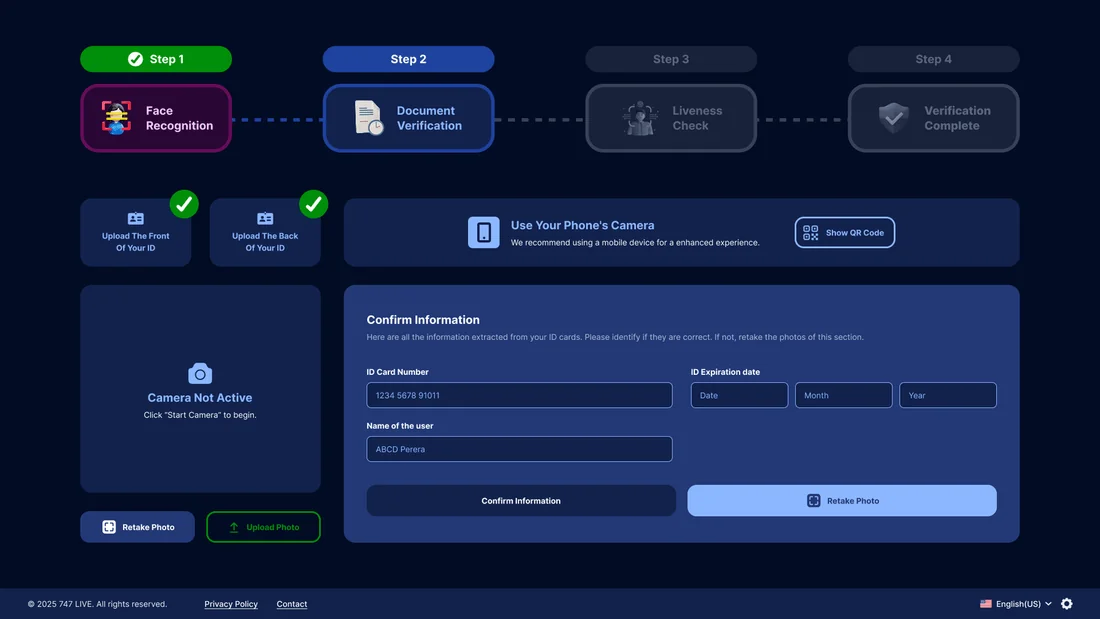
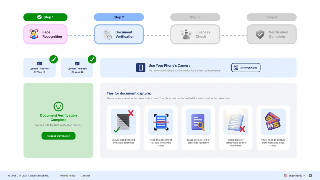
Step 2 · Documents
Upload · in progress · confirm info
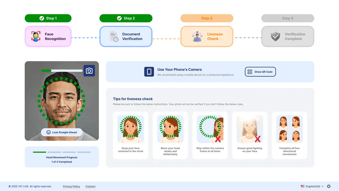
Step 3 · Face scan
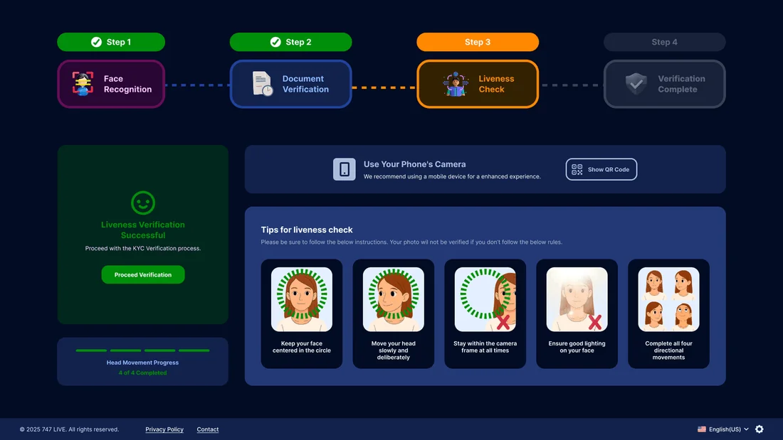
Liveness · success · retry on fail
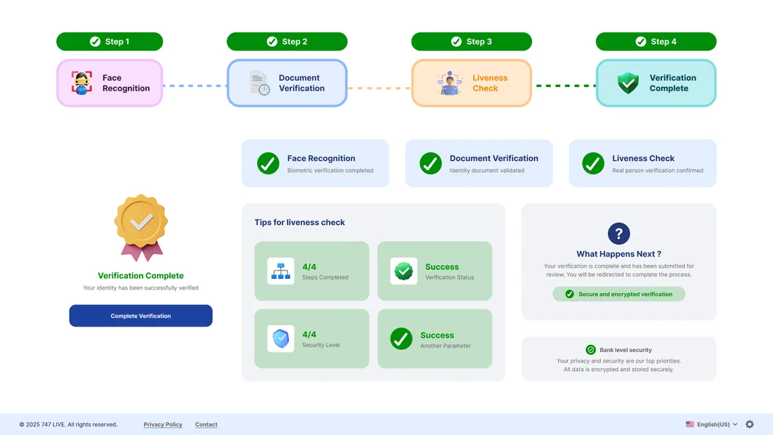
Step 4 · Complete
Review · confirmation · done
04Visual Design System
Inter on a trustworthy blue base, with green, orange and red kept strictly for success, in progress and error, so the status is always obvious in both themes.
Colour palette
Tap a colour to try itDesigned around one palette
Every screen is built from these colour and type tokens.
Typography
Type your own textA neutral, screen-first face - dense verification steps stay clear at every size
05Key Screens
12 high-fidelity screens from the final design. Tap any of them to see it full size.
06Interaction Details
Live status states
Every upload and scan shows whether it’s in progress, successful or has failed, and the colours make it instantly clear whether it passed, is still waiting or needs another try.
Preparation first
Each step starts with a calm preparation screen, so people know what they’ll need before the camera turns on.
Light & dark parity
The entire flow is designed twice, matched pixel for pixel, so it feels at home inside any app that uses it.
07Outcome & Reflection
Outcome
A complete verification system with a clear four-step journey and obvious status at every point, designed in light and dark for every preparation, capture, success and error screen.
Hardest Part
Covering every possible state, whether in progress, error, retry or success, without cluttering the smooth path, and keeping all of it consistent across two themes.
What I Learned
In verification, the moments where things go wrong are the real product. Designing errors and retries carefully is what stops people from giving up.
Next Steps
Handing over to engineering, doing accessibility reviews of the camera steps, and supporting more document types and countries.