

LYA Exam Portal
Exam registration and payment turned into a calm, guided journey for students, parents and teachers.
- Role
- Client
- Lyceum Academy
- Type
- Exam registration & payments
- Tools
- Figma
- Roles
- Screens
- 40+ high-fidelity
01The Brief
Registering and paying for an exam is often the most stressful part of taking one. The forms are all over the place, the fees aren’t clear, and the families and teachers involved can’t see the same information.
The LYA Exam Portal is Lyceum Academy’s online exam platform, and it turns that process into a guided journey for three different roles.
Problem
A single generic flow couldn’t work for students, parents and teachers, and confusing payment options turned the most important step into the most stressful one.
Goal
Build one portal with a journey designed for each role, a guided flow from registration through to payment, and payment options that suit how people actually pay in Sri Lanka.
Audience
Students who register for and sit exams, parents who pay for them, and teachers who confirm the exam details.
Registering and paying for an exam should feel as reassuring as getting the result. It should be clear, trustworthy and free of stress.
02Research & Insights
This product serves several roles, and each one arrives with a different goal and a different worry. My research mapped out those journeys and the gaps in trust around the payment step that were tripping people up.
- One generic flow forced on every user
- Payment as a confusing dead end
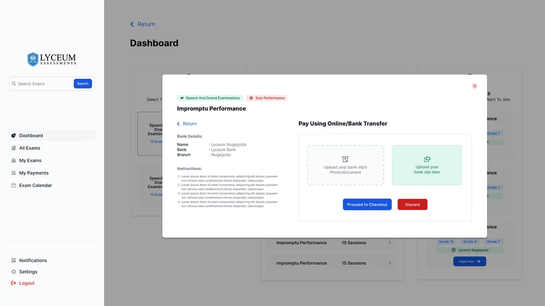
- No answer for bank-transfer realities
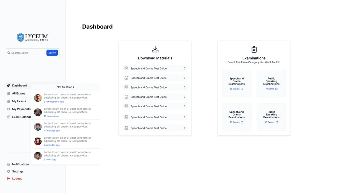
- Role-based dashboards for student, parent and teacher
- A guided, signposted register-to-pay flow
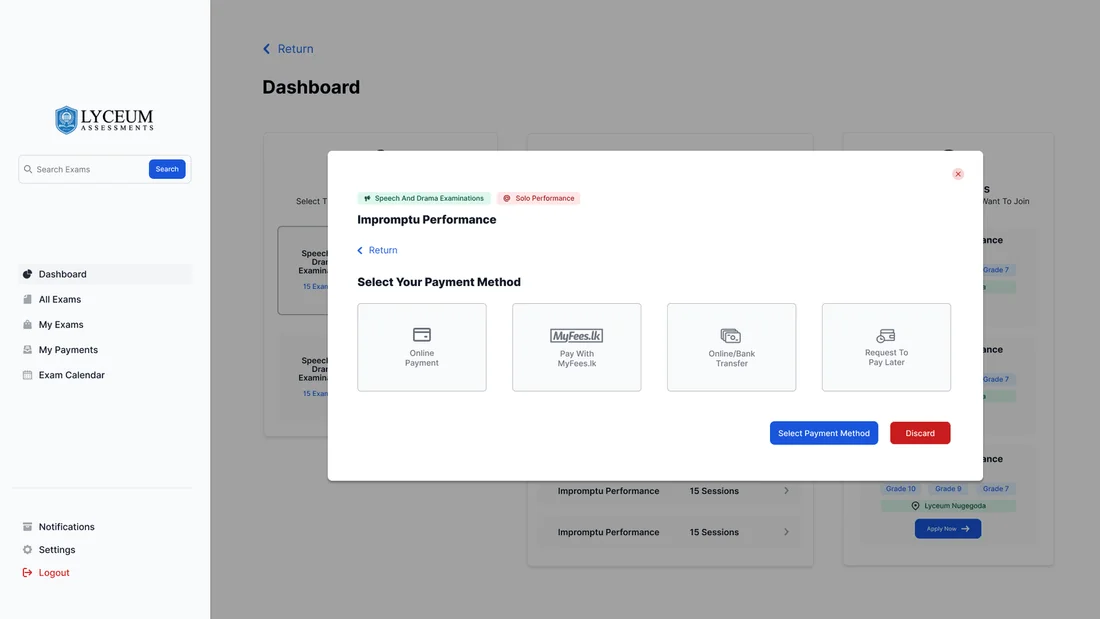
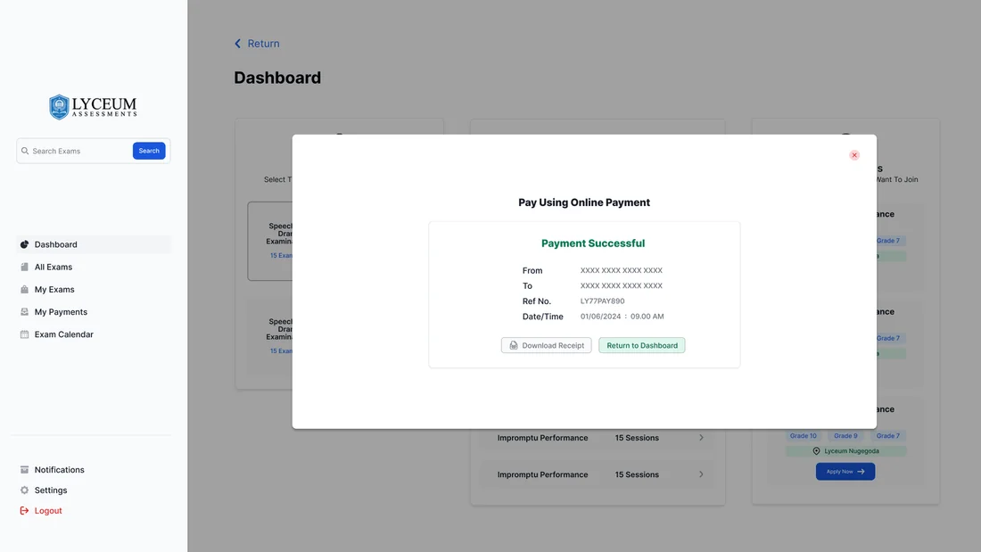
- Online and bank-transfer payment with clear status
The Student
“I just want to find my exam, confirm my details and pay - without confusion.”
The Parent
“I’m paying for my child’s exams - I need to trust it and keep a clear record.”
The Teacher
“I need to confirm exam details and keep everything accurate for my students.”
Focused student flow
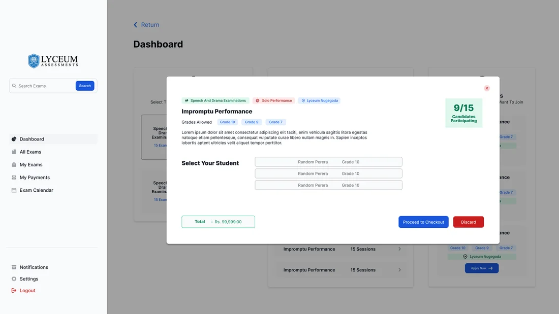
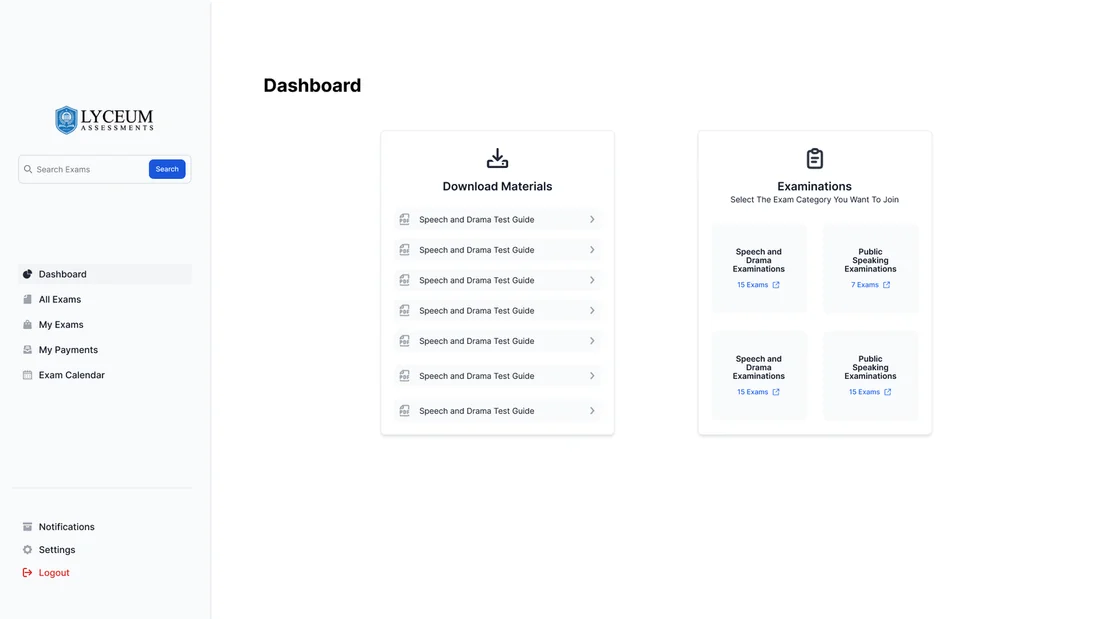
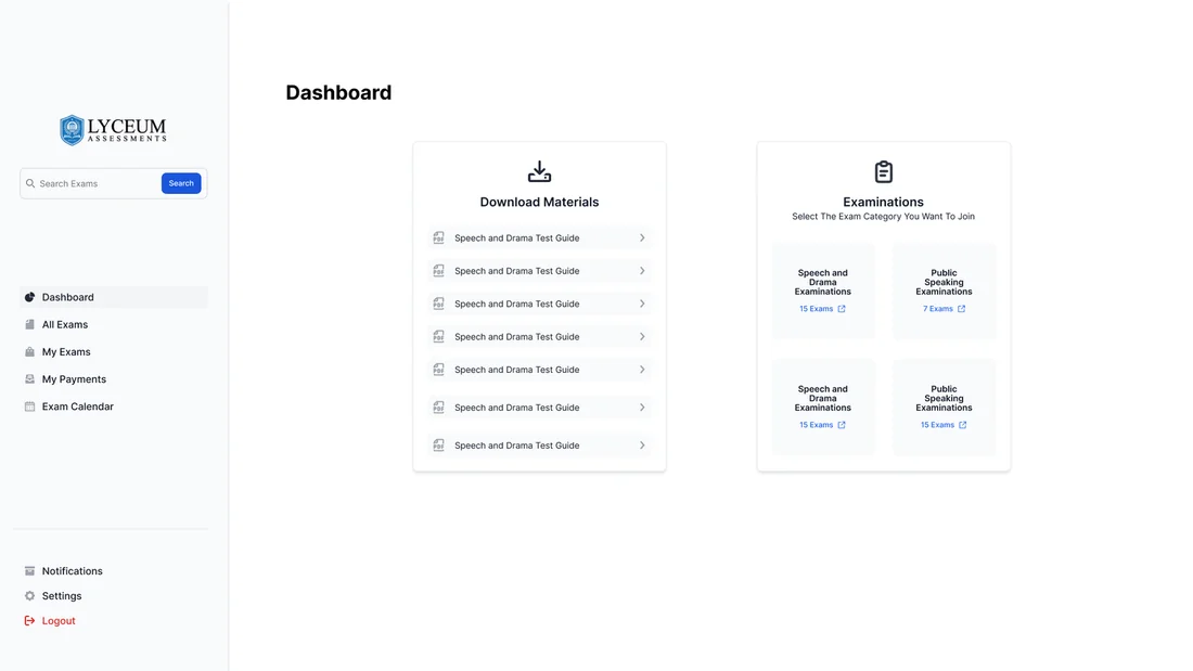
A focused dashboard and a simple step-by-step payment flow replace the old cluttered steps.
A payment trail
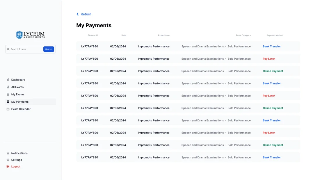
Parents get a "My Payments" history, which gives them confidence that everything has gone through.
Space to verify
Teachers get their own screens for checking and confirming exam details.
03Structure & Flows
One main journey, adapted into three flows for the three roles, all on the same design system, so the portal feels the same no matter who logs in.
Dashboard
Overview · notifications · quick actions
Exams
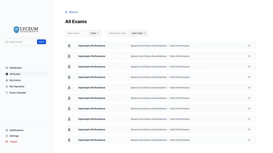
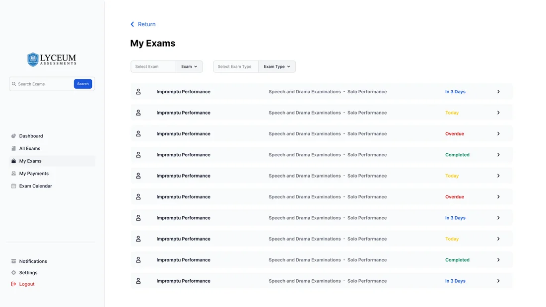
All exams · my exams · details
Payments
Online · bank transfer · my payments
Account
Login · roles · profile
04Visual Design System
A blue and mostly white palette that feels trustworthy and professional, and stays calm and easy to focus on when money and exams are involved.
Colour palette
Tap a colour to try itDesigned around one palette
Every screen is built from these colour and type tokens.
Typography
Type your own textGeometric, monolinear clarity with a little warmth - for every role and screen
05Key Screens
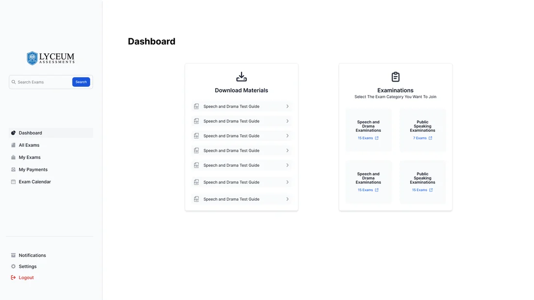
12 high-fidelity screens from the final design. Tap any of them to see it full size.

06Interaction Details
Role-based dashboards
Students, parents and teachers each land on a dashboard built around what they need to do.
Flexible payments
You can pay instantly online or by bank transfer, and there’s an "upload slip later" option because that’s how a lot of people actually pay.
Honest status
Every payment finishes with a clear success or failure screen that tells you what to do next.
07Outcome & Reflection
One portal and three confident journeys, with the payment step finally as trustworthy as it should be.
Outcome
A consistent portal for several roles, with three tailored flows covering registration, dashboards and every possible state for online and bank transfer payments.
Hardest Part
Keeping three side-by-side flows consistent, and handling payment edge cases like failures and "upload slip later" without cluttering the smooth path.
What I Learned
A shared design system is what makes a product with several roles feel like one product, and failed or pending payments matter just as much as successful ones.
Next Steps
Handing over to development, adding reminders for pending bank transfers, and building results publishing and admin reports.