
Fun Extreme Technology
A corporate website for a gaming technology company. It needed to feel fun enough for the gaming world while still looking credible to big enterprise clients.
- Role
- Client
- Fun Extreme Technology LLC
- Type
- Tools
- Deliverables
- 9+ pages, desktop & mobile
- Status
- Shipped to a live site
01The Brief
Fun Extreme Technology builds software for gaming platforms around the world, and they needed a company website that showed what they could do. That meant a Home page, four Solution pillars, plus Company, Careers and Contact pages.
The real challenge was that the company has two sides to it. Most B2B tech websites feel dry and templated, and most gaming websites feel playful but not very serious. This one site had to win over enterprise buyers, get gaming operators excited and attract engineers, all without splitting into two separate designs.
Problem
A gaming technology company needs a website that feels energetic enough for the gaming world but solid enough for enterprise buyers, and most websites only manage one or the other.
Goal
Create one bold design system led by red, used across Home, Solutions, Company, Careers and Contact, with every page fully designed for both desktop and mobile.
Audience
Gaming operators looking for a technology partner, engineers thinking about joining the company, and partners looking for signs that the company can be trusted.
Fun is right there in the company’s name, but its clients are big enterprises. The site had to look like both at the same time.
02Research & Insights
Three very different kinds of people land on the same homepage. A client wants to check what the company can do, a job candidate wants to get a feel for the culture, and a partner wants to see whether the company is credible. All three skim the page looking for proof rather than reading long paragraphs, so stats, clearly named solution pillars and real partnerships needed to appear early, with more detail just a click away.
- Stock-photo templates with no personality
- Service lists written as jargon walls
- One funnel that ignores clients, candidates and partners
- One confident red-gradient identity over calm blue-ash neutrals
- Four named solution pillars, each with a deep-dive page
- Dedicated journeys for Solutions, Company, Careers and Contact
The Gaming Operator
“Show me you’ve shipped gaming tech at scale - fast, secure and compliant.”
The Engineer Candidate
“I want to see what I’d build and who I’d build it with - before I hit Apply.”
The Strategic Partner
“Numbers, partnerships and a global footprint tell me this company is real.”
Specifics beat claims
Operators don’t trust vague service pages, so I broke each of the four pillars down into six specific services.
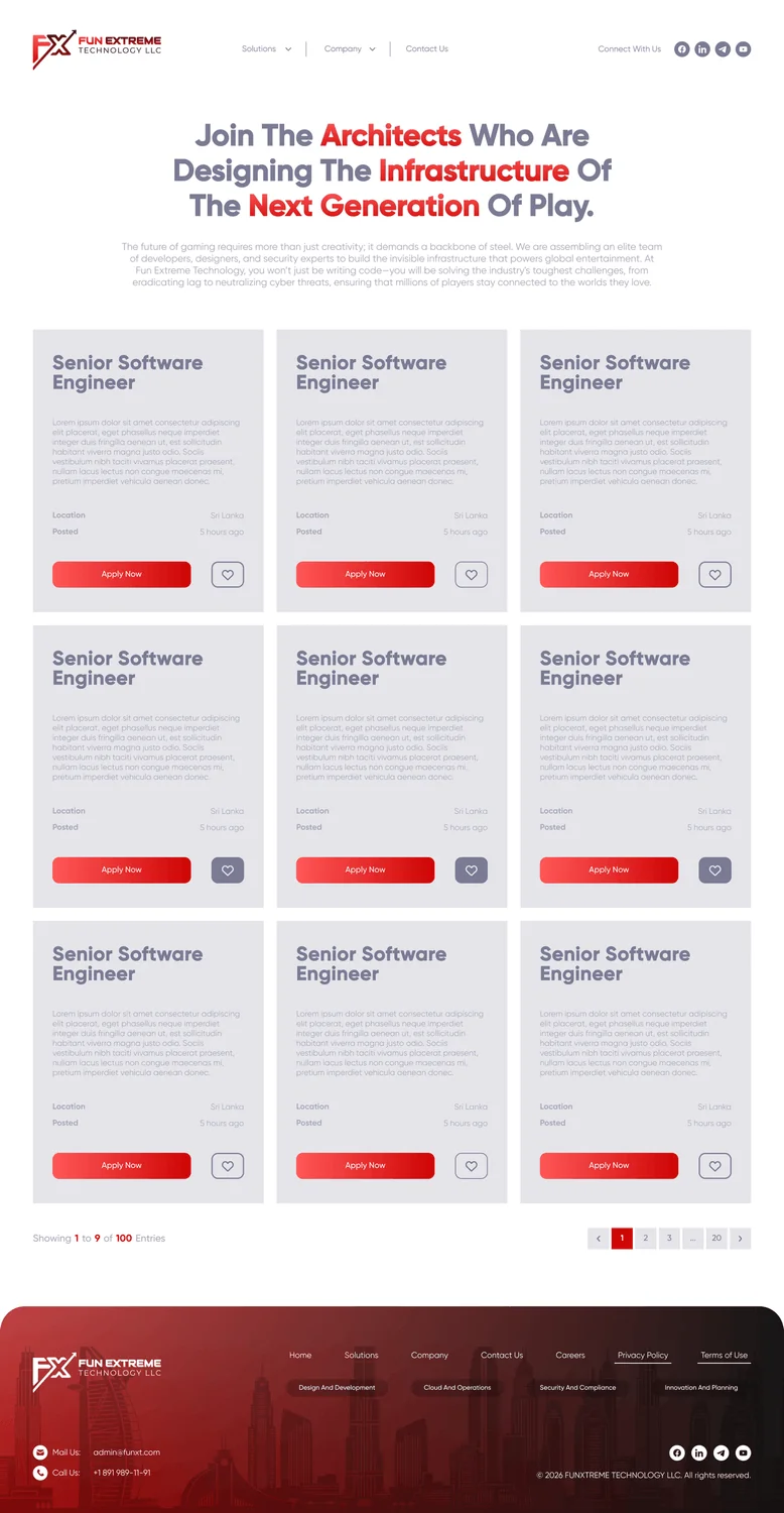
Careers is a hub, not a form
Candidates want to know what they’d be working on and what the culture is like, so the careers page has detailed role cards and simple ways to apply.
Proof up front
Partners want to check how big and established the company is, so stats, partner logos and a section on the global network sit near the top of the page.
03Structure & Flows
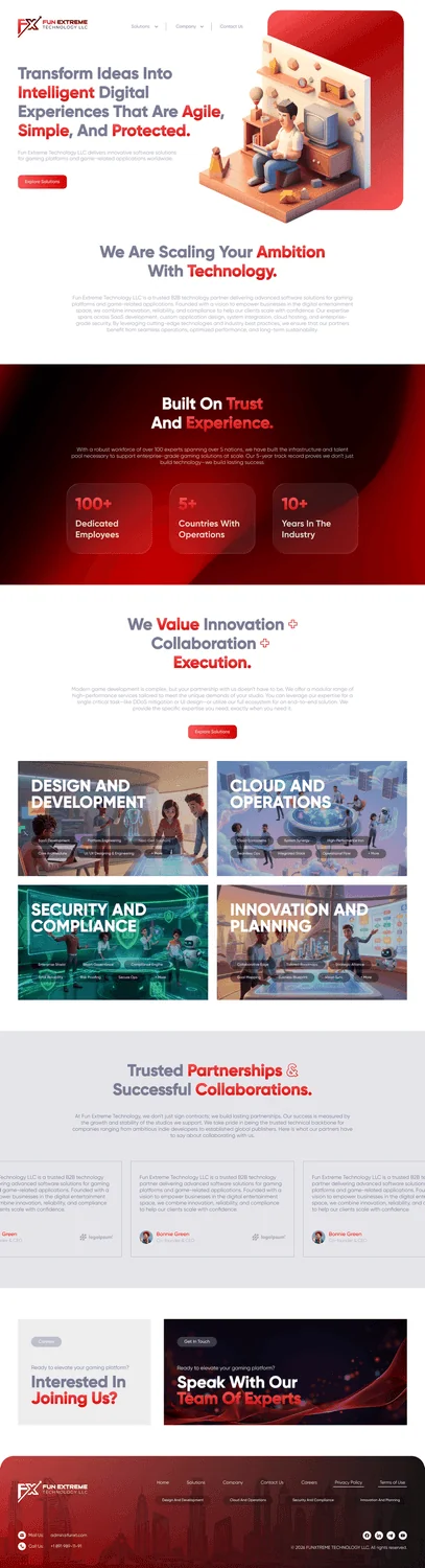
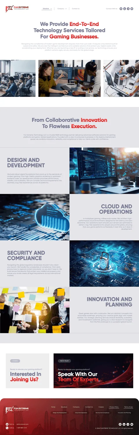
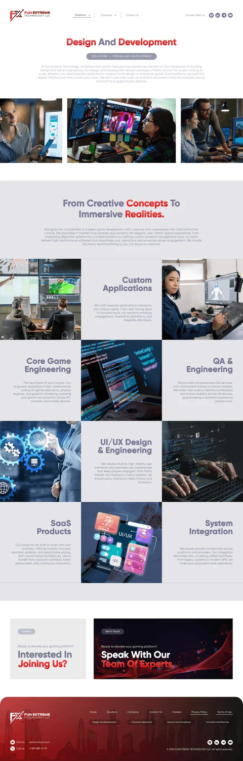
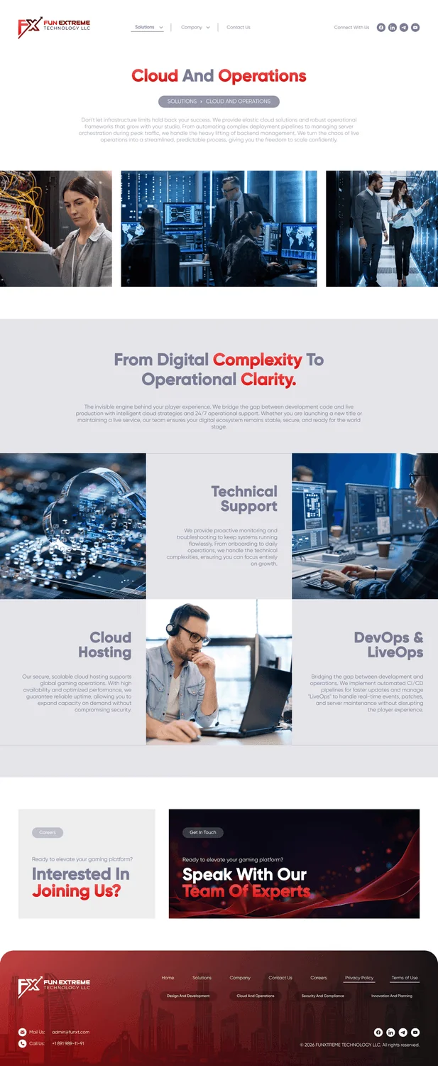
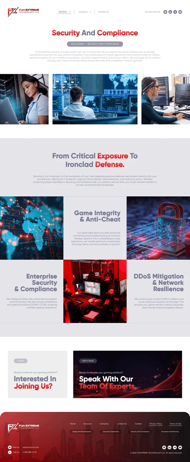
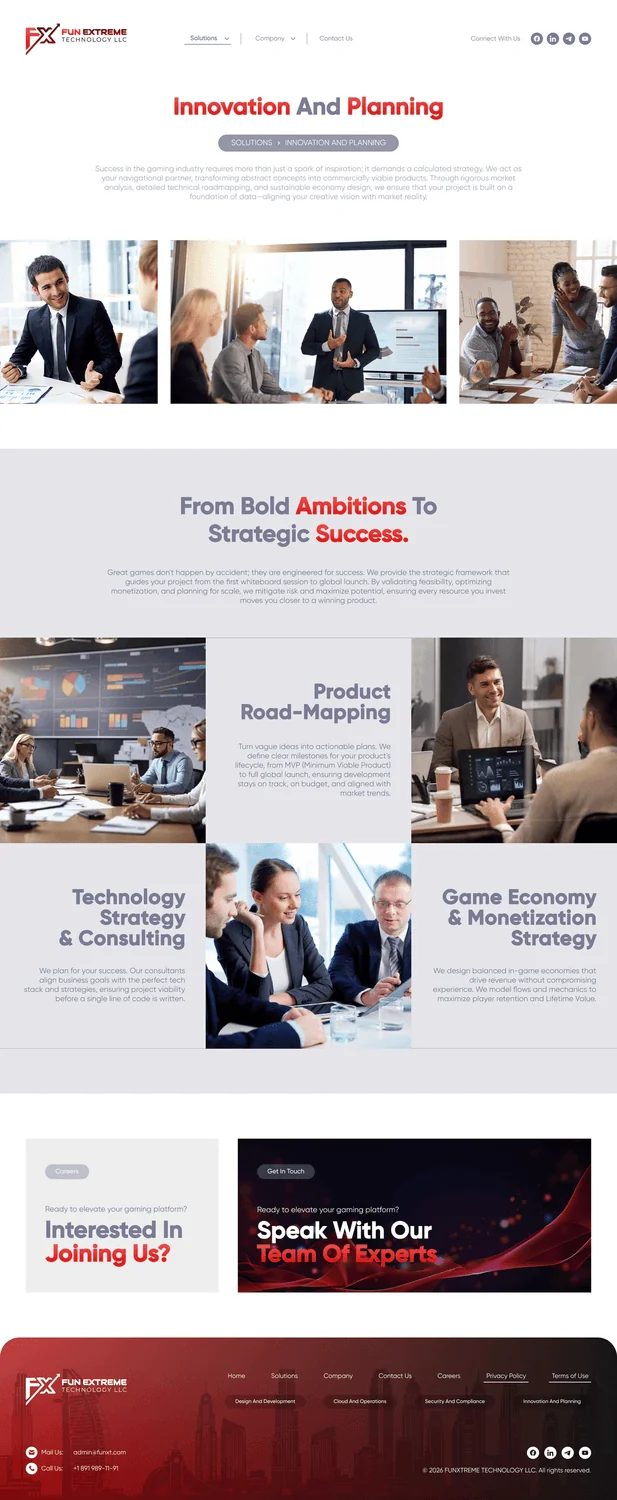
The four solution pillars, Design & Development, Cloud & Operations, Security & Compliance and Innovation & Planning, shape the whole site. They appear in the homepage grid, the Solutions overview and four deep-dive pages, each covering six services.
Home
Hero · stats · pillars · partners
Solutions
Overview · 4 pillar pages · 24 services
Company
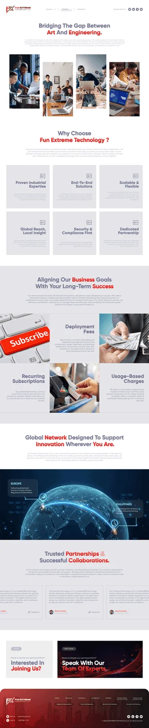
Why us · engagement models · global network
Careers & Contact
Role cards · apply · get-in-touch form
04Visual Design System
A single bold red gradient (#FF5757 → #CD0505) stands out against plenty of white space and two blue-ash greys. Every neutral colour has documented opacity steps from 8% to 80%, so the same colours work on bright sections and on dark charcoal bands.
Colour palette
Tap a colour to try itDesigned around one palette
Every screen is built from these colour and type tokens.
Typography
Type your own textEverything from hero statements to data labels - Regular to Black, 12-48pt
Licensed face - previewed here in Poppins, its closest web match.05Key Screens
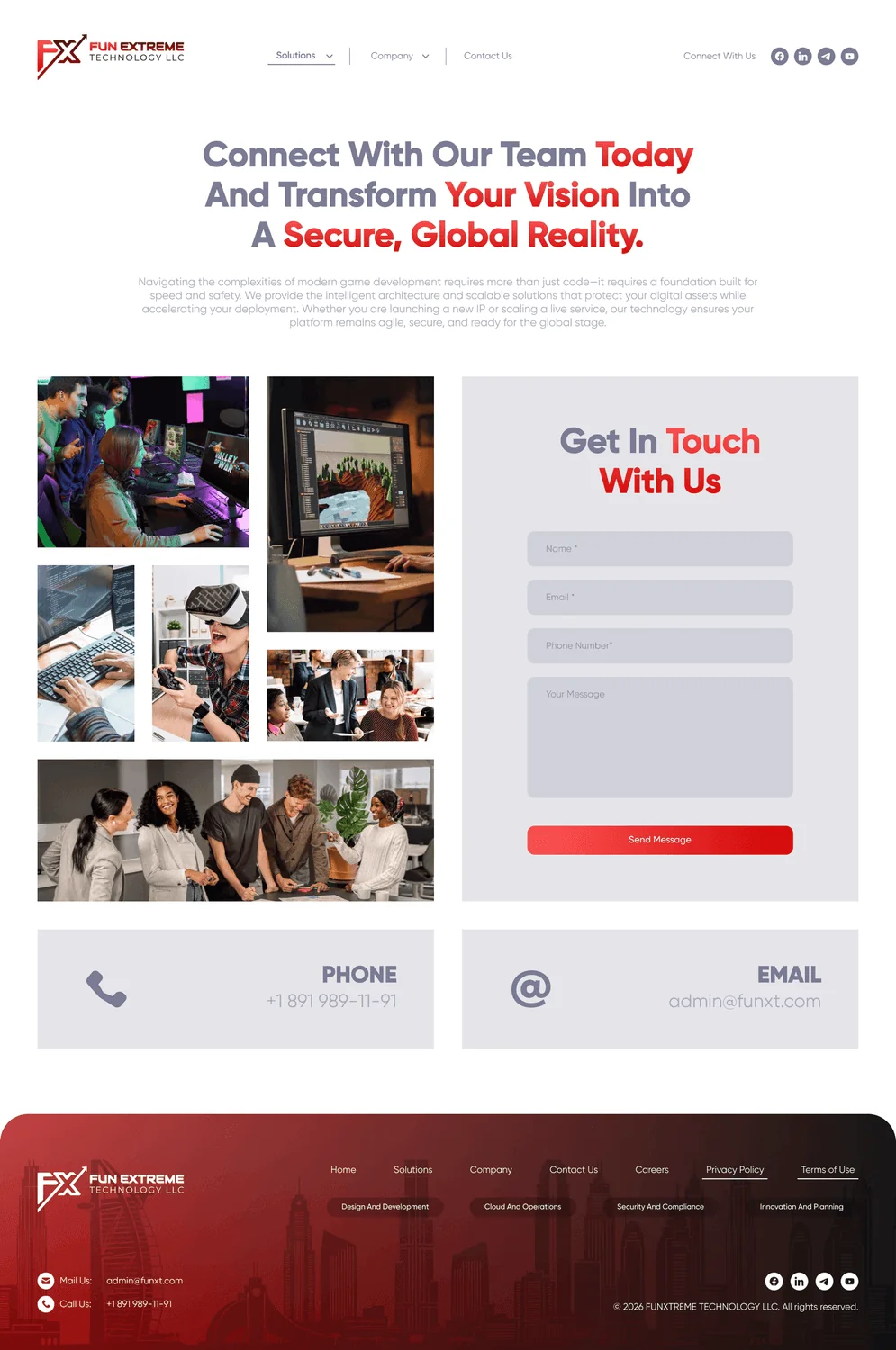
14 high-fidelity screens from the final design. Tap any of them to see it full size.





06Interaction Details
Pillar-driven navigation
The four solution tiles drive the whole site. Each one opens a deep-dive page that explains the pillar through six specific services.
Proof through numbers
Counters showing 100+ employees and 5+ countries, partner logos and a global network section turn the company’s claims into something visitors can actually see.
Conversion touchpoints
A two-part call-to-action band, with "Interested in joining us?" on one side and "Speak with our experts" on the other, plus role cards and a simple, focused contact form.
07Outcome & Reflection
Outcome
A complete company website with a homepage, a solutions section built around four pillars with their own deep-dive pages, and Company, Careers and Contact pages. Everything was designed for desktop and mobile and is now live.
Hardest Part
Keeping both sides of the company’s personality, the energy of gaming and the seriousness of enterprise, in one identity across nine content-heavy pages and two layouts.
What I Learned
A small, disciplined colour palette goes a long way. One red gradient and a set of documented opacity steps did the job of a much bigger design system.
Next Steps
Adding case studies and articles, polishing the animation on the gradient bands, and translating the site for markets around the world.