
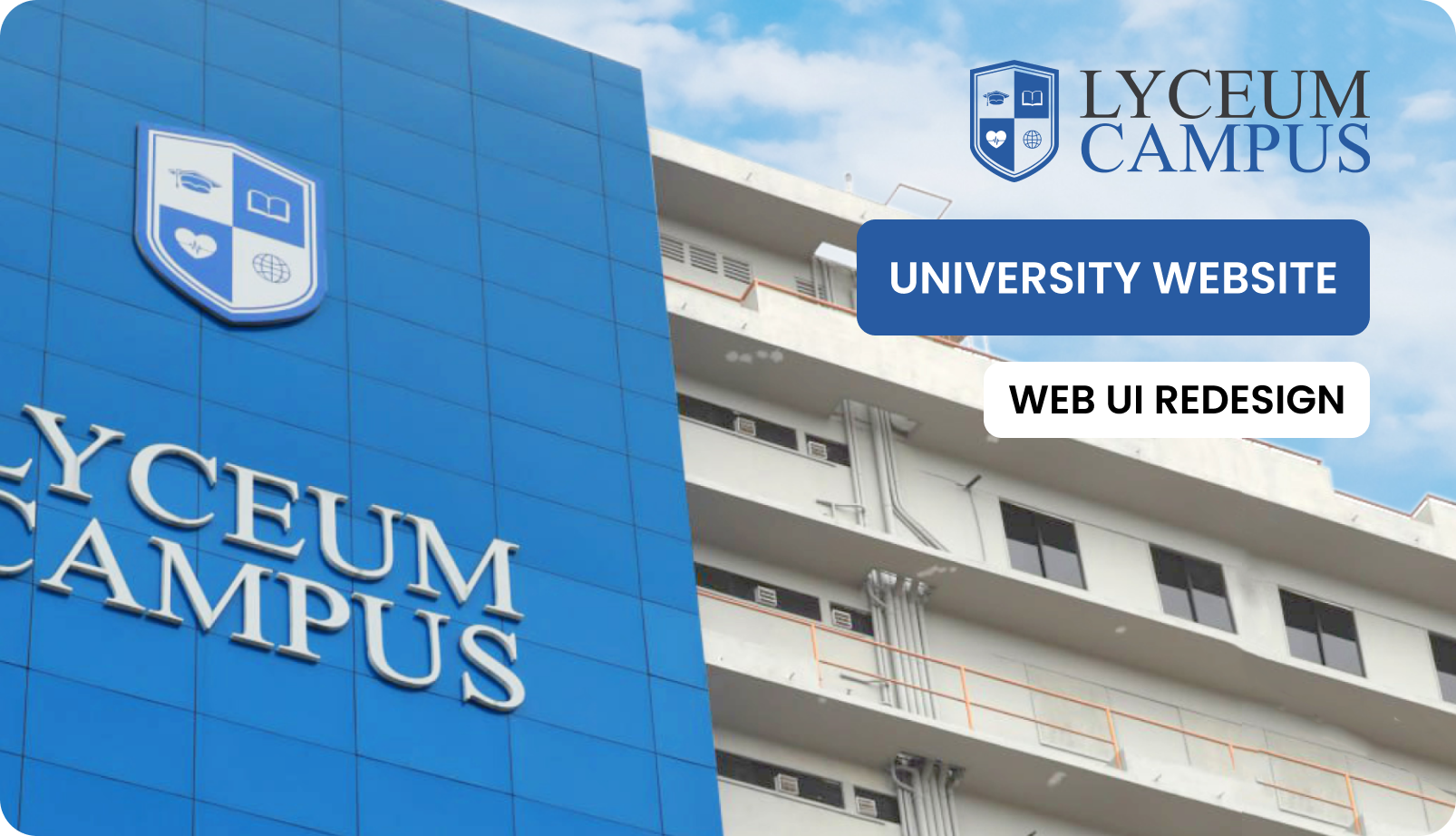
Lyceum Campus
Web Redesign
Reimagining a University's Digital Front Door
A university's website is often the first handshake with a prospective student. Lyceum Campus's existing site was fumbling that handshake — burying course information under layers of nested menus, breaking on mobile devices, and looking like it hadn't seen a design update in years. This project stripped everything back to one question: what does a student actually need to find, and how fast can they find it?
Context & The Problem
Three audiences, one website, zero clarity. Prospective students couldn't find course fees. Current students couldn't locate exam schedules. Faculty had no streamlined portal. The existing site had grown organically over years — page after page bolted on without a coherent navigation strategy — until the whole structure became an archaeological dig rather than a digital experience.
"Students were spending an average of 4–7 minutes just to find basic course information — something that should take under 30 seconds."
Problem Statement
Inconsistent navigation, cluttered layouts, and broken information hierarchy left every user group — students, parents, and faculty — confused and unable to locate critical academic resources.
The Goal
Redesign the entire web presence to cut navigation friction, achieve accessibility compliance across all age groups, and strengthen brand identity — targeting a 60% reduction in time-to-information.
Target Audience
Current students (18–26), prospective applicants & parents (16–50), and faculty/admin staff — each with vastly different digital literacy levels and usage patterns.
Discovery & Research
Before touching a single pixel, the project demanded deep listening. Competitive benchmarking against five local and international university sites, informal interviews with enrolled students, and direct observation sessions revealed patterns that no amount of guesswork could surface.
Competitive Analysis
- Dense, table-heavy layouts that overwhelm first-time visitors
- No clear visual hierarchy between primary and secondary content
- Mobile experiences that feel like desktop pages shrunk to fit
- Card-based layouts with clear CTA hierarchy perform significantly better
- Progressive disclosure — surface essentials first, reveal details on demand
- Dedicated "Quick Access" zones for the most-searched content
User Personas
"I just want to know what courses you have, how much they cost, and when intake starts."
"Is this a recognized degree? I need to read the full curriculum and see the faculty credentials."
"I use the site purely to jump into the LMS or find academic calendar updates."
Cross-Persona Insights
Ideation & Structure
User Flow: Prospective Student Journey
The old site forced users through 5–7 clicks to reach admissions contact. The redesigned flow cuts that to 3 clicks — with persistent "Apply Now" CTAs visible at every stage of the journey.
Information Architecture
About
History · Mission · Leadership · Campus Life
Academics
Programs · Courses · Faculties · Calendar
Admissions
Apply · Fees · Requirements · Deadlines
Campus Life
Events · Clubs · Facilities · Gallery
Visual Design & Style Guide
The visual identity was redesigned from the ground up to achieve a balance between academic tradition and modern accessibility. The following guidelines defined the cohesive look and feel across all digital touchpoints.
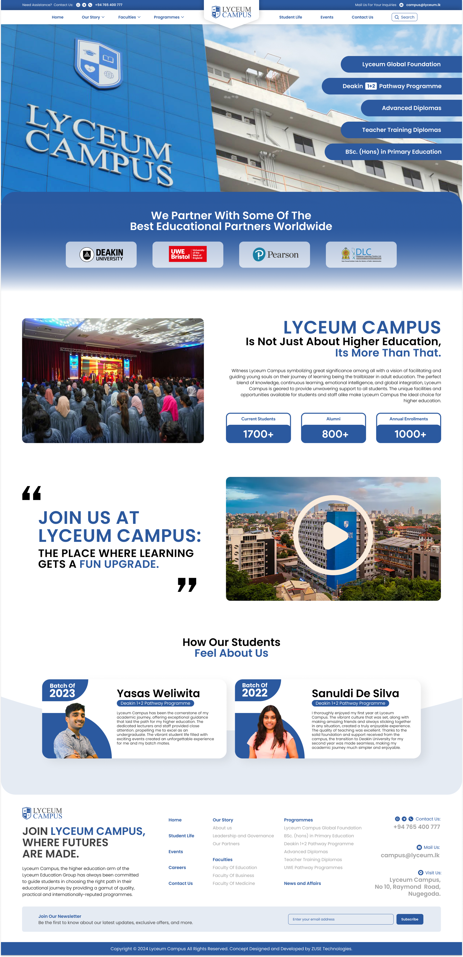
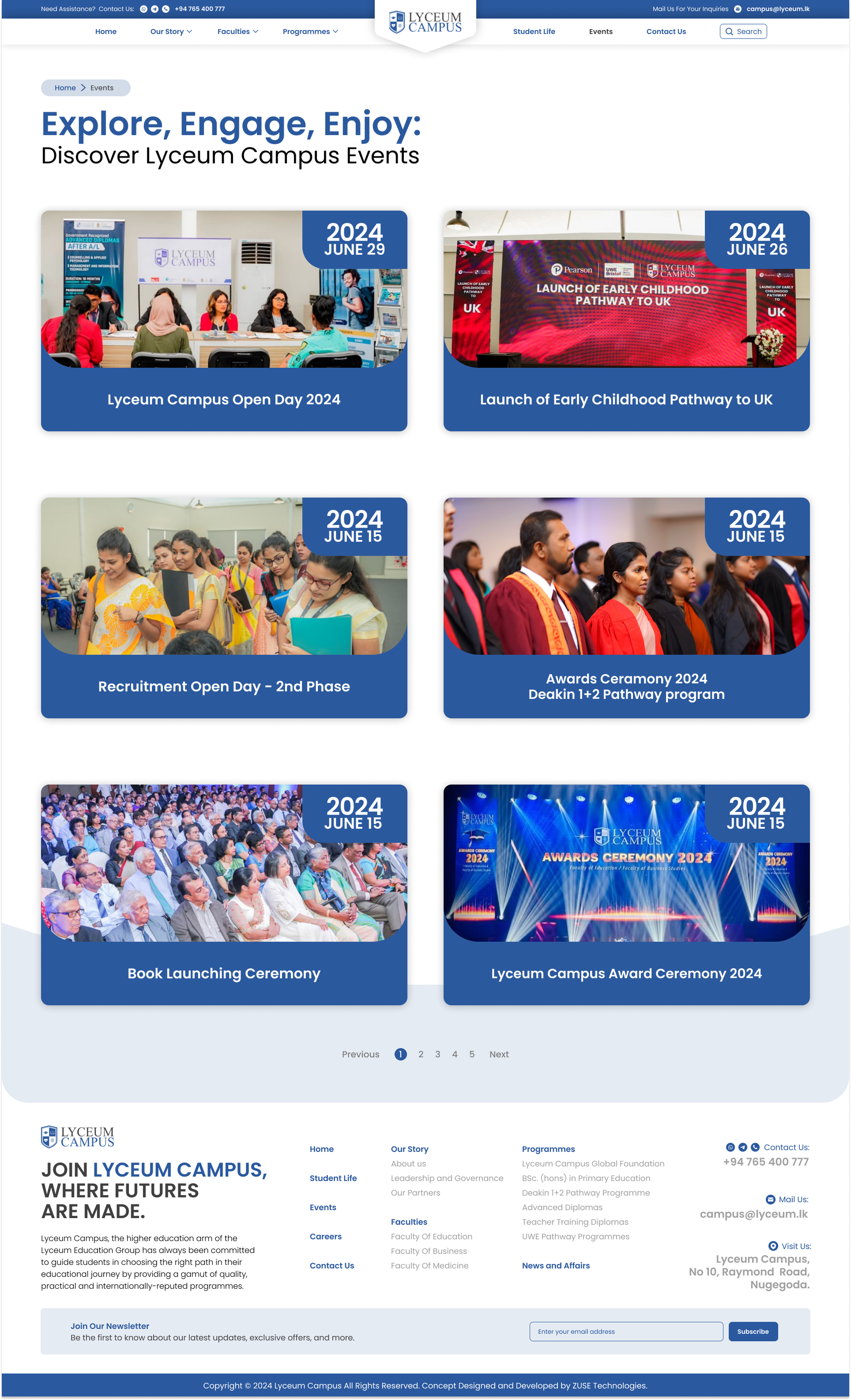
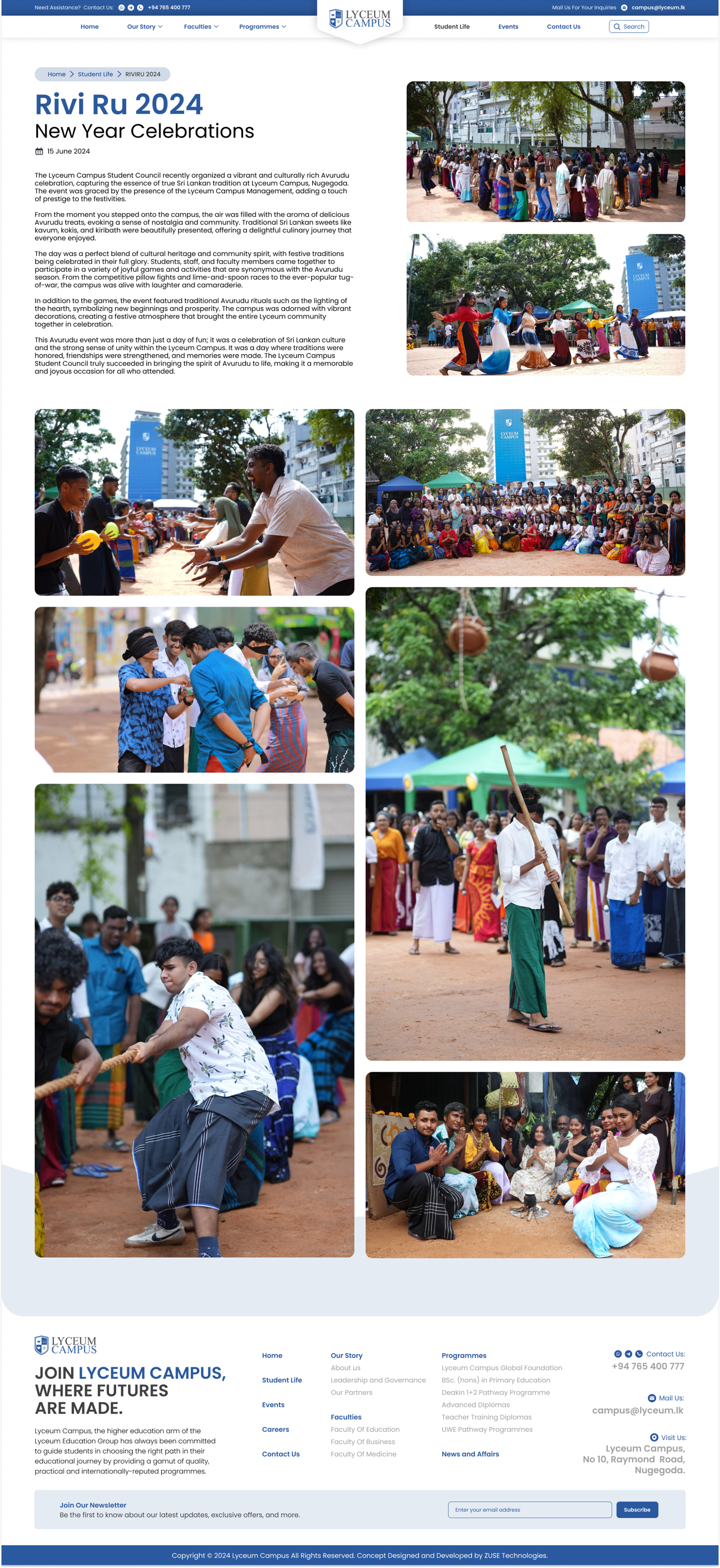
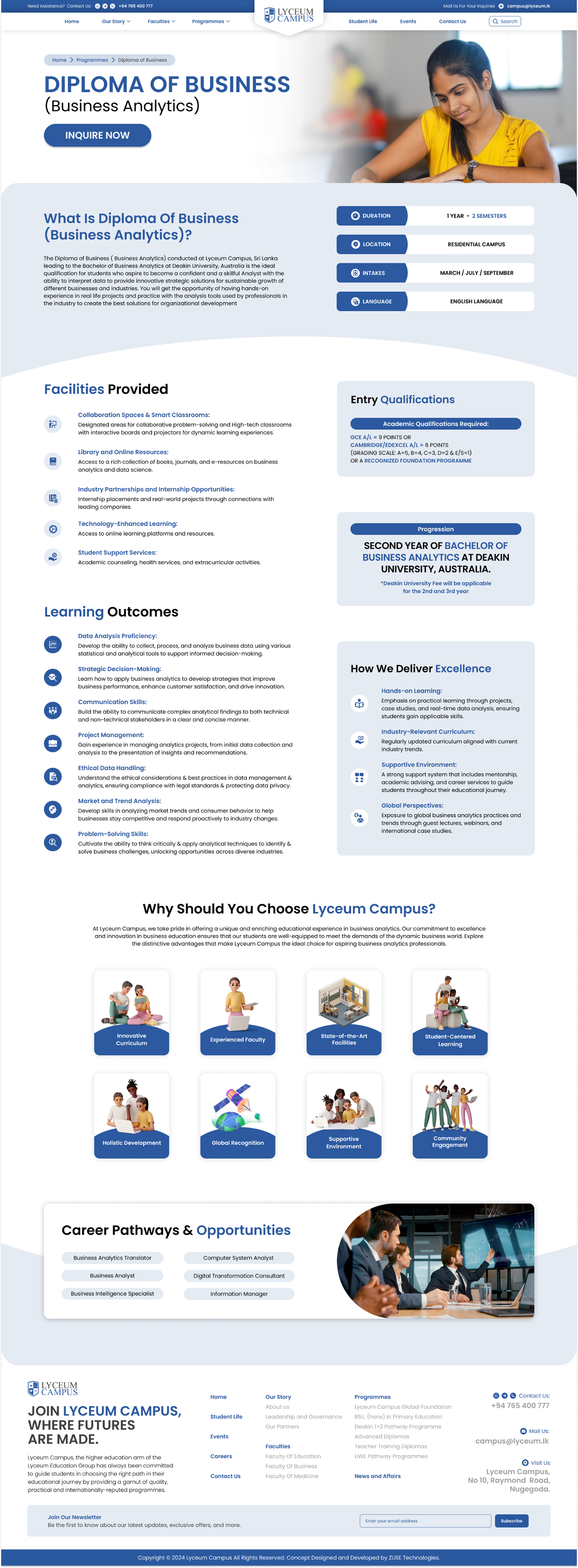
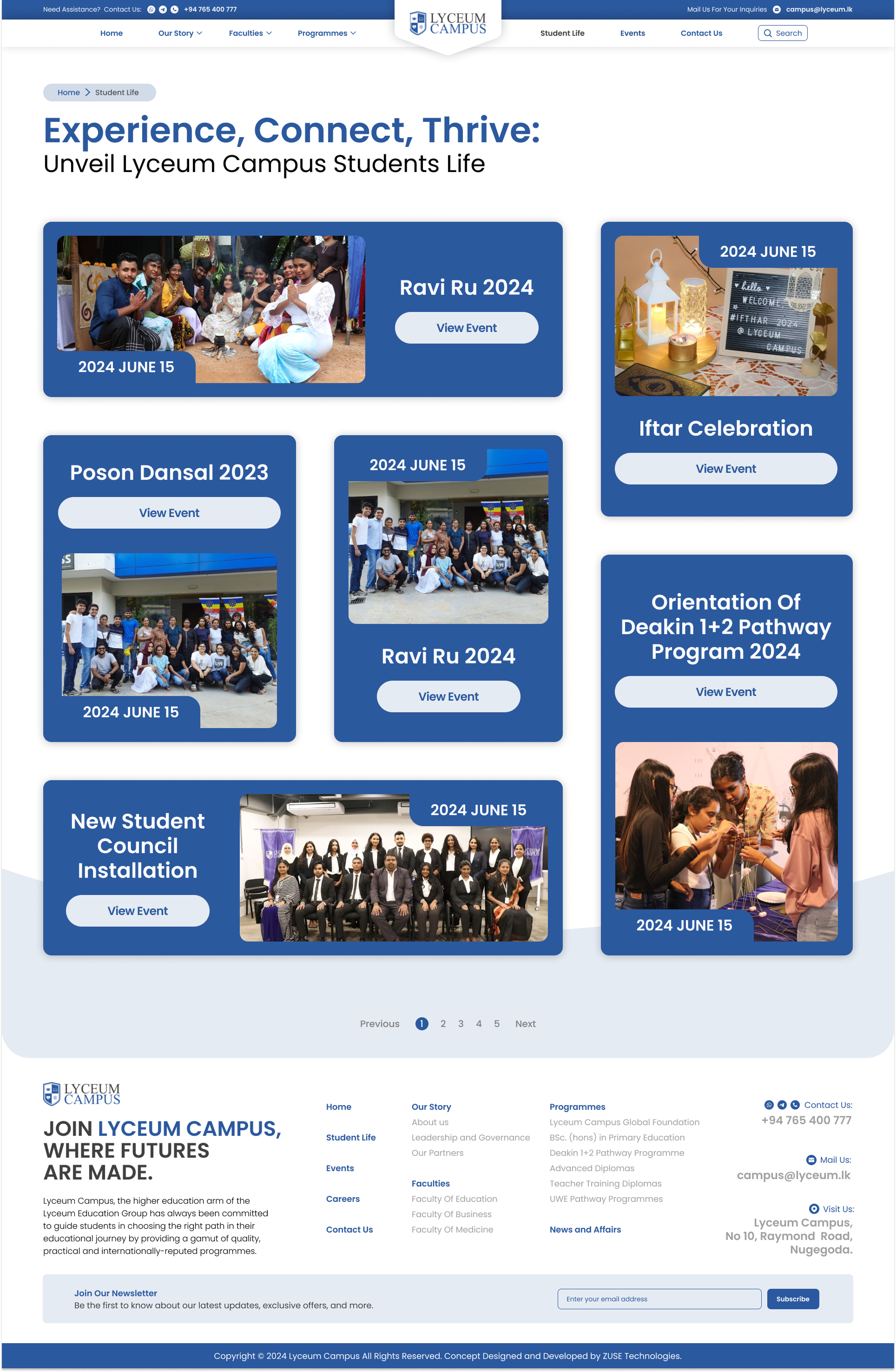
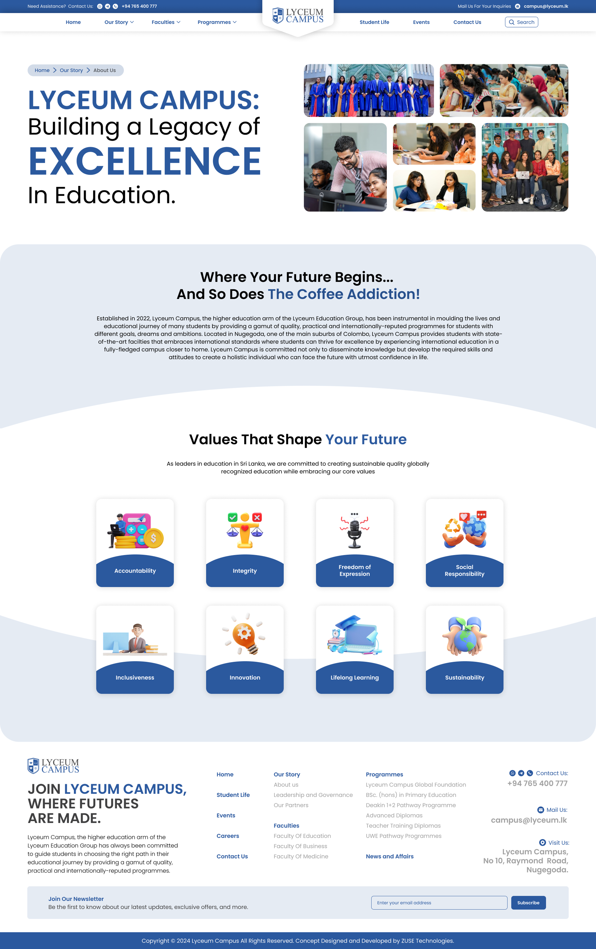
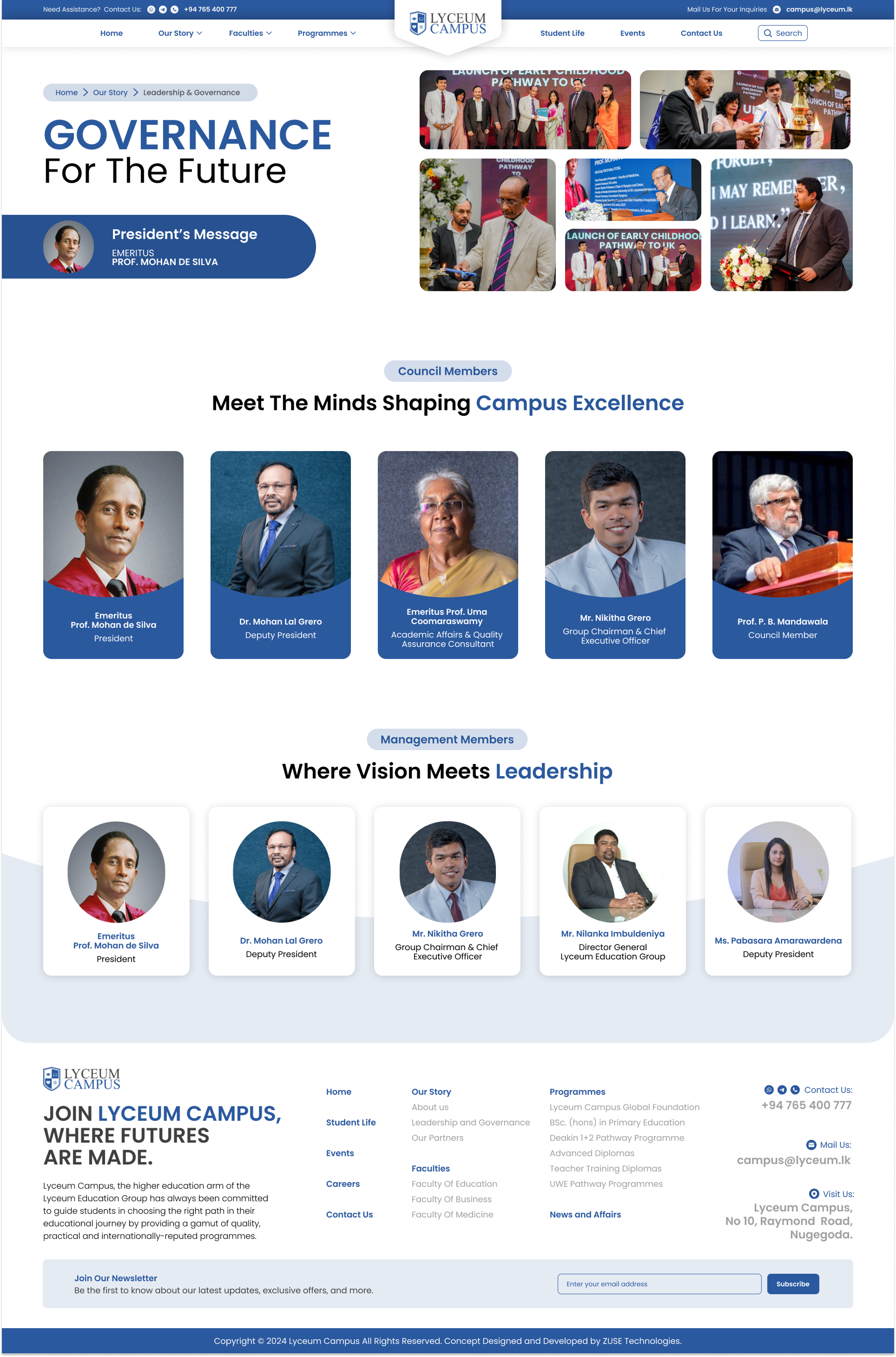
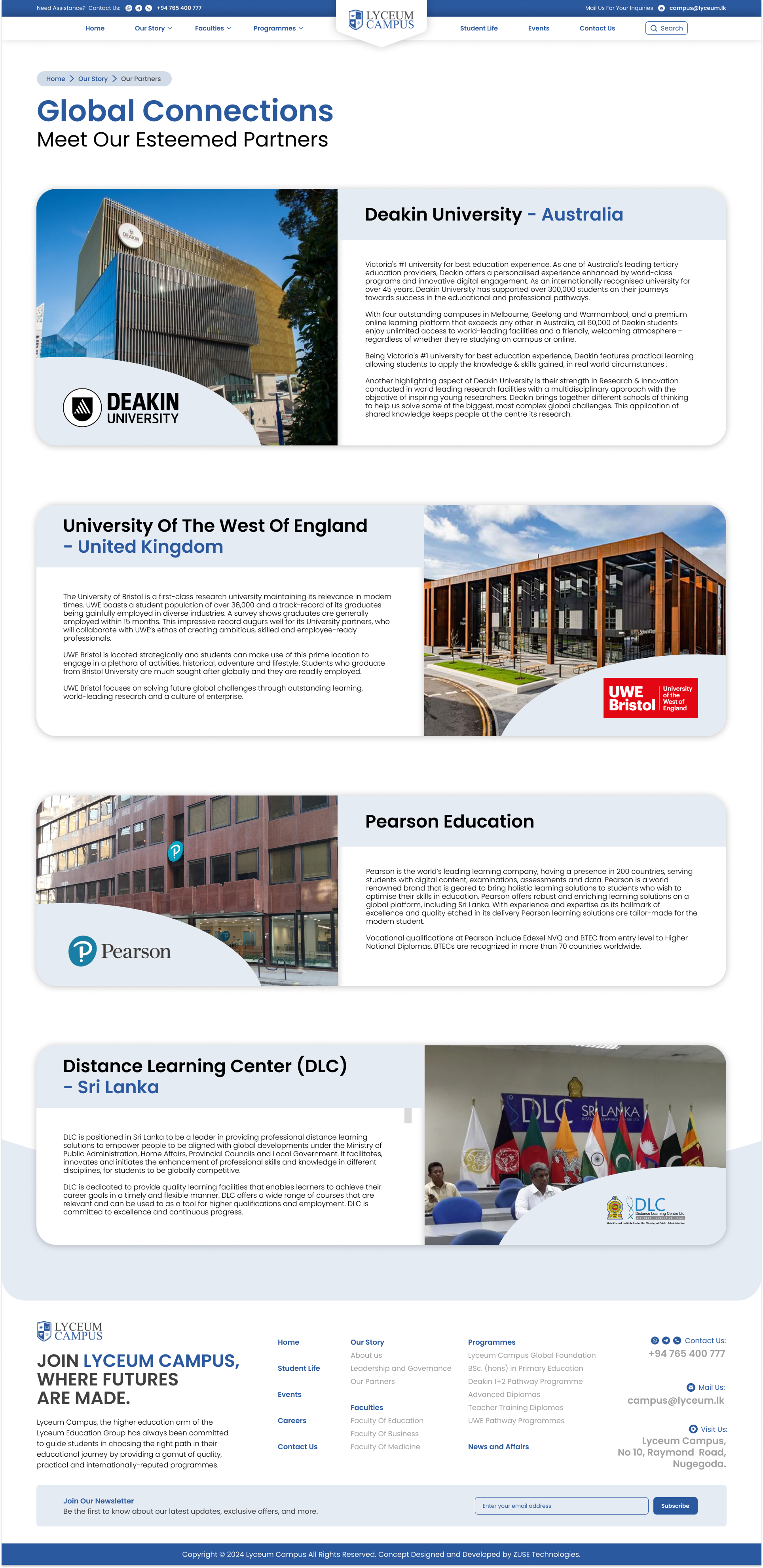
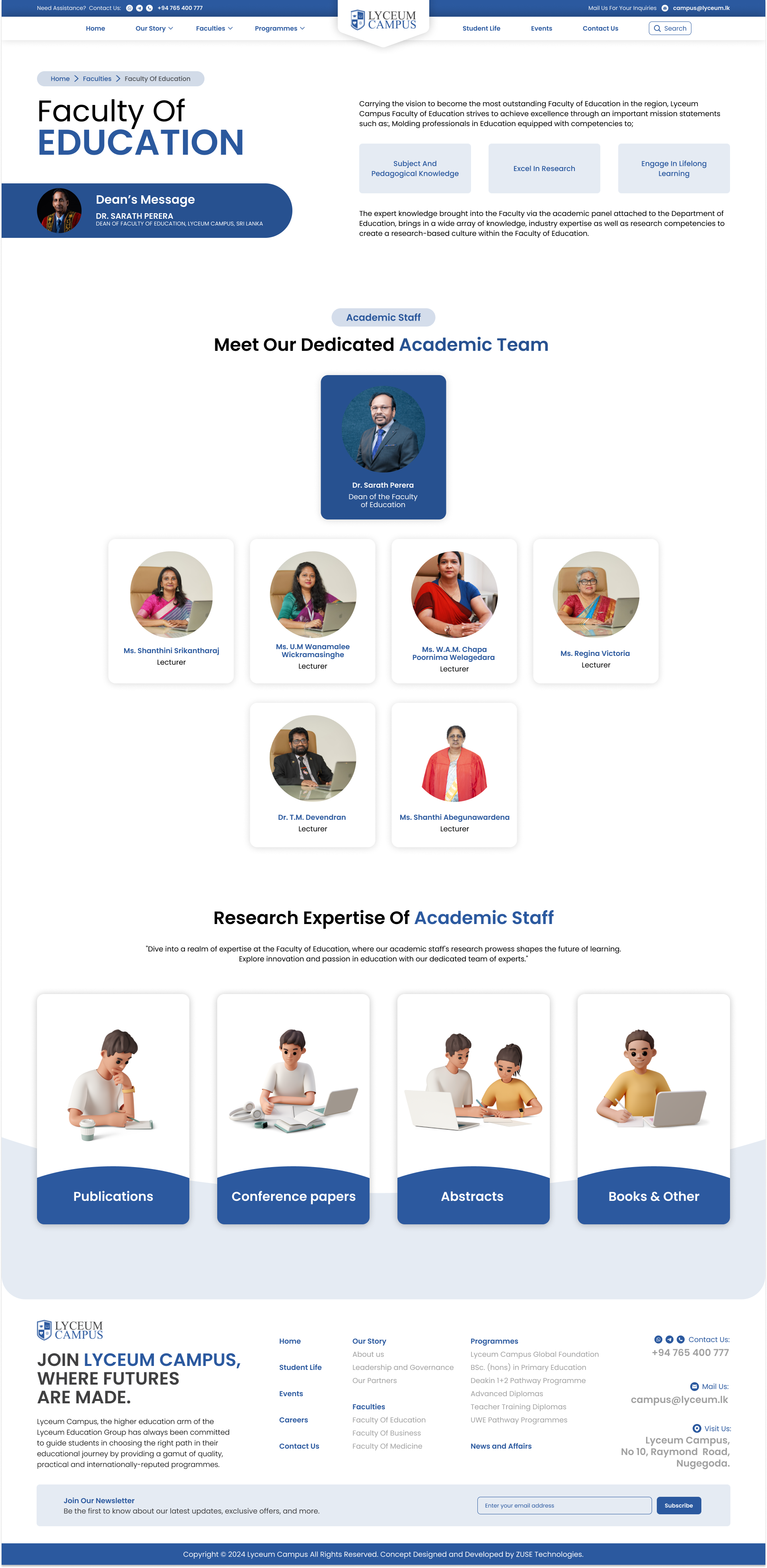
High-Fidelity Project Deliverables
The following interface designs represent the core of the redesign, focusing on a balance of information density and visual clarity. Click any screen to explore it in high resolution.
Interaction Design & Emotional Intent
A university website should evoke the feeling of arriving on campus for the first time — a blend of excitement, quiet confidence, and the sense that this is somewhere worth being. Every hover state, every page transition, every colour choice was deliberately tuned to reinforce that emotional resonance.
Button Feel
Primary CTAs use a spring-bounce scale on hover, creating a subtle "press" sensation that signals interactivity without distraction. The emotional intent: confidence and responsiveness.
Page Transitions
Content enters through staggered fade-up animations, creating a sense of the page breathing to life — evoking the experience of walking into a building and having it reveal itself naturally.
Colour Psychology
Navy + Blue communicates trust and authority. Cyan accents inject energy and modernity. Together, they avoid the sterile white-and-grey trap of most institutional sites.
Results & Reflection
Outcome Metrics
"Users described the redesigned experience as 'clean,' 'professional,' and — most importantly — 'easy to use.' Multiple test participants wished their own university's website worked this well."
🎓 Lessons Learned
Testing with real users — not just design peers — proved essential. Even "obvious" label choices like "Programmes" vs "Courses" caused significant confusion. A single wording change measurably improved findability.
⏭️ What Could Be Different
With more time, quantitative A/B testing between card-grid and list formats for the courses page would strengthen the data. A proper design-token system from the start would make responsive breakpoints more systematic.
🚀 Next Steps
Explore AI-driven personalisation — surfacing relevant programs based on browsing patterns. A dedicated mobile app with offline content support would better serve students accessing study materials on the go.
💬 Conclusion
This project proved that thoughtful UX isn't about adding features — it's about removing friction. A university's website should be a welcoming guide, not a bureaucratic maze. The data validated the approach.