
ZUSE Corporate
Learning System
Modernizing the Corporate Knowledge Ecosystem
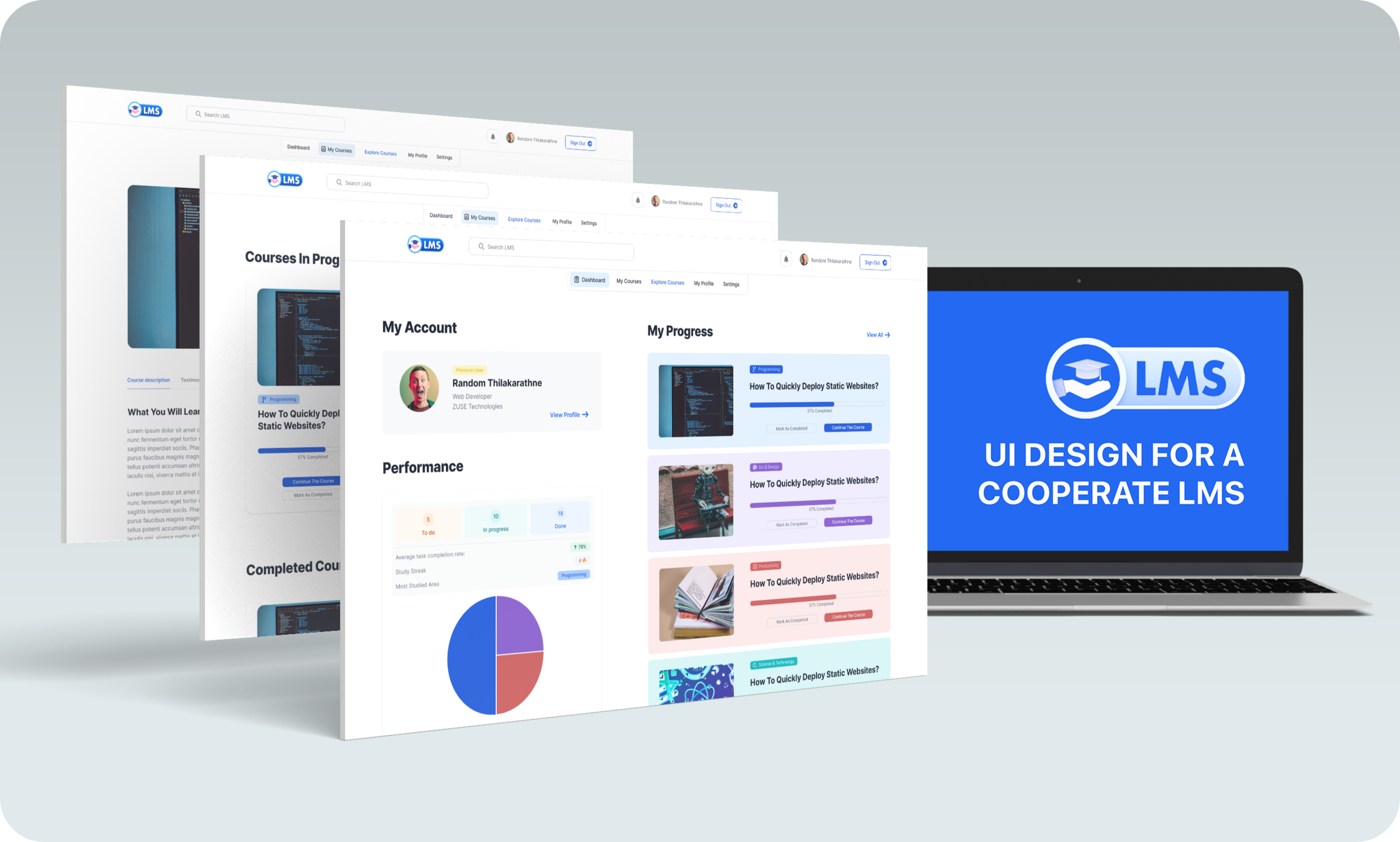
Legacy LMS platforms are often where professional growth goes to die. Cluttered dashboards, confusing navigation, and "one-size-fits-all" learning paths create friction for the very people they are meant to empower. ZUSE LMS strips away this bureaucracy, replacing it with a fluid, card-based interface that treats corporate training as a premium digital experience.
Context & The Friction
Corporate employees frequently report that their internal learning systems feel "disconnected" from their workflow. ZUSE Corporate LMS was faced with a critical challenge: How do we transform a functional necessity into an interactive destination that employees actually enjoy visiting? Complex hierarchies and dated UI patterns were causing record-high course abandonment rates among senior professionals.
"Employees were spending an average of 6–9 minutes just to find basic course information — leading to high drop-off rates before the learning even began."
Problem Statement
Dated UI hierarchies and cluttered dashboards were causing senior executives and busy professionals to abandon their mandatory training modules.
Strategic Goal
Redesign the hub to achieve a 50% increase in course engagement through progressive disclosure and an intuitive card-based dashboard layout.
Target Audience
Busy corporate professionals (25-55), company administrators, and HR managers seeking simplified compliance tracking and personal growth.
Discovery & Analysis
Competitive benchmarking against five major corporate training platforms revealed that "efficiency" was consistently sacrificed for "feature count." Observation sessions showed users getting lost in menu labyrinths when trying to perform the simplest task: resuming a course.
Competitive Analysis
- Dense, table-heavy layouts with zero visual relief
- Sidebar menus with 15+ top-level links causing choice paralysis
- Poor mobile responsiveness and broken session persistence
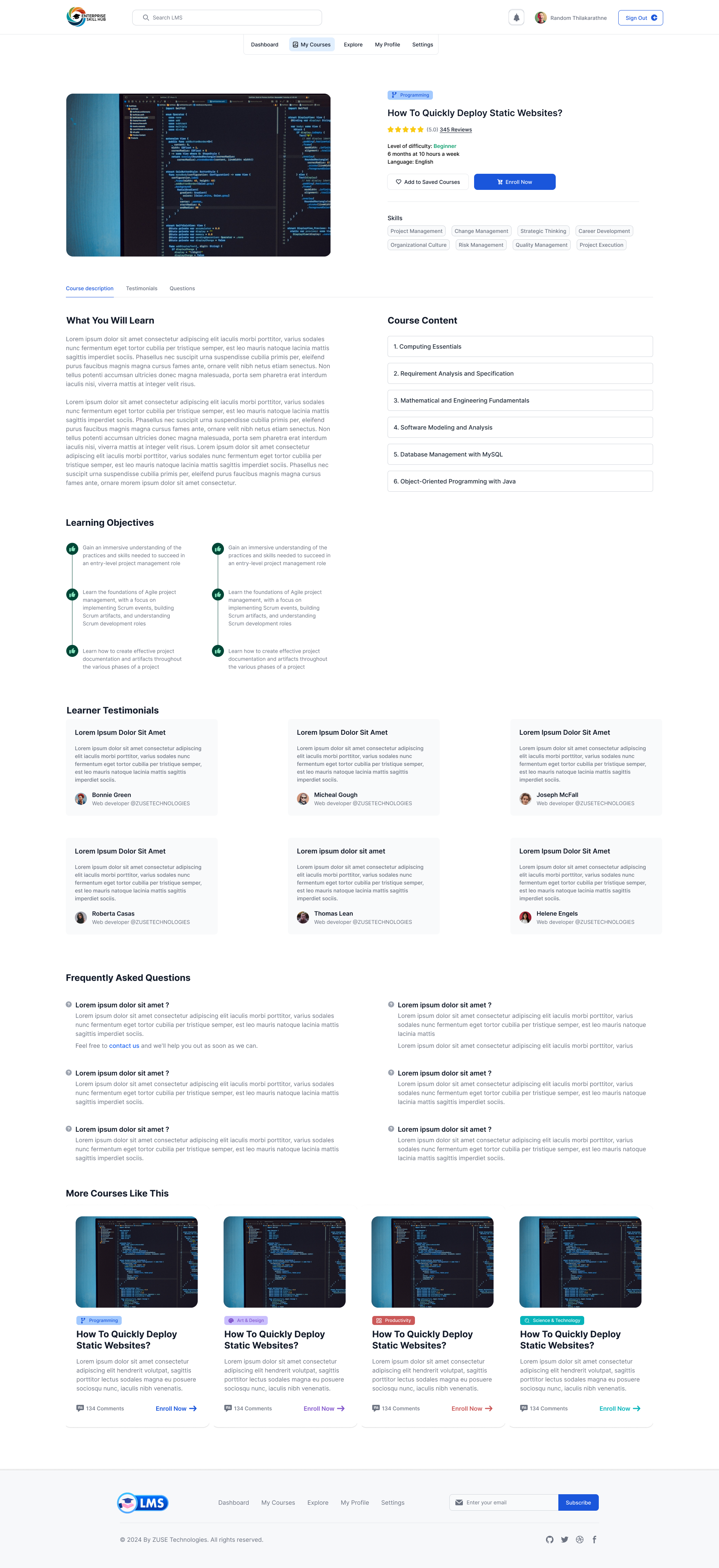
- Progressive disclosure of course materials to reduce cognitive load
- Personalized metrics surfacing "Next Up" modules immediately
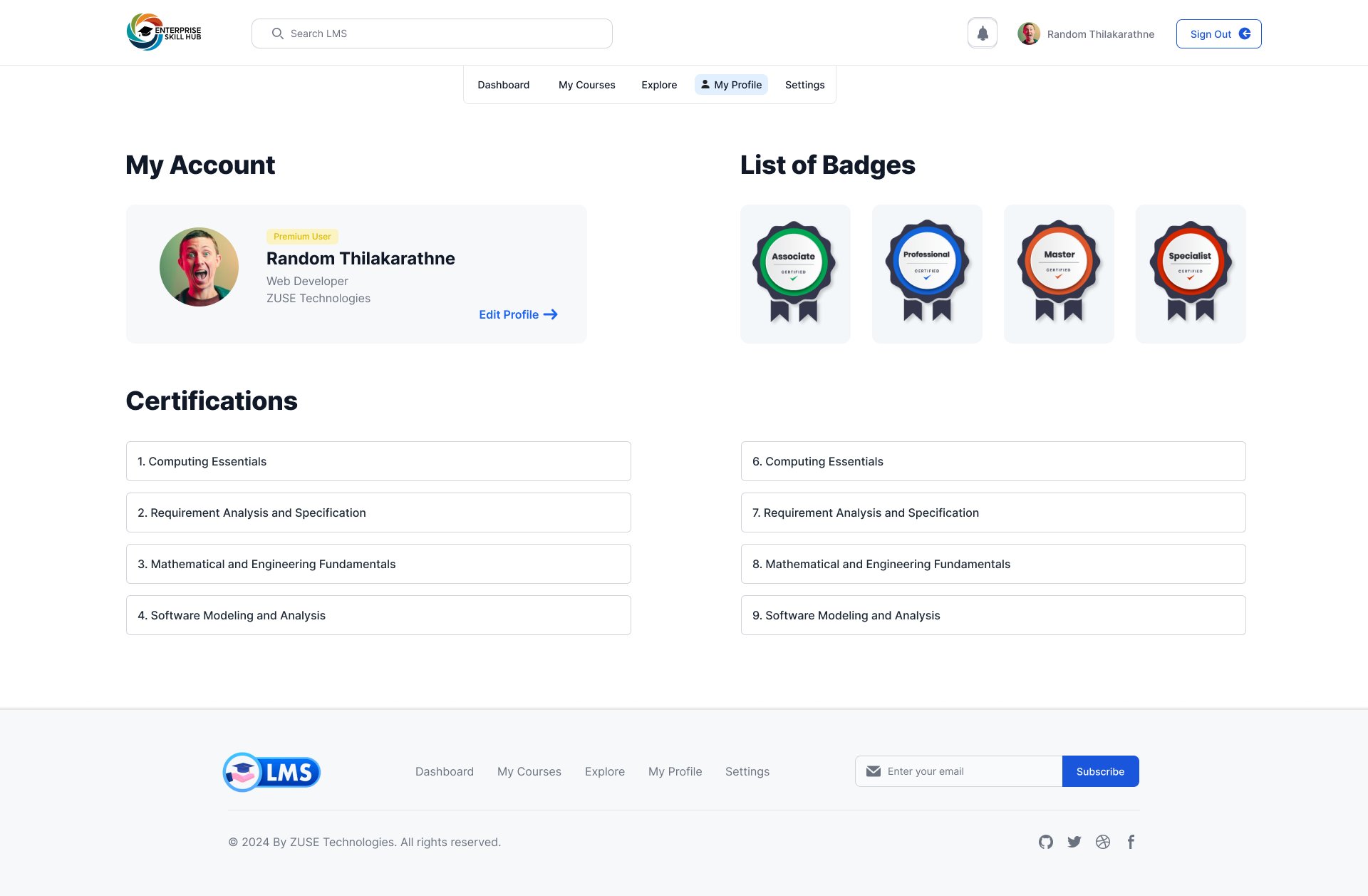
- Dedicated "Quick Access" for certificates and achievement tracking
User Personas
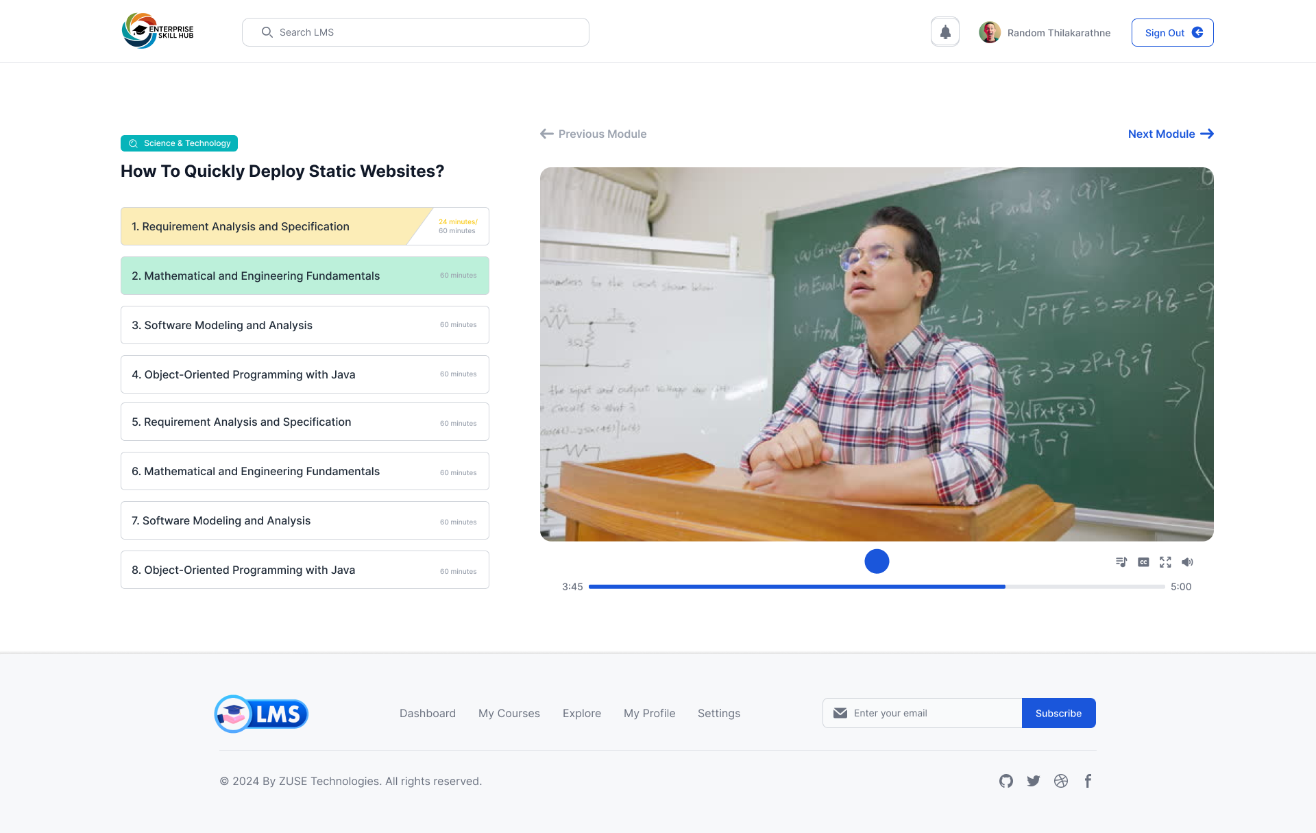
"I need to jump in, finish a module during my commute, and know exactly where I left off."
"I need to track certifications for my entire team without digging through nested reports."
"I spend half my day helping people reset passwords or find hidden course library links."
Cross-Persona Insights
Mapping the Workflow
User Flow: Learning Journey Redefined
We reduced the navigation burden by 40% by condensing 12 legacy menu items into 5 intelligent dashboard categories. The persistence of learner context across sessions became the primary design pillar.
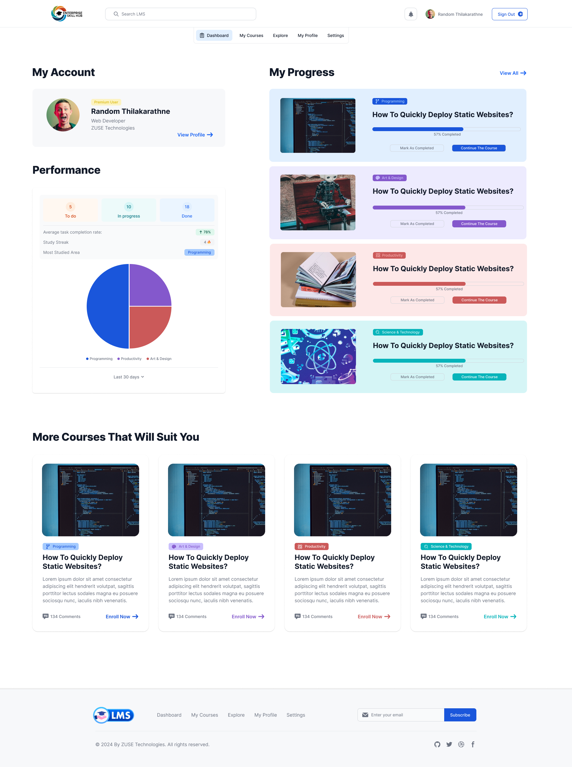
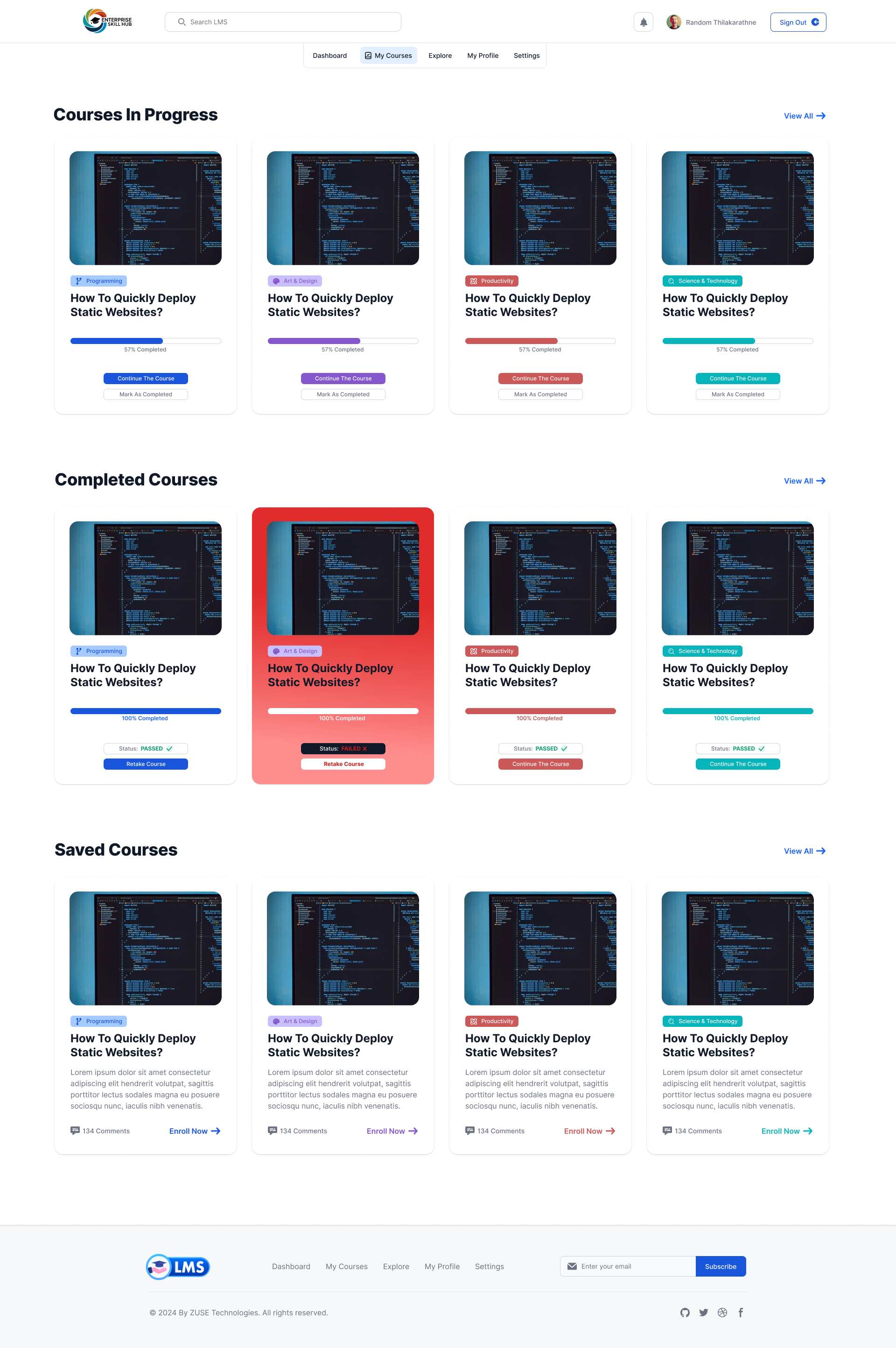
Information Architecture
Dashboard
Overview · Progress · Recent · Achievements
Library
Courses · Catalog · Categories · Recommendations
Analytics
Reports · Stats · Benchmarks · Team tracking
Account
Profile · Settings · Notifications · Help
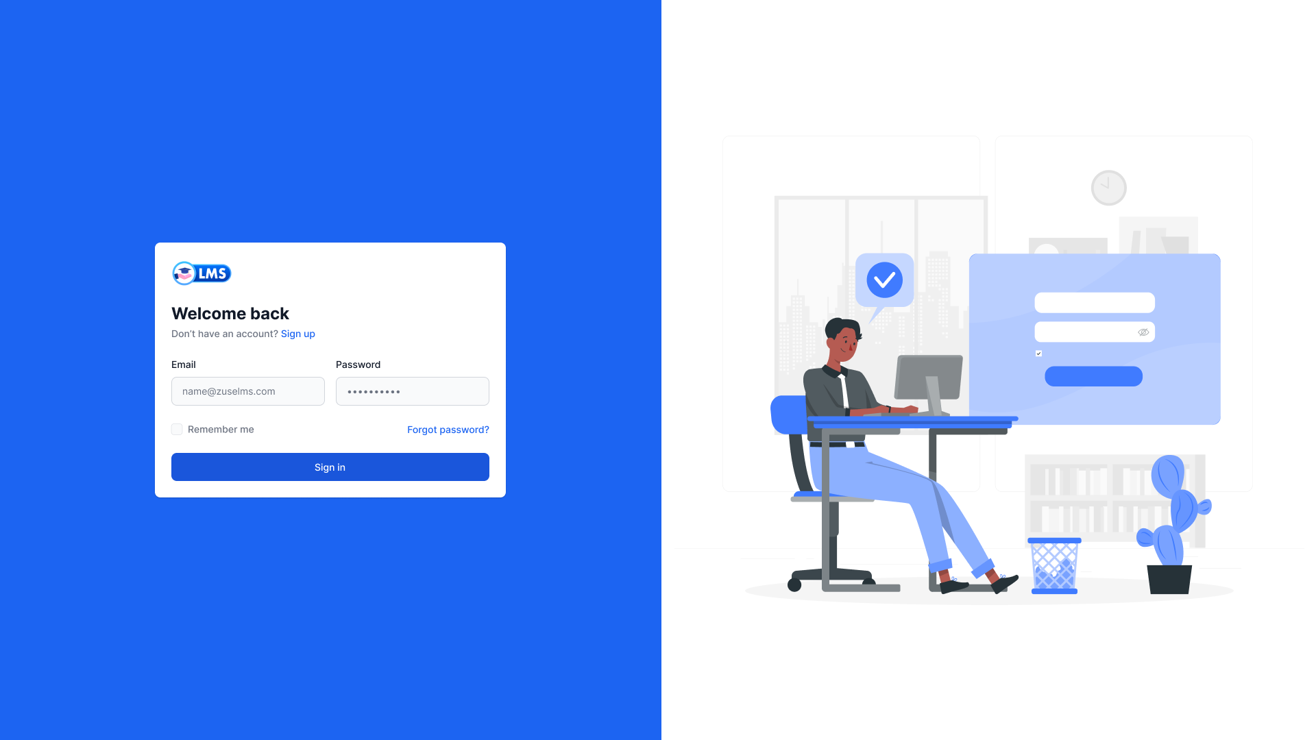
Visual Identity & Style Guide
The visual system prioritize accessibility and focus. By utilizing a high-contrast palette of deep primary blues and turquoise accents, we created an environment that feels both professional and energized.
Interface Architecture (Onboarding)
A streamlined 4-step onboarding flow was implemented to ensure 100% profile activation rates from the first login.
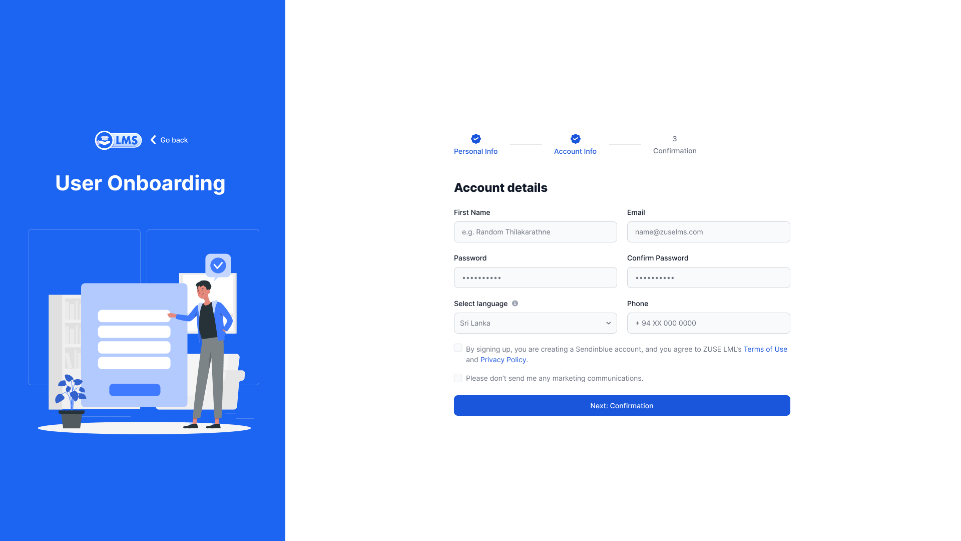
Account Discovery
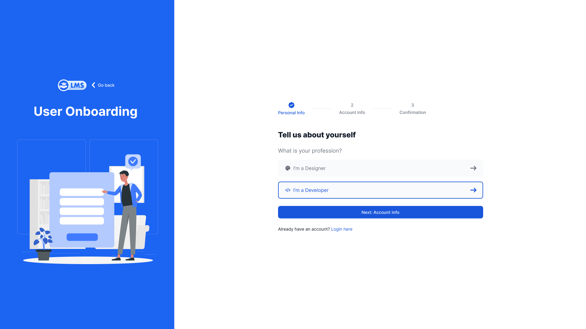
Personalization
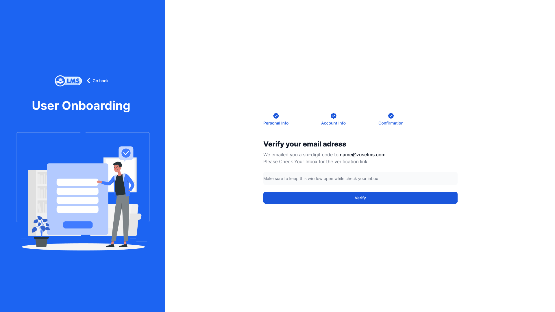
Verification
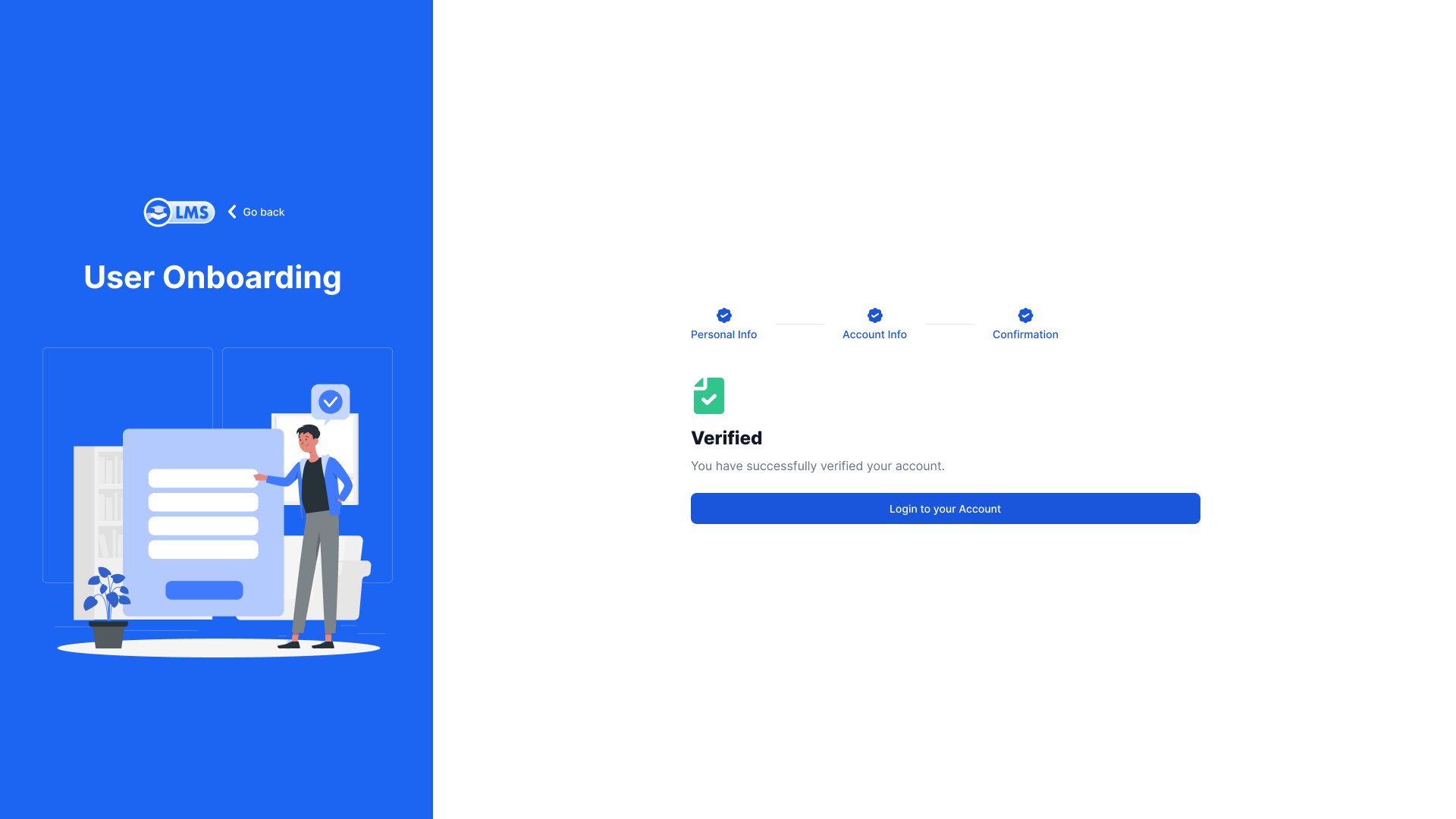
Success
High-Fidelity Project Deliverables
Outcome & Growth
"The redesigned interface proved that professional doesn't have to mean boring. By treating learners like premium customers, we saw interactivity spikes across all age groups."
🧠 Lessons Learned
Onboarding is the most critical junction. By simplifying the entry point into 4 digestible steps, we eliminated the anxiety associated with legacy corporate system complexity.
⏮️ Reflection
Designing for a SaaS environment requires a robust design-system approach from Day 1. The card-based components made scaling the courses library significantly more systematic.